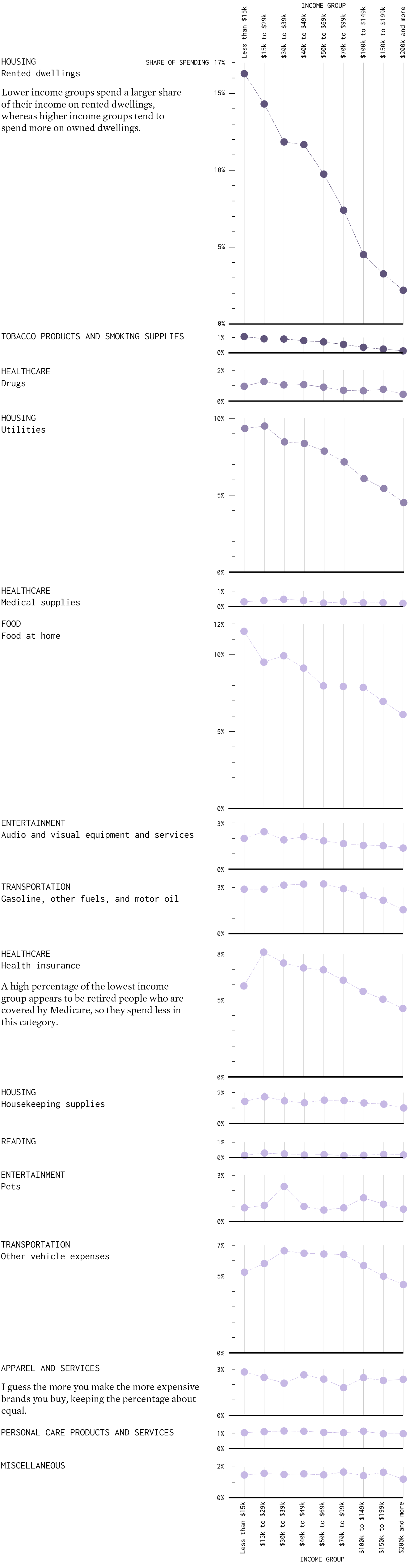
What People Spend Most of Their Money On, By Income Group, Relatively Speaking
The more money people come across, the more things they can and tend to buy. More money on average means bigger houses, more expensive cars, and fancier restaurants. But what if you look at relative spending instead of total dollars?
For example, if a lower income group uses 9 percent of their total spending to pay a mortgage, does the higher income group also pay 9 percent? Or does additional income go to other spending categories?
It varies.
The charts below show how different income groups spend their money, based on data from the Bureau of Labor Statistics for 2020. Each chart represents a spending category. Each column represents an income group.
Lower Income Spending
These are the categories that lower income groups tend to spend more on, percentage-wise, than higher income groups. Note the downward trends.
Higher Income Spending
These are the categories that higher income groups tend to spend more on, percentage-wise, than lower income groups. Note the upward trends.
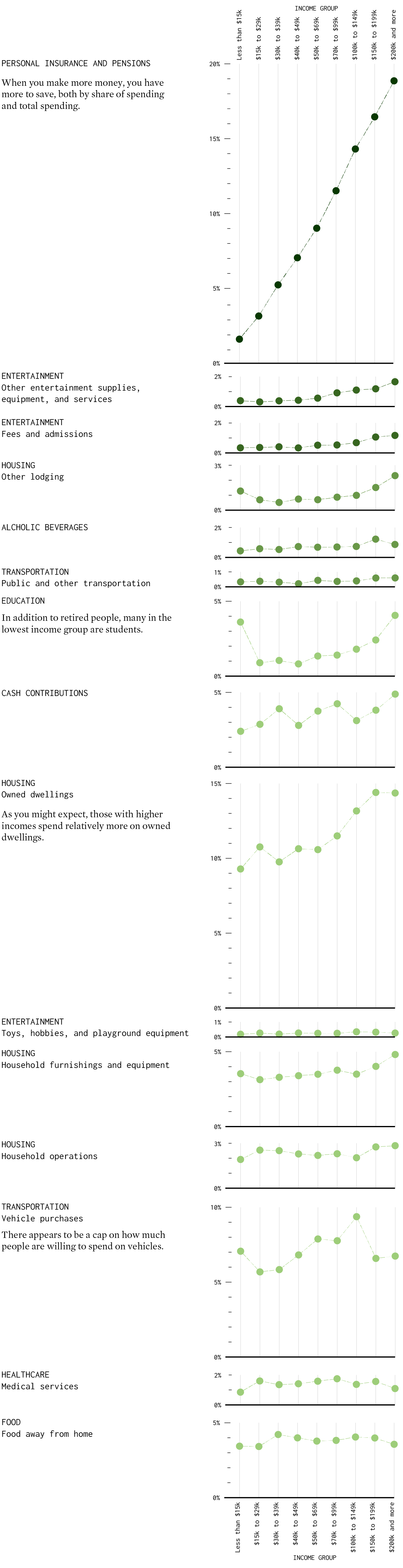
So yes, the more money people make, the more they tend to spend in all categories, but there’s only so much house or cars to buy. Once the essentials are covered, the extra money goes towards savings, entertainment, vacations, and higher education.
Notes
- The data comes from the Bureau of Labor Statistics. I used estimates for 2020. You can find more detailed descriptions of the spending categories here.
- Income is annual for what the BLS calls consumer units, which is similar to household income.
- I used R and Adobe Illustrator to make the charts.
Chart Types Used


Become a member. Support an independent site. Get extra visualization goodness.
See What You Get