Ben Orlin likes math and teaching. He’s bad at drawing. He has a…
-
Math and bad drawings
-
Members Only

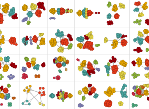
Small Multiples in R
Make a lot of charts at once, line them up in a grid, and you can make quick comparisons across several categories.
-
The Numbers Game on National Geographic
Jake Porway, the founder of DataKind, has a new show on the National…
-
Link
Selections in D3
Mike Bostock continues to beef up the documentation and tutorials for D3. This one for selections.
-
Insecurities of age through the eyes of Google Suggest
In this straightforward video, Marius Budin offers a look at our insecurities as…
-
A thorough Facebook analysis by Stephen Wolfram
Stephen Wolfram analyzed the Facebook world, based on anonymized data from the Wolfram|Alpha…
-
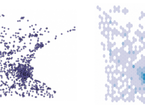
Binify for hexagon binning in Python
As an alternative to dot density maps, Binify by Kevin Schaul allows you…
-
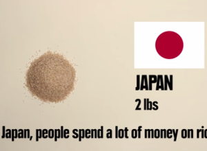
Stop motion video: Food you can buy for $5 in different countries
This stop motion video from BuzzFeed shows how much food you can buy…
-
Link
Visualization as Process →
Jer Thorp describes visualization as process rather than a tool or a product. “Please visualize our data.”
-
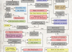
Flowchart for movie time travel →
Mr. Dalliard provides this handy flowchart to organize time travel movies. And yes,…
-
Link
What your zip code reveals about you
What your zip code reveals about you. More on data brokers and how advertisers and businesses use your information to sell you stuff.
-
Link
On Maps with Michal Migurski
Michal Migurski talks online mapping on the Data Stories podcast. Some history and current technologies. Skip to about 15 minutes in to get to the meat.
-
Orbiting planets found by NASA Kepler mission
The Kepler mission by NASA has discovered more than 100 planets that orbit…
-
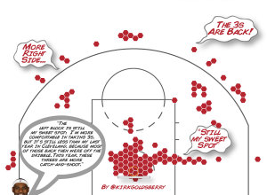
Shot charts show evolution of Lebron James
With the start of the NBA playoffs tomorrow, it’s worth coming back to…
-
Time-lapse: Package shipped with a hidden camera
Designer Ruben van der Vleuten was curious about the shipping process, so he…
-
Fictional villains chart
No comment necessary. [Thanks, Tom]…
-
Flexible data
Data is an abstraction of something that happened in the real world. How…
-
Wealth distribution in America
This video clearly describes the distribution of wealth in America using a set…
-
Link
Crosslet
Crosslet is “a free small (22k without dependencies) JavaScript widget for interactive visualisation and analysis of geostatistical datasets.” It’s a combination of Crossfilter, Leaflet, and D3.
-
Link
500K degree
A prediction on the cost of a college degree in 2030. Interesting, although the model is simplistic, namely it assumes tuitions will never level off (if just for a little while) and when no one can afford tuition, there’s going to be more change. Plus the Internet is changing things.
Recently for Members
Second Edition
 Visualize This: The FlowingData Guide to Design, Visualization, and Statistics (2nd Edition)
 Visualize This: The FlowingData Guide to Design, Visualization, and Statistics (2nd Edition)
New tools, refined process.
Browse by Chart Type See All →


