In a collaboration between PEER 1 Hosting, Steamclock Software, and Jeff Johnston, the Map of the Internet app provides a picture of what the physical Internet looks like.
Users can view Internet service providers (ISPs), Internet exchange points, universities and other organizations through two view options — Globe and Network. The app also allows users to generate a trace route between where they are located to a destination node, search for where popular companies and domains are, as well as identify their current location on the map.
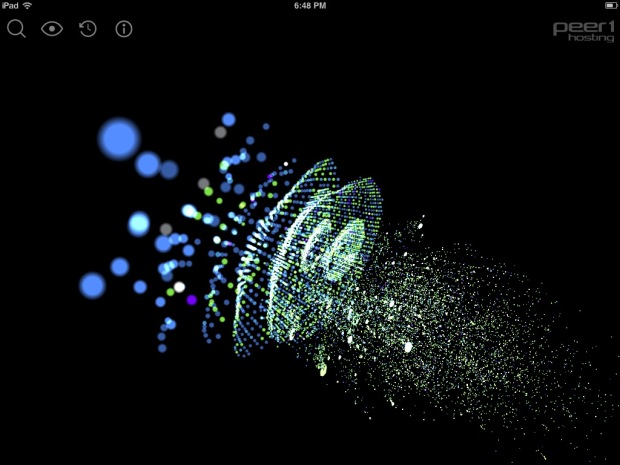
I can’t say how accurate it is or if the described mechanisms are accurate, but it sure is fun to play with. The view above and a globe are placed a three-dimensional space, and you can zoom and rotate as you please. There’s also a time slider, so you can see changes to the Internet over the years.
Get it for free on iTunes.
A CNNMoney segment of the app in action:
 Visualize This: The FlowingData Guide to Design, Visualization, and Statistics (2nd Edition)