That was fast. Just when you get used to dating with 2016, 2017…
-
2016.
-
Best Data Visualization Projects of 2016
Here are my favorites for the year.
-
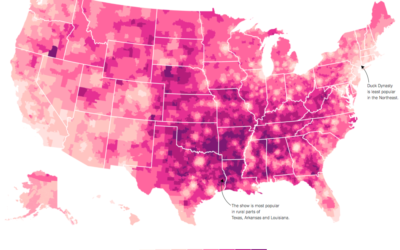
U.S. culture through TV show geography
Map who “likes” television shows on Facebook, by ZIP code, and you get…
-
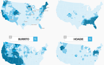
Where people use certain words
Nikhil Sonnad for Quartz mapped the top 100,000 words used in tweets. Search…
-
How Bayesian inference works
You might remember Bayes mentioned a few times in your introduction to statistics…
-
Interpolate your data for animation in R
The tweenr package in R, by Thomas Lin Pedersen, helps you interpolate data…
-
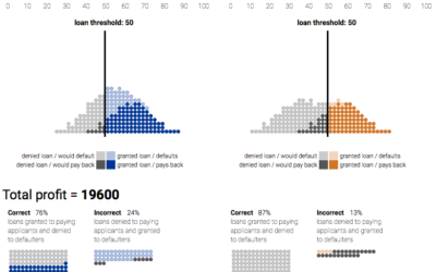
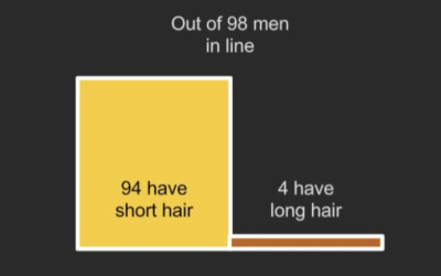
Minimizing discrimination in machine learning
From Google Research, a look at how discrimination in machine learning can lead…
-
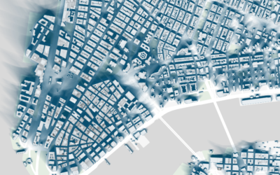
Map of New York City shadows
Shadows cast by buildings affect the feel and flow of a city, and…
-
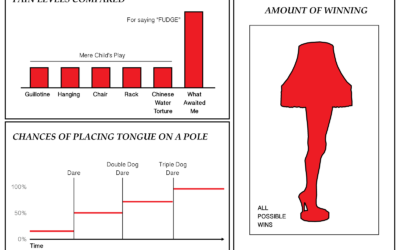
Christmas Movies as Charts
‘Tis the season.
-
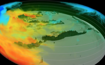
Following the carbon dioxide
This animated visualization from NASA Goddard Space Flight Center shows a model of…
-
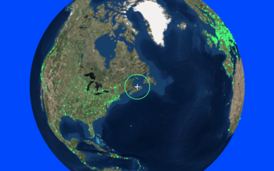
Listen to radio around the globe
Here’s a fun piece called Radio Garden. It’s exactly what the title says.…
-
Charting All the Beer Styles
The Beer Judge Certification Program lists 100 styles of beer. Here’s a chart for all of them.
-
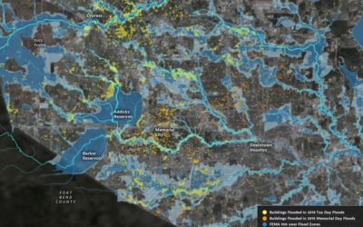
Houston flooding on the rise
Climate change is doing some weird stuff. What were once rare weather events…
-
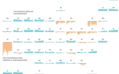
Electoral college and state population representation weights
By design, the electoral college and population don’t quite match up state-by-state. This…
-
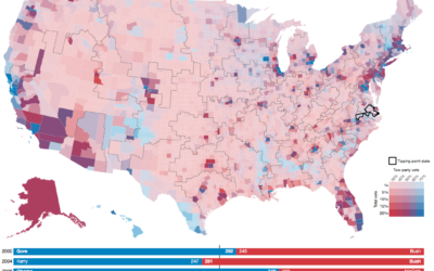
Random states of America show changing election outcomes
Geography and state borders play a big part in how elections play out…
-
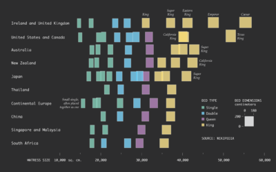
Bed Sizes Around the World
A king bed isn’t the same size everywhere. Sometimes, a king is a queen.
-

Handwriting with a neural network
Continuing the neural network explorations, Shan Carter and team of Google Brain and…
-
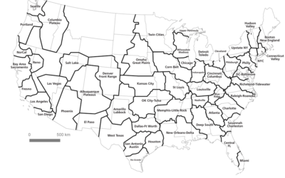
New region boundaries based on commutes
Geographers Alasdair Rae and Garrett Nelson used commuting data from the American Community…
-
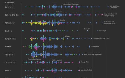
Fast Food Menu of Calories
How does the distribution of calories vary by fast food restaurant? Here’s a chart that shows all the menu items for ten of the biggest national fast food chains.
-

An average life as interpretive dance
BuzzFeed used interpretive dance to describe the average age of the milestones in…
Recently for Members
Second Edition
 Visualize This: The FlowingData Guide to Design, Visualization, and Statistics (2nd Edition)
 Visualize This: The FlowingData Guide to Design, Visualization, and Statistics (2nd Edition)
New tools, refined process.
Browse by Chart Type See All →


