The nice thing about animated GIFs for visualization is that they can get…
animation
-
Data visualization GIFs
-

Evolution of The New York Times front page
From Josh Begley, this quickfire flip book shows every New York Times front…
-
Members Only
How to Make an Animated Map in R, Part 4
In the the last part of the four-part series, you make a longer animation with more data and annotate.
-

Interpolate your data for animation in R
The tweenr package in R, by Thomas Lin Pedersen, helps you interpolate data…
-
Majority minorities
We saw the changing percentage of white people in the United States and…
-
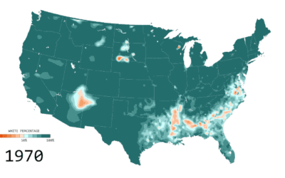
Percentage of white people
Below is the estimated percentage of white population in the United States from…
-
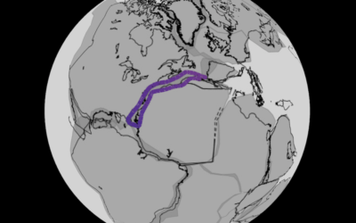
Continental drift, from 240 million years ago to present
Researchers modeled continental drift, going back 240 million years ago, on the scale…
-
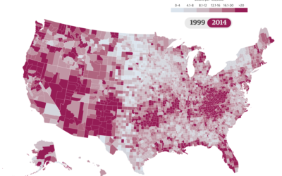
National drug overdose epidemic
Nadja Popovich for the Guardian delves into America’s drug overdose epidemic, starting with…
-
Link
Animate gradient to imitate flow with d3.js →
Gain a sense of direction from otherwise static connections.
-
Algorithms for the Traveling Salesman Problem visualized
The Traveling Salesman Problem is a popular puzzle that asks for the shortest…
-
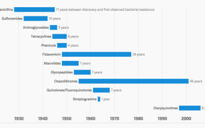
Antibiotic history and the winning bacteria
We take antibiotics. Bacteria dies, but some lives, evolves and develops a resistance…
-
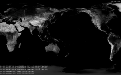
Nuclear detonations from 1945 to present
There have been over 2,000 nuclear detonations since 1945. Orbital Mechanics mapped each…
-
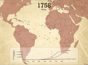
Animated map shows Trans-Atlantic slave trade
The Trans-Atlantic Slave Trade Database provides records for thousands of voyages between the…
-
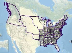
Animated history of US county boundaries
Here’s a straightforward animation that shows US county boundaries change between 1629 and…
-

One animated art piece per day, with D3.js
Data-Driven Documents, or D3.js, is a flexible JavaScript library that lets you draw…
-

Data trails explainer
We produce data all the time, everywhere we go, and this process implies…
-
Bike share data in New York, animated
Citi Bike, also known as NYC Bike Share, is releasing monthly data dumps…
-
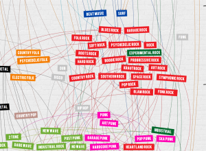
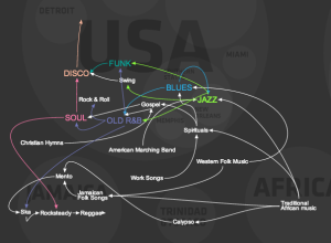
Timeline shows a century of rock history
Jessica Edmondson visualized the history of rock music, from foundations in the pre-1900s…
-
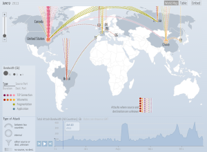
Digital attack map
A Distributed Denial of Service (DDoS) attack attempts to disable a site or…
-
Evolution of western dance music
A quick animated look on the evolution of western dance music, a mixture…
Recently for Members
Second Edition
 Visualize This: The FlowingData Guide to Design, Visualization, and Statistics (2nd Edition)
 Visualize This: The FlowingData Guide to Design, Visualization, and Statistics (2nd Edition)
New tools, refined process.
Browse by Chart Type See All →


