Pierre Ripoll provides several ways to visualize periodicity using animation. Moving dots, rotating…
animation
-
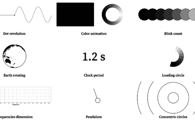
Visualizing periodicity with animations
-

Break the chain
For The Spinoff, Toby Morris illustrates how individuals can break a chain of…
-
How to Flatten the Curve, a Social Distancing Simulation and Tutorial
Using R, we look at how your decreased interaction with others can help slow the spread of infectious diseases.
-

SVG and CSS animations, without JavaScript
Andrew Wang-Hoyer built over 200 animations on and off over two years. They…
-
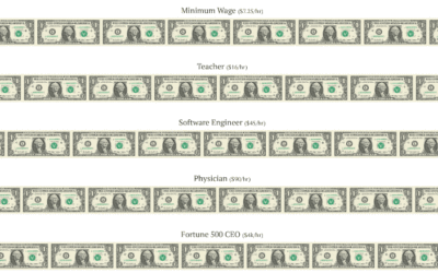
Printing money at the speed of various wages
Neal Agarwal used a money printing metaphor to depict differences in various wages.…
-
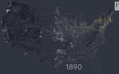
Mapping the construction of railroads in America
For the Financial Times, Alan Smith and Steven Bernard traced the history of…
-
Members Only
How to Make Animated Visualization GIFs with ImageMagick
Using the library command-line gets you more flexibility to highlight the important parts of the data.
-
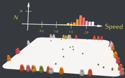
Natural selection simulation
Using blobbies with varying traits such as size, speed, and food gathering ability,…
-
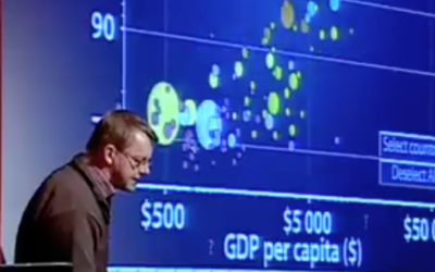
Animation in visualization, revisited a decade later
Rewind to 2006 when Hans Rosling’s talk using moving bubbles was at peak…
-
Members Only

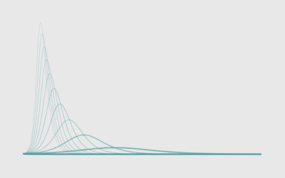
Playing the Distributions, Hypothetical Outcome Plots, Getting Closer to Real Life
Histograms for a general audience can be a challenge. I’m curious if building up the distributions over time can be helpful.
-
Members Only
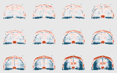
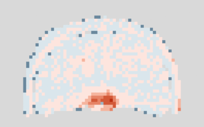
How to Make Animated (GIF) Heatmaps in R
Using color as the visual encoding, show changes over time in two dimensions.
-
Members Only

Uses for Animation in Charts and Animating Your Own Data
Important question: Is animation in visualization even worthwhile? Well, it depends. Surprise, surprise. In this issue, I look at animation in data visualization, its uses, and how I like to think about it when I implement moving data.
-
Members Only
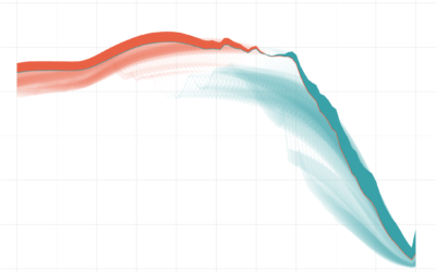
How I Made That: Animated Difference Charts in R
A combination of a bivariate area chart, animation, and a population pyramid, with a sprinkling of detail and annotation.
-
Members Only
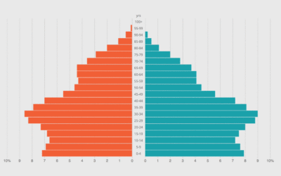
How to Make an Animated Pyramid Chart with D3.js
Compare distributions side-by-side with a pyramid chart. Observe the change over the years by animating it.
-

Understanding animated transitions in data visualization
Alec Barrett for TWO-N describes the benefits and some of the intricacies of…
-
Link
Let it flow, let it flow, let it flow →
The particles R package from Thomas Lin Pedersen ports d3-force from d3.js to R. Make a bunch of dots move.
-
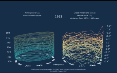
3-D tube chart of global CO2 concentration and temperature
Because you can never have enough time series charts that show increases of…
-
Members Only
How to Make Animated Line Charts in R
Sometimes it’s useful to animate the multiple lines instead of showing them all at once.
-
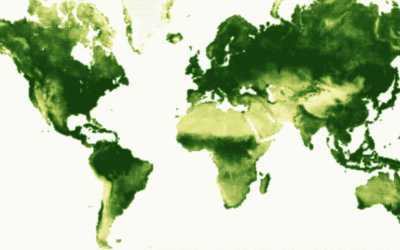
Breathing Earth of vegetation
Using data from NOAA STAR, Nadieh Bremer creates a breathing Earth that shows…
-
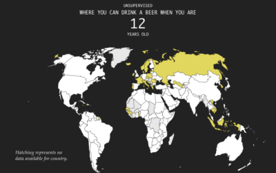
Legal Drinking Age Around the World
As you probably know, different countries have different legal age limits for drinking…
Recently for Members
Second Edition
 Visualize This: The FlowingData Guide to Design, Visualization, and Statistics (2nd Edition)
 Visualize This: The FlowingData Guide to Design, Visualization, and Statistics (2nd Edition)
New tools, refined process.
Browse by Chart Type See All →


