Digital artist Lauri Vanhala animated a day of maritime traffic in the Baltic…
animation
-
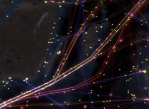
Maritime traffic in the Baltic Sea, animated
-
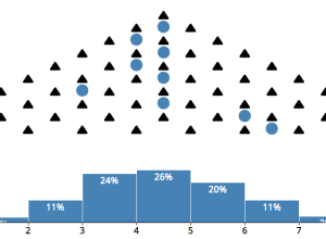
Central limit theorem animation
The central limit theorem:
In probability theory, the central limit theorem (CLT) states… -
Link
Money on the Bench
The New York Times has a set of tickers that keep track of the money spent on players who are injured sitting on the bench.
-
DDoS attack animation
In distributed denial-of-service attack a bunch of machines make a bunch of requests…
-
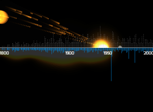
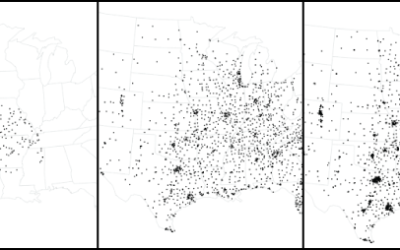
Meteorites seen falling since 2500BC visualized
About 35,000 meteorites have been recorded since 2500 BC, and a little over…
-
Map of live Wikipedia changes
On Wikipedia, there are constant edits by people around the world. You can…
-
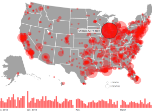
Gun deaths since Sandy Hook
The shooting at Sandy Hook Elementary School was horrible, but there have been…
-
Members Only
How to Make an Animated Growth Map in R
Although time series plots and small multiples can go a long way, animation can make your data feel more real and relatable. Here is how to do it in R via the animated GIF route.
-
A shroud of cold air descends on the U.S.
From NOAA, an animation showing a wave of cold during the Martin Luther…
-
Ten years of cumulative precipitation
We’ve all seen rain maps for a sliver of time. Screw that. I…
-
Link
Animated GIFs in R →
-
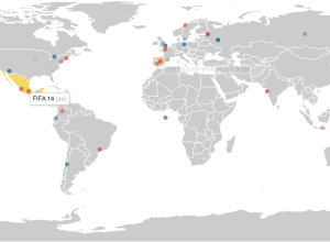
2012 political donations mapped over time
Following their animated and narrated visualization on political contributions over time, VisPolitics maps…
-
Bike patterns
Jo Wood, a professor of visual analytics, visualized five million bike rides using…
-
Animated political contributions
The Forest of Advocacy is a series of animations that explores the political…
-
Olympic rings as data symbols
Artist Gustavo Sousa used the Olympic rings as data indicators for statistics like…
-
What planets would look like if they replaced our moon
Artist Brad Goodspeed imagined what the planets would look like if they were…
-
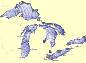
Great Lakes currents map
Using the same tech Martin Wattenberg and Fernanda Viegas created to show wind…
-
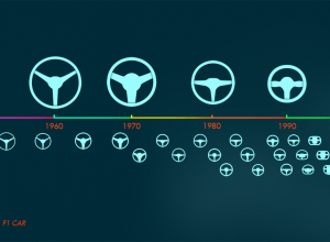
Evolution of the Formula One car, animated
Animator and illustrator Rufus Blacklock animated 60 years of Formula One race car…
-
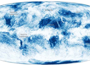
A year of global cloud coverage →
Jonathan Corum for the New York Times mapped cloud coverage from April 2011…
-
World sentiment mapped, based on Wikipedia
Kalev H. Leetaru animated world sentiment over time, based on Wikipedia entries.
See…
Recently for Members
Second Edition
 Visualize This: The FlowingData Guide to Design, Visualization, and Statistics (2nd Edition)
 Visualize This: The FlowingData Guide to Design, Visualization, and Statistics (2nd Edition)
New tools, refined process.
Browse by Chart Type See All →


