• Membership
  • Books
  • Projects
  • Learning
  • Newsletters
  • Member Login
  • Coronavirus cases rising in prisons

    November 13, 2020

    Topic

    Statistical Visualization  /  coronavirus, Marshall Project, prisons

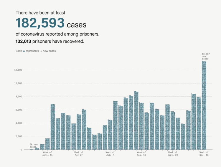
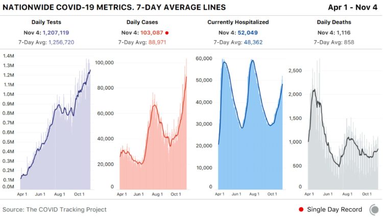
    Coronavirus cases are rising (again), which includes prisoners and prison staff. The Marshall Project has been tracking cases since March and provides a state-by-state rundown:

    New infections this week rose sharply to their highest level since the start of the pandemic, far outpacing the previous peak in early August. Iowa, Michigan and the federal prison system each saw more than 1,000 prisoners test positive this week, while Texas prisons surpassed 2,000 new cases.

  • Student surveillance and online proctoring

    November 13, 2020

    Topic

    Data Sharing  /  education, privacy, surveillance, testing, Washington Post

    To combat cheating during online exams, many schools have utilized services that try to detect unusual behavior through webcam video. As with most automated surveillance systems, there are some issues. For The Washington Post, Drew Harwell looks into the social implications of student surveillance:

    Fear of setting off the systems’ alarms has led students to contort themselves in unsettling ways. Students with dark skin have shined bright lights at their face, worrying the systems wouldn’t recognize them. Other students have resorted to throwing up in trash cans.

    Some law students who took New York’s first online bar exam last month, a 90-minute test proctored by the company ExamSoft, said they had urinated in their chairs because they weren’t allowed to leave their computers, according to a survey by two New York state lawmakers pushing to change the rules for licensing new attorneys during the pandemic.

    Oh.

  • Members Only

    The Process 115 – Breaking Chart Monotony

    November 12, 2020

    Topic

    The Process  /  monotony

    When every day feels like more of the same, here are some of the things I do to shake off the monotony.

  • Red counties mostly stayed red

    November 12, 2020

    Topic

    Statistical Visualization  /  election, New York Times, scrollytelling

    For The New York Times, Denise Lu and Karen Yourish looked at the red and blue shifts for the counties that voted red in 2016:

    President-elect Joseph R. Biden Jr. won the popular vote by more than five million — and his margin is expected to grow as states finish counting. Still, results so far show that President Trump’s support remained strong in most of the counties that voted for him in 2016. Here’s how.

    Always enjoy scrollytelling through spaghetti.

  • How to Make Marimekko Charts in Excel

    Marimekko charts, or mosaic plots, allow you to compare categories over two quantitative variables.

  • Tour of the D3 ecosystem

    November 11, 2020

    Topic

    Coding  /  d3js, Ian Johnson, tour

    D3.js, a flexible JavaScript library useful for visualization, can feel intimidating at first. It does a lot. So Ian Johnson gave a talk on what the library provides, along with a tour of the essentials.

  • Minimalist creative coding environment

    November 9, 2020

    Topic

    Data Art  /  dots, Martin Kleppe, minimalist

    tixy.land is a minimalist coding environment by Martin Kleppe:

    Control the size and color of a 16×16 dot matrix with a single JavaScript function. The input is limited to 32 characters – but no limits to your creativity!

    Fun. You can find a tiny bit more info here.

  • Swings in the battleground states

    November 9, 2020

    Topic

    Infographics  /  election, swing, Washington Post

    For The Washington Post, Ashlyn Still and Ted Mellnik show the shifts in the 2020 election compared against the 2012 and 2016 elections. Good use of swooping arrows.

  • Estimate your Covid-19 risk, given location and activities

    November 8, 2020

    Topic

    Statistics  /  coronavirus, risk

    The microCOVID Project provides a calculator that lets you put in where you are and various activities to estimate your risk:

    This is a project to quantitatively estimate the COVID risk to you from your ordinary daily activities. We trawled the scientific literature for data about the likelihood of getting COVID from different situations, and combined the data into a model that people can use. We estimate COVID risk in units of microCOVIDs, where 1 microCOVID = a one-in-a-million chance of getting COVID.

  • Wind map to show change in vote shares and participation

    November 6, 2020

    Topic

    Maps  /  election, Washington Post, wind

    The Washington Post goes with a wind metaphor to show the change in voting activity between 2016 and 2020. The up and down direction represents change in turnout, and the left and right direction represents change in vote margin.

    A fun riff on the classic Viégas and Wattenberg wind map and the Bostock and Carter election map from 2012.

    The Post map is based on this and this code.

  • Large collection of optical illusions and visual phenomena

    November 6, 2020

    Topic

    Design  /  illusion

    Sometimes our eyes play tricks on us. Even when we know what is actually happening, our visual system won’t let us see the reality. Michael Bach has an extensive collection of 141 optical illusions, along with explanations of what’s tripping up:

    Optical illusion sounds derogative, as if exposing a malfunction of the visual system. Rather, I view these phenomena as highlighting particular good adaptations of our visual system to experience with standard viewing situations. These experiences are based on normal visual conditions, and thus under unusual contexts can lead to inappropriate interpretations of a visual scene (=”Bayesian interpretation of perception”).

  • Members Only

    The Process 114 – Data, the Fuzzy and Fragile Representation of Real Life

    November 5, 2020

    Topic

    The Process  /  abstract, election, fuzzy

    As I’m sure you know, it was Election Day on Tuesday here in the United States. I told myself that I wouldn’t watch the results roll in, because the record number of mail-in ballots would throw off regular timelines. Of course I broke.

  • Spike past 100k Covid-19 cases in a day

    November 5, 2020

    Topic

    Statistical Visualization  /  coronavirus, COVID Tracking Project, record

    Meanwhile… based on estimates from The COVID Tracking Project, the United States had an all-time high for daily counts yesterday, at 103,087. And 1,116 people died.

  • Watch the election percentages for votes counted so far

    November 5, 2020

    Topic

    Statistical Visualization  /  Bloomberg, election

    Still waiting for those results? Bloomberg’s election page for each state shows the estimated range of votes counted so far. Really like the dual encoding with the shaded gradient and line. For example, here’s the page for Pennsylvania.

  • Testing voting scenarios while we wait for the counts

    November 4, 2020

    Topic

    Infographics  /  election, FiveThirtyEight, New York Times, possibilities

    As we wait for the votes to be counted in the remaining states, here are a couple of interactives to test the possibilities. The New York Times updated their graphic on all possible paths to the White House (the original from 2012).

    FiveThirtyEight also has their thing:

    Or, there’s this decision tree by Kerry Rodden:

    Or, you could carry on with your day as if nothing is happening and not concern yourself with things that are outside of your control.

    Nope. Not gonna do that.

  • Election needles are back

    November 3, 2020

    Topic

    Statistical Visualization  /  election, needle, New York Times, uncertainty

    The NYT election needles of uncertainty are back, and they’re about to go live (if they haven’t already). I’m not watching, but in case that’s your thing, there you go.

    It’s a little different this time around, because of the pandemic and mail-in voting. There’s no national needle this time. Instead, there are three needles for Florida, Georgia, and North Carolina, because they’re battleground states and the necessary data to run the estimates is available.

  • Electoral coloring page

    November 3, 2020

    Topic

    Maps  /  coloring, election, Washington Post

    If you want to color in your own electoral map at home, The Washington Post provides this blank, printable page. I hear coloring is soothing or something like that. [via @SethBlanchard]

  • Waves of distraction

    November 3, 2020

    Topic

    Sketchbook  /  animation, distraction

    I’ve been distracted lately, so instead of making regular charts, I’ve been making animated GIFs using various visual encodings. It hits the sweet spot of producing something without having to access the part of my brain for longer thinking sessions.

    Tunnels:

    Round and round:

    Needles of uncertainty made certain:

    I hope this brings some calm and predictability to your day.

  • Early voting by state

    November 3, 2020

    Topic

    Maps  /  election, New York Times, voting

    It’s election day here in the United States, but millions of votes have already been mailed or dropped off. In some states, the number of early votes already surpassed the total in 2016. The New York Times provides a state-by-state breakdown.

  • Election map design challenges

    November 2, 2020

    Topic

    Design  /  Betsy Mason, challenge, electoral, New York Times

    For NYT Opinion, Betsy Mason outlines the design challenges behind election maps. Do you show geography? Do you focus on scale? What colors should you use? For every choice, there’s always tradeoffs, which is why there are so many views.

  • Page 96 of 396
  • <
  • 1
  • ...
  • 93
  • 94
  • 95
  • 96
  • 97
  • 98
  • ...
  • 396
  • >

Analyze, visualize, and communicate data usefully, beyond the defaults.

Become a member →

Recently for Members

July 10, 2025
Switching axis positions

July 3, 2025
Questions to visual answers

June 26, 2025
Visualization Tools and Learning Resources, June 2025 Roundup

June 19, 2025
Making Data Relatable

June 12, 2025
Comparing multiples

Second Edition

Visualize This: The FlowingData Guide to Design, Visualization, and Statistics (2nd Edition)

New tools, refined process.

Order: Amazon / Bookshop

Browse by Chart Type See All →

Density Plot Line Map Bar Chart Race Alluvial Diagram Grid Map Parallel Coordinates Glyph Chart Network Graph Connected Scatter Plot Calendar

Browse By Topic

  • Visualization

    Seeing data

  • Maps

    Seeing geographic data

  • Infographics

    Explaining data

  • Networks

    Connecting data

  • Statistics

    Analyzing data

  • Software

    Working with data

  • Sources

    Getting data

  • Design

    Making data readable

Made by FlowingData

  • The Process

  • Data Underload

  • Chart Everything

  • Guides

  • Books

  • Shop

  • About
  • Contact
  • LinkedIn
  • Instagram
  • Bluesky
  • RSS
Copyright © 2007-Present FlowingData. All rights reserved.