How to Make Marimekko Charts in Excel
Marimekko charts, or mosaic plots, allow you to compare categories over two quantitative variables.
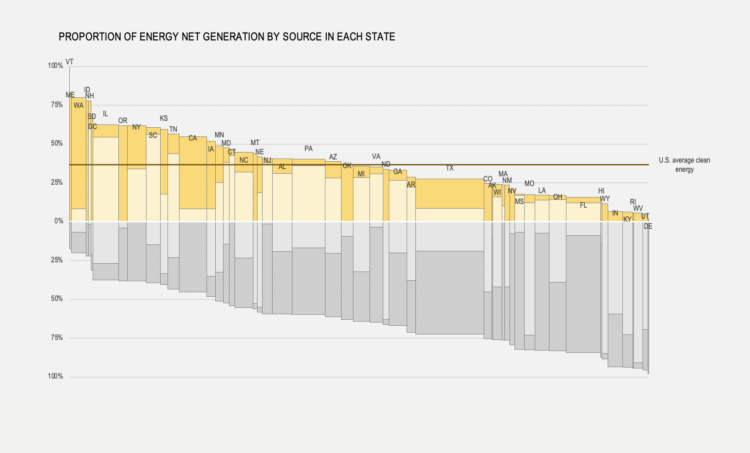
In the chart above, column width denotes the energy generated in a state as a proportion of the total energy generated in the US (for example, Texas is, by far, the largest producer). The share of each source by state is displayed along the y-axis. Coal and other Fossil sources are displayed to the bottom in gray, while Nuclear and Renewable sources are displayed to the top in yellowish tones. You can see that, while Texas is the large generator of energy, around two thirds of it is generated from coal and other fossil sources. Illinois, on the other hand, generates more than 50% of its energy from nuclear sources.
So, as you can see, Marimekko charts are some kind of dual stacked bar charts, where you stack categories along both the x- and the y- axes. You can use Marimekko charts in a variety of contexts. You could display the size of sales territories along the y-axis and your product’s market share along the y-axis: do you have significant market shares in large markets? Are your best-performing territories only the smallest ones?
To access this full tutorial, you must be a member. (If you are already a member, log in here.)
Get instant access to this tutorial and hundreds more, plus courses, guides, and additional resources.
Membership
You will get unlimited access to step-by-step visualization courses and tutorials for insight and presentation — all while supporting an independent site. Files and data are included so that you can more easily apply what you learn in your own work.
Learn to make great charts that are beautiful and useful.
Members also receive a weekly newsletter, The Process. Keep up-to-date on visualization tools, the rules, and the guidelines and how they all work together in practice.
See samples of everything you gain access to:
About the Author
Jorge Camoes is a data visualization consultant based in Lisbon. Author of the book Data at Work. Runs ExcelCharts.com, where he discusses how to use Excel as data visualization tool. Recently playing with PowerBI & PowerQuery.