-
Members Only
-
From Dan Goodspeed, the bar chart race is back. The length of the bars represents Covid-19 case rates per state, and color represents partisanship. The animation currently starts on June 1 and runs through October 13. It plays out how most of us probably assumed at some level or another.
-
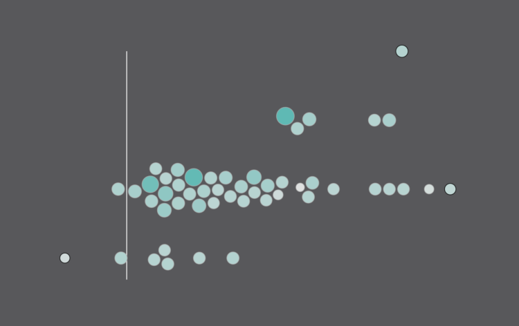
The Gartner hype cycle is a graphical representation of where certain technologies are at in terms of expectations and productivity. It’s abstract and qualitative. But Mark Mine looked at 25 years worth of cycles to see how things have changed in a more quantitative fashion.
Mine made his dataset available here.
-
Someone mentioned that $400,000+ per year was commonplace in American households. That seemed like an odd comment.
-
In 1966, artist Ed Ruscha published Every Building on the Sunset Strip, which was a stiched collection of photos taken while driving along Sunset Boulevard. Ruscha continued to take pictures over the years. Getty and Stamen made the multi-year work available online with a unique explorer that lets you drive the drive along 12 timelines.
Select your vehicle, the years, and move along the map.
See also Eric Rodenbeck’s process post on how the work came together.
-
For MIT Technology Review, Karen Hao looks into the process of artists Francesca Panetta and Halsey Burgund to produce a deepfake of Richard Nixon reading an alternate history of the moon landing:
This is how Lewis D. Wheeler, a Boston-based white male actor, found himself holed up in a studio for days listening to and repeating snippets of Nixon’s audio. There were hundreds of snippets, each only a few seconds long, “some of which weren’t even complete words,” he says.
The snippets had been taken from various Nixon speeches, much of it from his resignation. Given the grave nature of the moon disaster speech, Respeecher needed training materials that captured the same somber tone.
Wheeler’s job was to re-record each snippet in his own voice, matching the exact rhythm and intonation. These little bits were then fed into Respeecher’s algorithm to map his voice to Nixon’s. “It was pretty exhausting and pretty painstaking,” he says, “but really interesting, too, building it brick by brick.”
Sounds like a lot of work, luckily.
-
From a distance, it’s difficult to build an understanding of the scale and nature of protests. A soundbite here. A video clip there. So, to show the Minneapolis protests more completely, The Washington Post and The Pudding stitched together 149 livestreams with timestamps and location:
Videos were collected by searching Youtube, Facebook, Twitter, Twitch and other sources and then limited to live streams to ensure accuracy of time, location and remove reposted clips. Each video was reviewed and tagged to a location by hand to remove any videos that were replays as live streams. Thumbnails were then extracted using FFMPEG and links to the original videos were provided. Interesting quotes and context setting annotations were called out to provide a deep experience while allowing for quick scanning. Finally links and inline play of the original videos is provided for those wishing to see the videos as streamed.
With so much footage, it’s easy to imagine any sense of narrative getting lost in a bunch of moving pictures. But the layout and structure of this story, organized as a timeline and categorized by area, really help you see what happened over a week.
-
FiveThirtyEight publishes win probabilities for NBA games throughout the season. During the playoffs, they show chances of winning each round, and with each game, the probabilities shift. Adam Pearce animated these shifts, from the start of the playoffs up to now.
Nice. The visualization. Not so much the Lakers.
-
For Scientific American, Youyou Zhou made a line chart that shows cause of death in the United States, from 2015 up to present. Covid-19 was the leading cause of death in April and is now sitting at number 3. The rise in unclassified deaths also stands out.
-
Members Only
-
Colour Controversy is a simple game that shows you a shade and asks you what color it is. The fun part is that the shades are usually in between two colors, say blue and green, and you can only choose one. A running tally is kept so that you can see the “most controversial” colors.
-
Using a straightforward treemap, The Washington Post looks at where the $4 trillion bailout went. As you scroll, different categories highlight with accompanying text.
This is probably the old man in me, and I know the scrollytelling format works better for mobile and provides more focus, but I find myself missing the large, featured-filled interactives. Those were the days.
-
To visualize uncertainty in election forecasts, Matthew Kay from Northwestern University used a Plinko metaphor. The height of each board is based on the distribution of the forecast, and each ball drop is a potential outcome. The animation plays to eventually shows a full distribution.
(And Kay made his R code available on GitHub.)
-
For The New York Times, Ella Koeze looks at the various types of unemployment and how rates changed over the past six months.
The piece uses area charts, with a focus on the shape over time. With the consistent value axis and side-by-side placement, it’s kind of like a deconstructed stacked area chart, but with easier comparisons across categories.
-
Microsoft Excel is useful for many things, but it has its limitations (like all software), which led to an undercount of 15,841 Covid-19 positive tests recorded by Public Health England. For the Guardian, Alex Hern reports:
In this case, the Guardian understands, one lab had sent its daily test report to PHE in the form of a CSV file – the simplest possible database format, just a list of values separated by commas. That report was then loaded into Microsoft Excel, and the new tests at the bottom were added to the main database.
But while CSV files can be any size, Microsoft Excel files can only be 1,048,576 rows long – or, in older versions which PHE may have still been using, a mere 65,536. When a CSV file longer than that is opened, the bottom rows get cut off and are no longer displayed. That means that, once the lab had performed more than a million tests, it was only a matter of time before its reports failed to be read by PHE.
The gut reaction seems to dunk on Excel, but the whole infrastructure sounds off. Excel wasn’t meant to handle that many rows of data, and as a non-Excel person, I think it’s been like that forever.
Why are these records manually entered and transferred to a database? Why is the current solution to work off this single file that holds all of the data?
I bet the person (or people) tasked with entering new rows into the database aren’t tasked with thinking about the data. Who eventually noticed no new records were recorded after a week?
Such important data. So many questions.
It’s not so much an Excel problem as it is a data problem, and what looked like downward trend was actually going up.
-
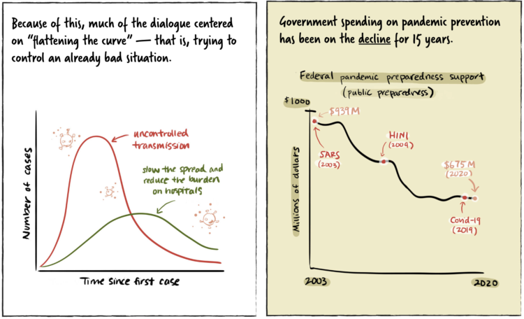
The timeline for a new infection isn’t the same for everyone. Some never show any symptoms. Some recover quickly. Some take months to recover. So, for The New York Times, Katherine J. Wu and Jonathan Corum describe the timeline of a coronavirus infection with a set of illustrative charts instead of using exact numbers.
-
Just looking back at the past eight or nine months of coronavirus posts for no particular reason. Some that stood out:
- When It Comes to Covid-19, Most of Us Have Risk Exactly Backward
- How washing your hands for 20 seconds does the trick
- This 3-D Simulation Shows Why Social Distancing Is So Important
- Math behind wearing masks
- Face mask respirator and its usefulness with different beard styles
-
You’ve seen the line charts showing case rates over time. The focus is on trends and whether things are getting better or worse. This piece by Jan Willem Tulp focuses on the current rates with tickers and a sonification of new cases.
Ding, ding, ding. There’s a new ding for each new case as you look at the page, based on a weekly average for each country tracked by Our World in Data.
-
Members Only
-
NPR estimated how many people have experienced unhealthy air this year, largely in part to the wildfires on the west coast:
An NPR analysis of U.S. Environmental Protection Agency air quality data found that nearly 50 million people in California, Oregon and Washington live in counties that experienced at least one day of “unhealthy” or worse air quality during wildfire season so far this year. That’s 1 in 7 Americans, an increase of more than 9 million people compared with 2018, the worst previous year.
Oh.