It’s hot here in the western United States, and it’s only mid-June. From The Washington Post, we’re stuck in a heat dome:
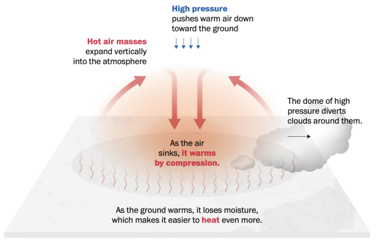
Hot air masses expand vertically into the atmosphere, creating a dome of high pressure that diverts weather systems around them. One way to gauge the magnitude of a heat wave is to measure the height of the typical halfway point of the atmosphere — at the 500 millibar pressure level. For this pressure level to stretch to heights of 600 dekameters, or 19,685 feet, is quite rare, but that marker was forecast for this week, and it was indeed reached in Flagstaff, Ariz., on Tuesday.
Splendid.


 Visualize This: The FlowingData Guide to Design, Visualization, and Statistics (2nd Edition)


