My two cents on a discussion about what visualization books beginners should and should not read.
My two cents on a discussion about what visualization books beginners should and should not read.
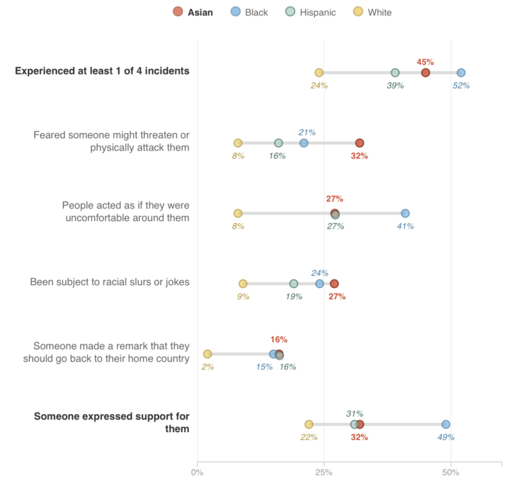
Asian Americans are often viewed as a “model minority”, but when you look, just a little bit closer, the tag doesn’t fit. Connie Hanzhang Jin for NPR breaks it down in a set of six charts.
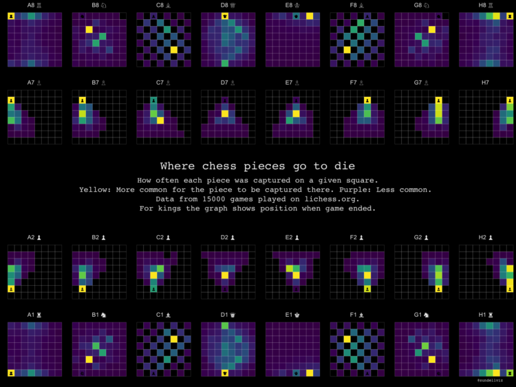
Reddit user desfirsit made heatmaps to show where on the chess board pieces are usually captured. The top two rows are for black pieces, and the bottom row is for white pieces.
I’m no chess player, but this seems to look right? The frequency of captures appears to agree with movement patterns. Although I’m surprised that the queen, despite having the most freedom of movement, is often captured in the same place. But like I said, I’m no chess player.
You can grab the data from Lichess, which provides data for millions of chess games.
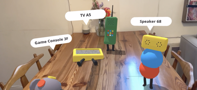
Your computer connects to your router, which connects to your modem. Your printer connects to your computer. The devices all send data and talk to each other. Nicole He and Eran Hilleli imagined these conversations in augmented reality:
The application would first detect all of the different devices connected to your network; this would include the more obvious ones like computers or phones, as well as other things, like TVs, speakers, game consoles, vacuums or washing machines. It would then locate their manufacturing data and use it to recast your devices as charming characters, spawning on nearby surfaces in augmented reality. Each character’s design would hint at the device it represents while remaining playful and open to interpretation (e.g. a character that resembles a TV portraying your TV).
The playful, cartoon-like devices contrast with the more creepy angle of a connected home.
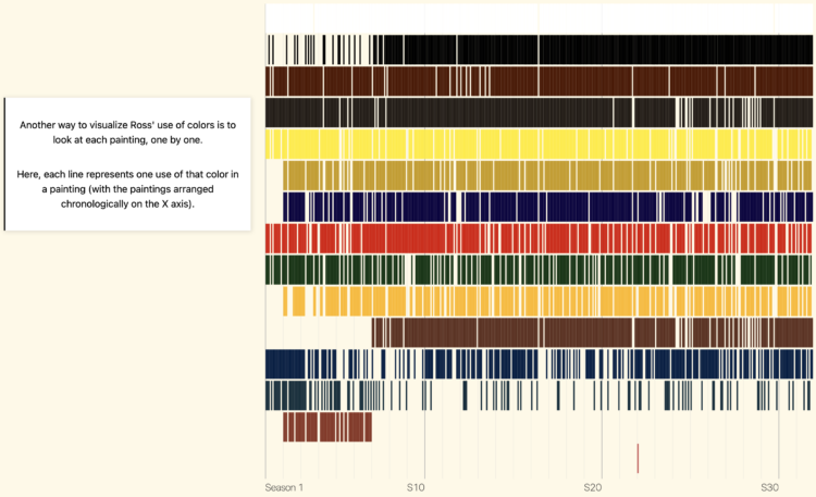
Connor Rothschild charted all the colors Bob Ross used in The Joy of Painting:
Most commonly, paintings have 12 colors. Of the 403 pieces in The Joy of Painting, 100 used 12 colors.
The peak is concentrated around 12, meaning most of Ross’ paintings used somewhere in the range of 7-13 colors; very rarely did they venture outside of that range.
Grab the data here, which was collected by Jared Wilber.

In 1921, hundreds were killed. The New York Times recreated the neighborhood, adding weight to what happened and showing the loss a hundred years ago:
For decades, what happened in Greenwood was willfully buried in history. Piecing together archival maps and photographs, with guidance from historians, The New York Times constructed a 3D model of the Greenwood neighborhood as it was before the destruction. The Times also analyzed census data, city directories, newspaper articles, and survivor tapes and testimonies from that time to show the types of people who made up the neighborhood and contributed to its vibrancy.
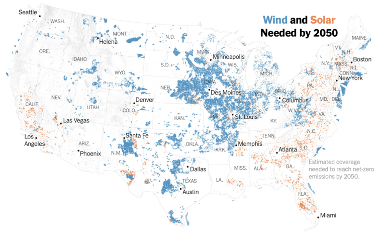
Based on estimates from Princeton University’s Net-Zero America Project, Veronica Penney for The New York Times mapped where wind and solar energy need to expand to to reach the United States’ 2050 goals. Compared to what we need, there is a long way to go from where we are now.
See also Bloomberg’s angle, which used the same data but focused more on land area than on location.
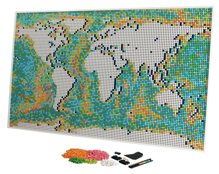
We’ve seen maps made out of LEGO bricks before, but LEGO is about to release an official world map set. And cartographers everywhere rejoiced.
Here’s the good stuff for May.
We know what you did during lockdown is a short fiction film by Financial Times that demonstrates the challenges of using data for good at the sacrifice of privacy and the complexity of individual lives. Worth the watch.
[arve url=”https://www.youtube.com/watch?v=4WTpO9y2Dh4″ loop=”no” muted=”no” /]
I immediately wanted to unplug every single internet-connected device in the house. But of course I did not.
See also the short film Sight from 2012, which imagines a world where everyone’s reality is augmented with data through digitized contact lenses.

Find out which jobs most often pair together among married couples.
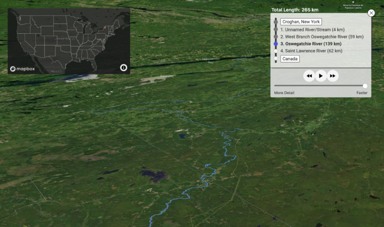
River Runner is a fun interactive map by Sam Learner. Click anywhere in the contiguous United States to drop some rain and, based on data from the U.S. Geological Survey, the map shows you where the rain ends up and the path it takes to get there.
This uses USGS NHDPlus data and their NLDI API to visualize the path of a rain droplet from any point in the contiguous United States to its end point (usually the ocean, sometimes the Great Lakes, Canada/Mexico, or another inland water feature). It’ll find the closest river/stream flowline coordinate to a click/search and then animate along that flowline’s downstream path.
When you think about it, it’s kind of nutty that something like this is even possible. [via Waxy]
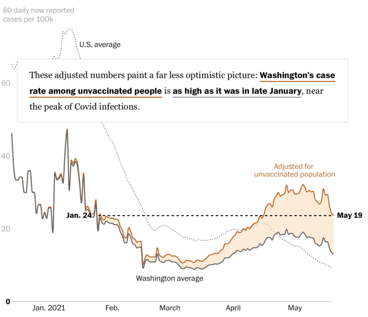
Overall, Covid-19 cases and hospitalizations are down in the United States, but much of that is from vaccinations. When you look at only those who are not vaccinated, the rates are still high in many areas of the country. Dan Keating and Leslie Shapiro for The Washington Post show the differences.
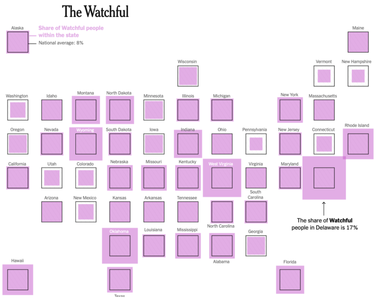
The United States vaccination rate was rolling for a while there, but it has slowed down. Sema Sgaier for NYT Opinion talks about why that is, breaking it down to four general types of people who are hesitant or don’t plan on getting vaccinated:
After conducting a national survey of U.S. adults, we grouped people into distinct profiles based on their shared beliefs and barriers to getting the vaccine. This approach, borrowed from the marketing world, is called psychobehavioral segmentation. It will allow health officials to target their strategies in ways that ignore demographic categories, like age and race. In the United States, we used this approach to identify five distinct personas: the Enthusiasts, the Watchful, the Cost-Anxious, the System Distrusters and the Covid Skeptics.
The last two groups will be harder to convince, but for the watchful and cost-anxious, I hope they look at the numbers.
The risk of side effects is very low (especially when you compare to the everyday things we do to live), your risk of infection or hospitalization goes way down when you get vaccinated, and you don’t have to pay anything.
Visualization and perception researcher Lace Padilla was on the kid-centric show Mission Unstoppale to talk about visualizing uncertainty:
[arve url=”https://youtu.be/iJrX-_pIQSc” loop=”no” muted=”no” /]
I approve of this message.
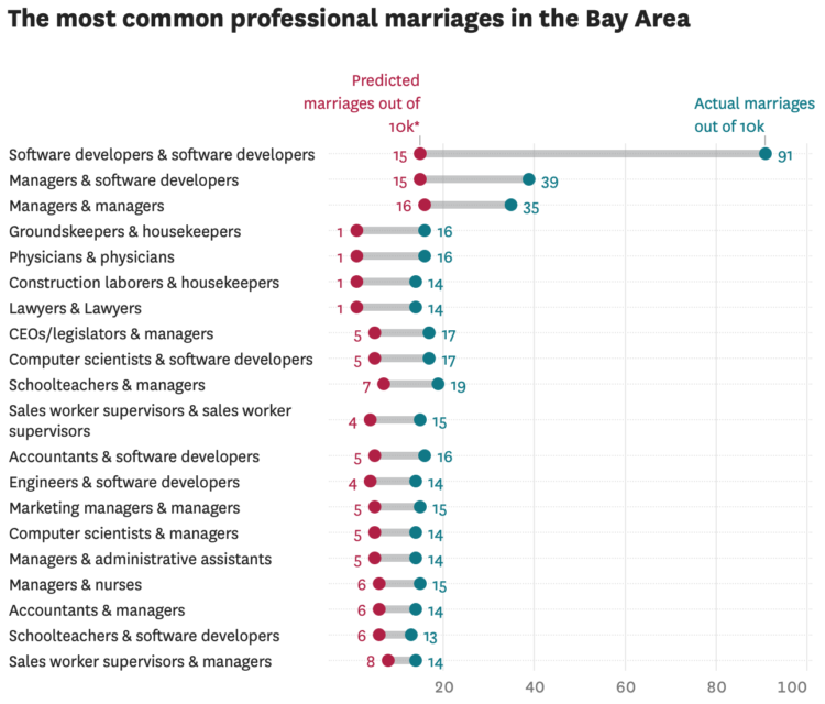
Susie Neilson for the San Francisco Chronicle compared the marriage of professions in San Francisco against the national average. As you might expect, there were a lot of programmers:
Perhaps unsurprisingly, the most common union between two professionals here is between a computer programmer and … another computer programmer. Our estimates show that an estimated 1% of all marriages in the region are between two software developers — specifically developers of applications and systems software. For the U.S. overall, software developer unions make up less than one-tenth of a percent of all marriages.
Back in 2017, I made similar comparisons nationally. I like this local angle. Also, maybe I should look at the most recent numbers.
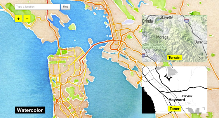
In 2012, Stamen Design released watercolor map tiles based on OpenStreetMap data. It was amazing to see, especially for a time when most online maps looked about the same. Now these watercolor map tiles are part of Cooper Hewitt, the Smithsonian design museum:
“Interactive digital works by their very nature subvert traditional museum collecting practices,” said Andrea Lipps, associate curator of contemporary design at Cooper Hewitt. “Watercolor Maptiles is itself a dynamic, living web-based map that is placeless; it exists on a browser and its assets are distributed across servers. By creating a duplicate version of the Watercolor Maptiles site and hosting it on Smithsonian Institution servers and domain, Cooper Hewitt has established a new acquisition model for the museum sector.”
Amazing.
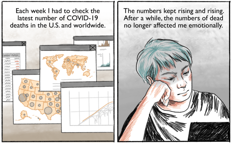
Connie Jin, who works for NPR and updates a Covid-19 dashboard, talks about in comic-form feeling numb to the large numbers and how to deal. It comes back to the individual.
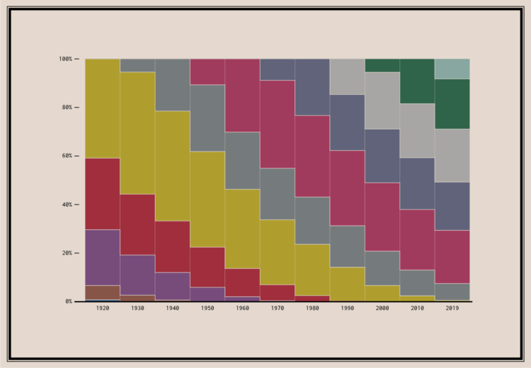
Since no one has figured out how to defeat time, age generations come and go. This chart shows the generational breakdowns since 1920.


 Visualize This: The FlowingData Guide to Design, Visualization, and Statistics
Available now.