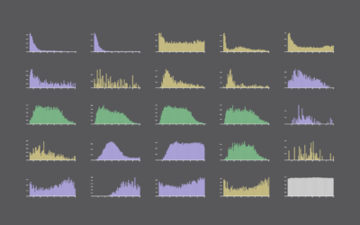
Where chess pieces are most often captured

Jun 2, 2021

Reddit user desfirsit made heatmaps to show where on the chess board pieces are usually captured. The top two rows are for black pieces, and the bottom row is for white pieces.

I’m no chess player, but this seems to look right? The frequency of captures appears to agree with movement patterns. Although I’m surprised that the queen, despite having the most freedom of movement, is often captured in the same place. But like I said, I’m no chess player.

You can grab the data from Lichess, which provides data for millions of chess games.

Become a member. Support an independent site. Make great charts.

See What You Get

Learn to Visualize Data See All →

How to Make a Spiral Chart in R

Using a spiral might not be the best way to encode data. But here’s how to do it anyway. Just in case.

Introducing a Course for Mapping in R

Mapping geographic data in R can be tricky, because there …

How to Make a Line Chart with a Color Gradient in R

Use color to reinforce or add another layer of meaning to a regular line chart.

How to Make a Smoother Animated Growth Map in R

Show change over time and geography with smooth transitions.

Favorites

Think Like a Statistician – Without the Math

I call myself a statistician, because, well, I’m a statistics graduate student. However, the most important things I’ve learned are less formal, but have proven extremely useful when working/playing with data.

The Best Data Visualization Projects of 2014

It’s always tough to pick my favorite visualization projects. Nevertheless, I gave it a go.

Jobs Charted by State and Salary

Jobs and pay can vary a lot depending on where you live, based on 2013 data from the Bureau of Labor Statistics. Here’s an interactive to look.

Years You Have Left to Live, Probably

The individual data points of life are much less predictable than the average. Here’s a simulation that shows you how much time is left on the clock.