Coming and Going Age Generations
Since no one has figured out how to defeat time, age generations come and go. This chart shows the generational breakdowns since 1920.
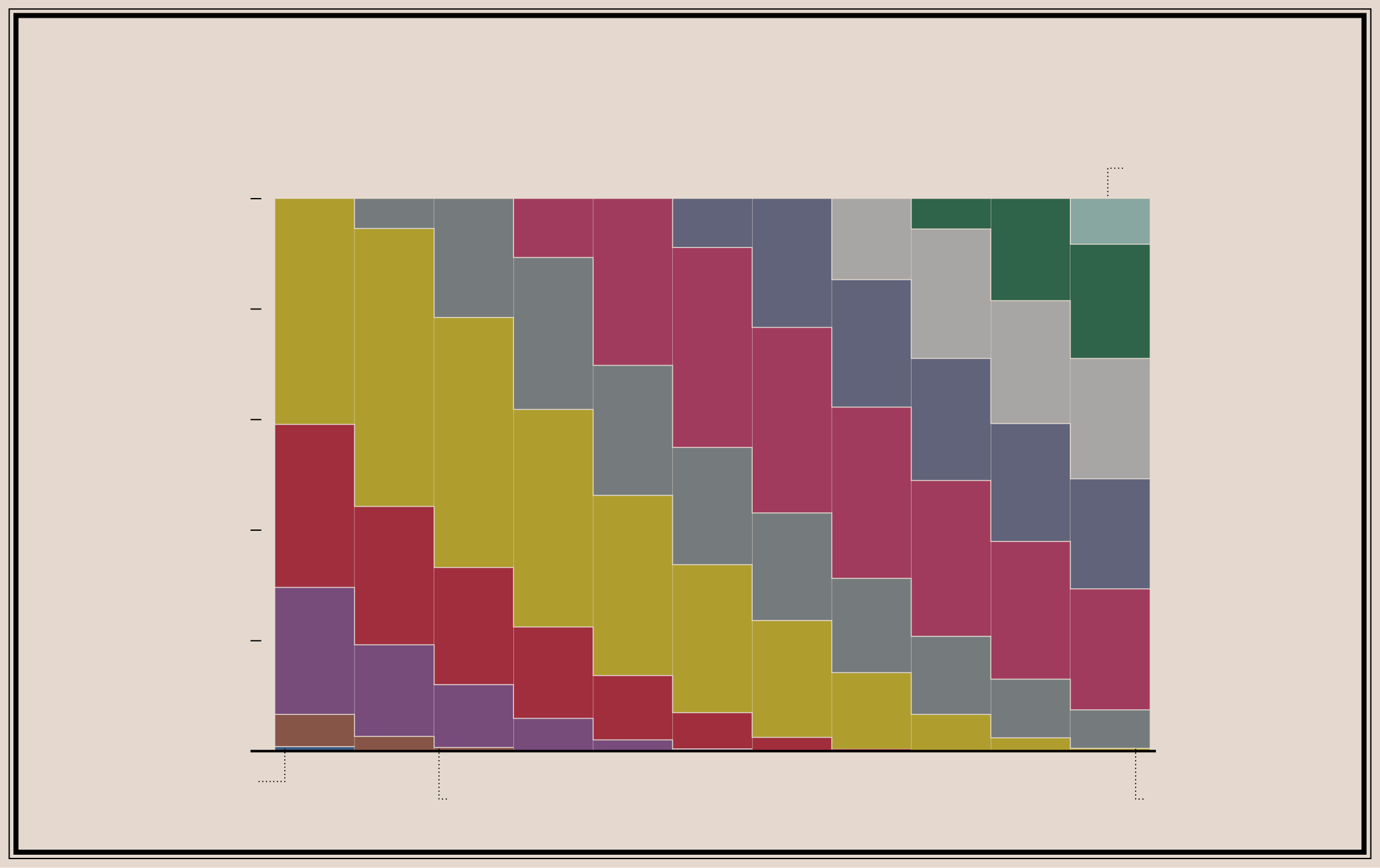
RELATIVE POPULATION DISTRIBUTION OF
AGE GENERATIONS
FROM 1920 THROUGH 2019
Based on estimates from the Decennial Census and the American Community Survey
A new generation begins.
100%
Generation Alpha
Greatest Generation
Generation Z
80%
Millennials
60%
Lost Generation
Generation X
40%
20%
Boomers
Missionary Generation
Progressive Generation
Silent Generation
0%
1920
1930
1940
1950
1960
1970
1980
1990
2000
2010
2019
Gilded and Transcendental Generations
All generations come to an end eventually.
Even the greatest.
RELATIVE POPULATION DISTRIBUTION OF
AGE GENERATIONS
FROM 1920 THROUGH 2019
Based on estimates from the Decennial Census and the American Community Survey
Gilded and Transcendental
Progressive
Greatest
Lost
Missionary
0%
20%
40%
60%
80%
100%
1920
1930
1940
1950
1960
1970
1980
1990
2000
2010
2019
0%
20%
40%
60%
80%
100%
Alpha
Z
Millennials
X
Boomers
Silent
The Census Bureau released counts for 2020, but only at the national and state levels. So the most recent count available by age uses estimates from the 2019 American Community Survey. As time does, the older generations will shift down a bit, and Generation Alpha will grow.
See here for a more detailed view of the distribution for 2019.
Chart Type Used

Become a member. Support an independent site. Get extra visualization goodness.
See What You Get