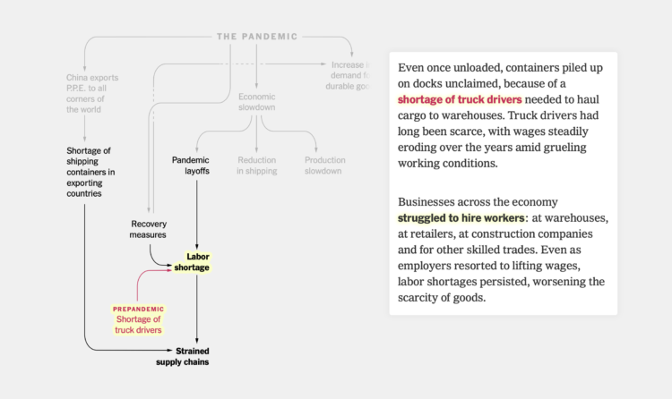
Lazaro Gamio and Peter S. Goodman for The New York Times used a flowchart to explain how the world’s supply chains got to where they are now. The scroll takes you through the set of intertwining variables.
Lazaro Gamio and Peter S. Goodman for The New York Times used a flowchart to explain how the world’s supply chains got to where they are now. The scroll takes you through the set of intertwining variables.
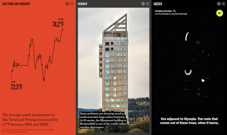
The effects of climate change can be seen around the world, in the present. The New York Times uses a mix of maps, charts, videos, illustrations, and photographs to imagine postcards sent from every country in the world to show what’s happening.
Leland Wilkinson passed away on Friday, according to his daughter Amie. In visualization circles, he was best known for The Grammar of Graphics, which defined a system to describe and implement all statistical charts. Here’s Jessica Hullman on Wilkinson’s contribution:
My own admiration for Grammar of Graphics is partly why I chose to get into visualization back as a grad student. I remember thinking his concept of a frame was really important but underappreciated in any discussions I’d heard about visualization. I read it for the first time as a Ph.D. student and have been calling it my favorite book for years. Whenever I go back to reread chapters I always come away with some new appreciation. I even bring in a copy to pass around in my interactive visualization course, trying to get students to sense its influence and hopefully read it. Just looking at the examples is like an education in visualization.
Hadley Wickham, whose ggplot2 package in R is based on Wilkinson’s grammar, posted:
Lee Wilkinson is the reason that ggplot2 exists; not just because he wrote the Grammar of Graphics, but also because he was so kind and supportive to me when I was a young grad student thinking of trying to implement it. He will be missed.
The Grammar of Graphics was one of the first books I ever read on visualization, and the topics have stuck with me ever since. Wilkinson’s work no doubt influenced many others and helped push visualization to where it is today.
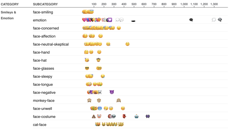
I am told people use these things called emoji in their messages to communicate emotional cues in the text. There is a face for laughter. There is a smiling one. There is even one that is a pile of poo with a face on it. Imagine that. Poo. Jennifer Daniel shows the rankings for emoji usage in 2021 (along with another chart that shows the shift in usage since 2019).
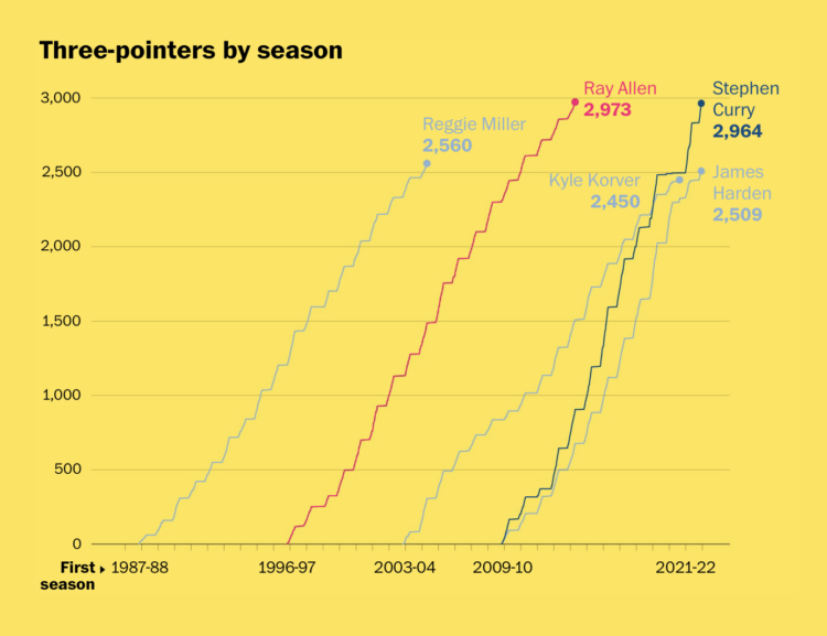
Stephen Curry is about to break the record for number of three-pointers made in a career. By law, as dictated by sports visualization record keeping, a multiple line chart must be made to show the player of interest compared against others. The Washington Post got it done, along with shot charts and other career timelines.
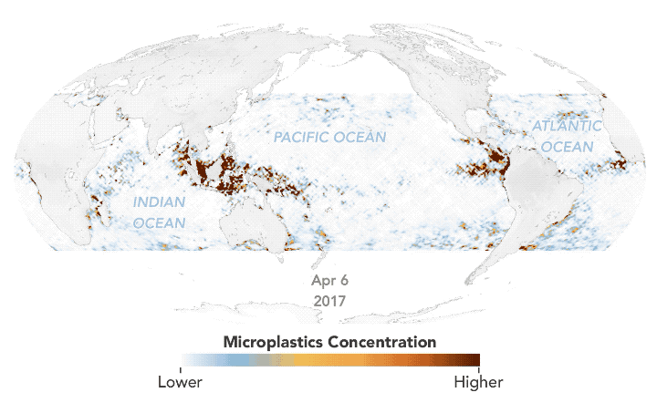
Using estimates based on satellite data, Joshua Stevens for NASA Earth Observatory mapped the concentration of microplastics in the ocean over time:
Researchers at the University of Michigan (UM) recently developed a new method to map the concentration of ocean microplastics around the world. The researchers used data from eight microsatellites that are part of the Cyclone Global Navigation Satellite System (CYGNSS) mission. Radio signals from GPS satellites reflect off the ocean surface, and CYGNSS satellites detect those reflections. Scientists then analyze the signals to measure the roughness of the ocean surface. These measurements provide scientists with a means to derive ocean wind speeds, which is useful for studying phenomena like hurricanes. It turns out that the signals also reveal the presence of plastic.
The more money people come across, the more things they can and tend to buy. More money on average means bigger houses, more expensive cars, and fancier restaurants. But what if you look at relative spending instead of total dollars?
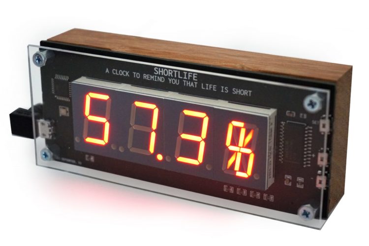
Shortlife is a clock by artist Dries Depoorter that simply shows the percentage of your life lived, based on life expectancy from the World Health Organization. It has a warranty of six months.
I kind of want this? Please note: Results may vary.
Ben Smith for The New York Times got an internal document that outlines TikTok’s recommendation system. This quote caught my eye:
Julian McAuley, a professor of computer science at the University of California San Diego, who also reviewed the document, said in an email that the paper was short on detail about how exactly TikTok does its predictions, but that the description of its recommendation engine is “totally reasonable, but traditional stuff.” The company’s edge, he said, comes from combining machine learning with “fantastic volumes of data, highly engaged users, and a setting where users are amenable to consuming algorithmically recommended content (think how few other settings have all of these characteristics!). Not some algorithmic magic.”
Life360 is a service that lets families keep track of where members are based on phone location data. For The Markup, Jon Keegan and Alfred Ng report on how Life360 then sells that data to third parties for millions of dollars:
Through interviews with two former employees of the company, along with two individuals who formerly worked at location data brokers Cuebiq and X-Mode, The Markup discovered that the app acts as a firehose of data for a controversial industry that has operated in the shadows with few safeguards to prevent the misuse of this sensitive information. The former employees spoke with The Markup on the condition that we not use their names, as they are all still employed in the data industry. They said they agreed to talk because of concerns with the location data industry’s security and privacy and a desire to shed more light on the opaque location data economy. All of them described Life360 as one of the largest sources of data for the industry.
You kind of expect this from a free app, but Life360 is a paid service that collects children’s location data. Seems questionable.
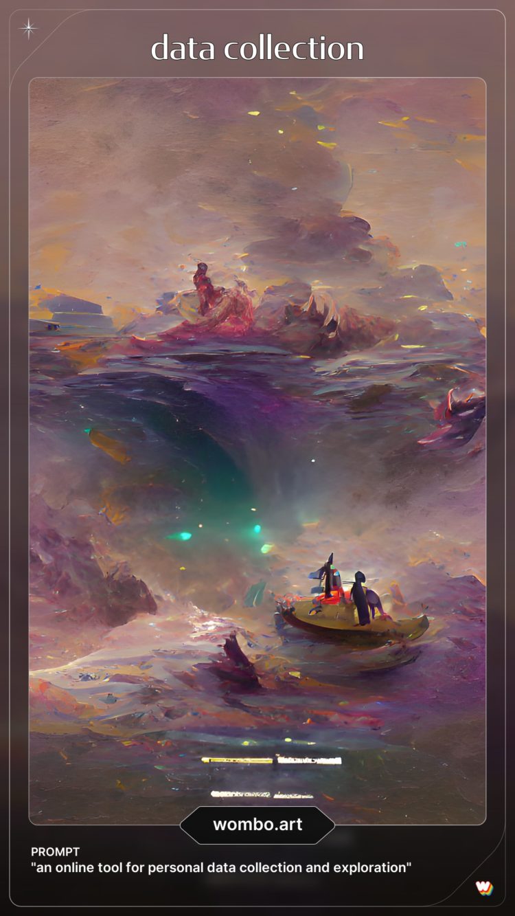 Wombo Dream is a fun app that lets you enter some words to output a related AI-powered artwork in various styles. You can get the app, or you can play with it in your browser. I entered my dissertation title.
It’s been a while since we got our regular reminder that the Mercator projection is better for navigation on the tradeoff for distorted area at the poles. Neil Kaye provides an animation:
Animating the mercator projection so countries and territories are correct size and shape in relation to each other.#dataviz #30Daymapchallenge #worldisnotflat #day28 pic.twitter.com/968GSBepA1
— Neil Kaye (@neilrkaye) November 28, 2021
See also the Mercator projection with the poles shifted to where you live and this physical demo of how all maps have their distortions.
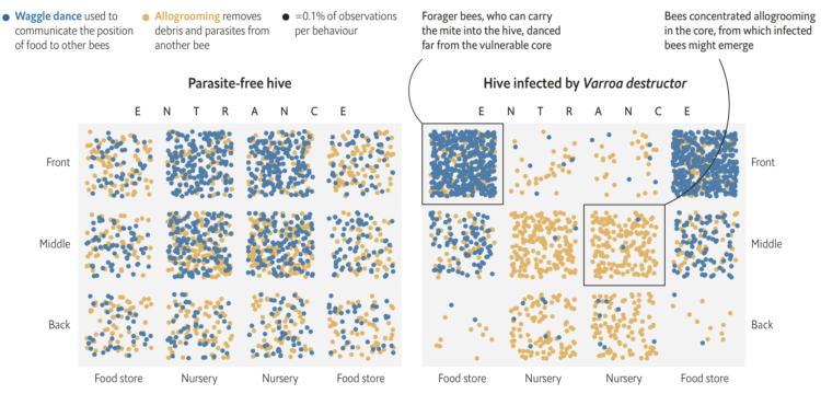
Research by M. Pusceddu et al. shows that honeybees use social distancing when a parasite is introduced to the hive. In a parasite-free hive, activities are spread throughout the hive, whereas clusters form when parasites are detected. The Economist illustrated the difference with a grids of dot densities.
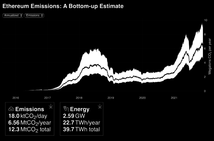
It seems clear that Ethereum (and other cryptocurrencies) in its current state is bad for the environment, but it’s hard to say how bad it really is. Kyle McDonald estimated emissions and energy usage to try to understand better: “Ethereum is comparable to keeping 2-3 coal power plant running.”
See McDonald’s real-time estimates here.
I’m opening the print shop for a few days. Get your order in, and I’ll try my best to get it to you before Christmas.
Here’s the good stuff for November.
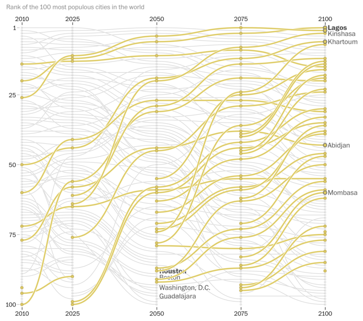
In a multi-faceted piece, The Washington Post described the rapidly growing cities in Africa that are projected to be the most populated cities in the world:
In three projections by the University of Toronto’s Global Cities Institute, Africa accounted for at least 10 of the world’s 20 most populous cities in 2100. Even in the institute’s middle-of-the-road development scenario, cities that many Americans may seldom read about, such as Niamey, Niger, and Lusaka, Zambia, eclipse New York City in growth.
Many U.S. cities such as Atlanta, Houston, and Washington, D.C. are projected to fall out of the top 100 by 2100.
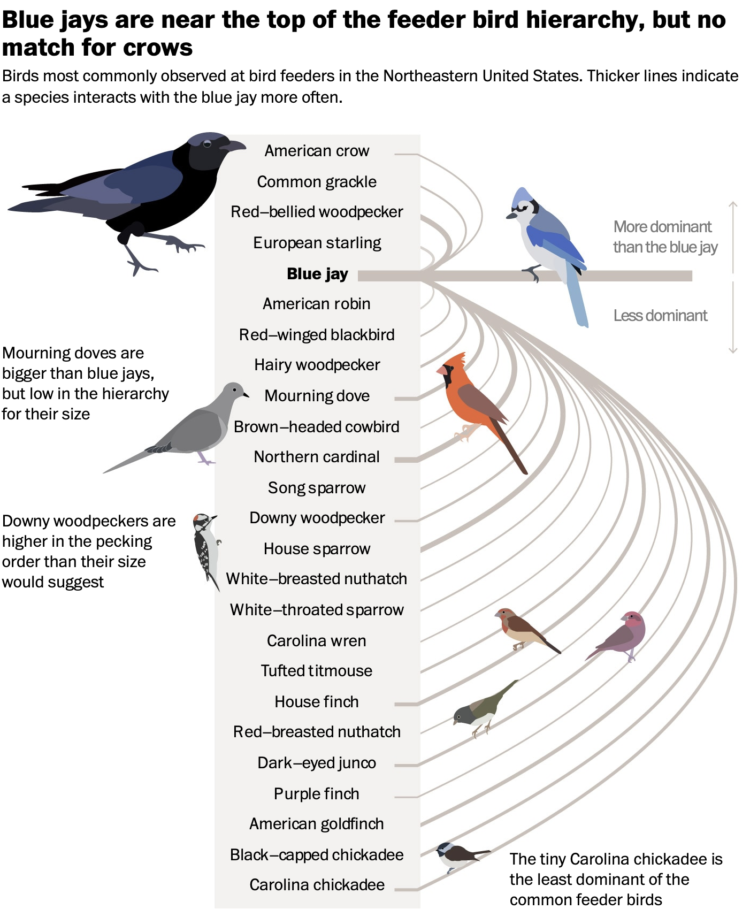
Using data from Project FeederWatch, which is a community tracking project to count birds around feeders, Miller et al. estimated the pecking order among 200 species. This was in 2017. For The Washington Post, Andrew Van Dam and Alyssa Fowers worked with the researchers for an updated ranking using a more comprehensive dataset. The result is bird power rankings 2021 edition.
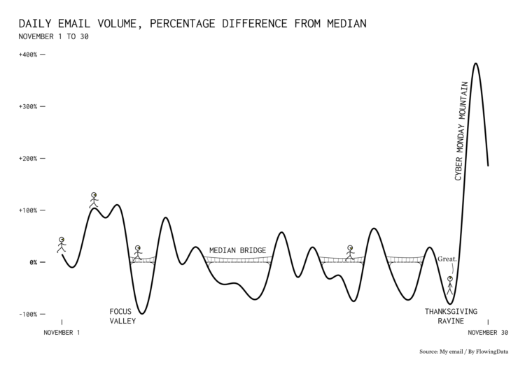
I scraped my inbox when I got a bunch of emails on Cyber Monday. It seemed like a lot, but I wondered by how much. It was about five times more than usual, which is a bigger shock to the system when volume a few days before on Thanksgiving was nearly zero.


 Visualize This: The FlowingData Guide to Design, Visualization, and Statistics
Available now.