Here’s the good stuff for May.
Here’s the good stuff for May.
The Centers for Disease Control and Prevention track cause of death over time, under several classifications and groupings. Among 1- to 19-year-olds, regulations decreased motor vehicle deaths, but deaths by firearms increased and became the leading mechanism in 2018.
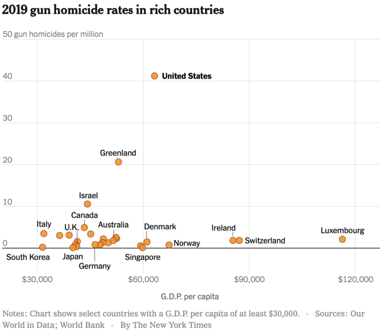
This chart from The New York Times, based on estimates from Our World In Data and World Bank, shows GDP per capita against gun homicide rates. The United States stands alone. Why.
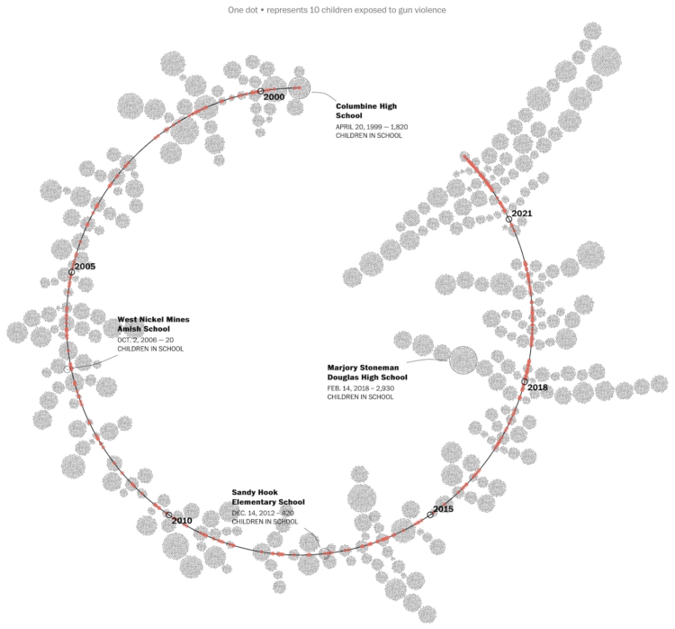
The Washington Post maintains a database of school shootings (which is sad in itself that such a thing has to exist) to keep record of tragedy that the U.S. government does not track. They calculated the number of kids since Columbine who were exposed to such terrible events:
The Washington Post spent a year determining how many children have been affected by school shootings, beyond just those killed or injured. To do that, reporters attempted to identify every act of gunfire at a primary or secondary school during school hours since the Columbine High massacre on April 20, 1999. Using Nexis, news articles, open-source databases, law enforcement reports, information from school websites and calls to schools and police departments, The Post reviewed more than 1,000 alleged incidents but counted only those that happened on campuses immediately before, during or just after classes.
The events are terrible when they happen, and they go on to affect thousands of others for a lifetime — kids who were just going on with their daily activities.

Alicia P.Q. Wittmeyer, for NYT Opinion, approached the one-million mark for Covid deaths with text messages. The piece starts on February 29, 2020, when the first person died because of Covid. The count to 1 million begins, and a recurring ticker reminds you of the increase over time. Thirteen text message threads between someone who died and a person who cared remind you that the numbers are real.
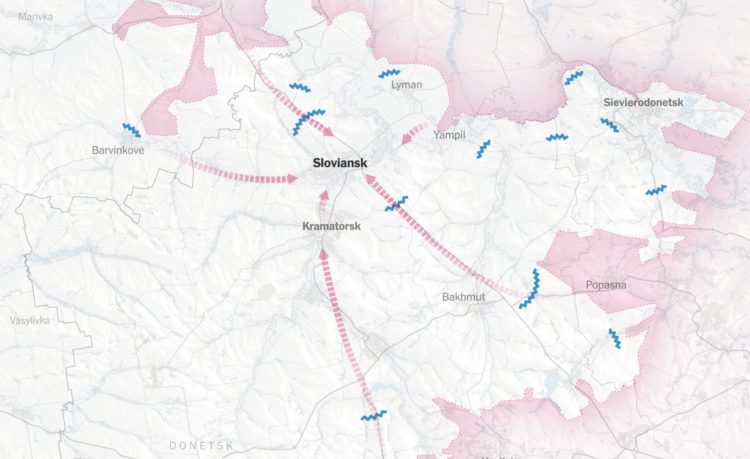
The war in Ukraine continues, but the scale and objects appear to have changed over time. Josh Holder, Marco Hernandez, and Jon Huang for The New York Times mapped the shrinking scope as Russia loses more soldiers and resources.

Cindermedusae by Marcin Ignac is “a generative encyclopedia of imaginary sea creatures.” I’m into the aesthetic.
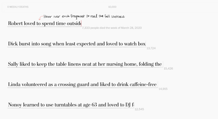
Alyssa Fowers and Leslie Shapiro, for The Washington Post, used the stories of 114 individuals to show weekly Covid deaths. Each story is “cut short”, making the length of each fragment match counts for the corresponding week.
My brain was slightly confused by the metaphor at first. The lower the count, the more an individual’s story is cut short, but my intuition expected that more deaths would mean stories were cut short more.
That said, the sentiment is in the right place. Maybe the stories didn’t need to be tied to weekly counts? I’m imagining something closer to Periscopic’s piece from 2013 on lives cut short by guns.
Neil Halloran, known for his documentary films that lean strongly on data visualization, collaborated with RAND to explain the possibility (or lack) of a nuclear winter. In the last third of the film, Halloran also discusses the pursuit of absolute truth and whether it’s truly worth it in the end. Lots to think about.
If you’re into R and analyzing sports data, you’ll want to save this CRAN task view:
This CRAN Task View contains a list of packages useful for sports analytics. Most of the packages are sport-specific and are grouped as such. However, we also include a General section for packages that provide ancillary functionality relevant to sports analytics (e.g., team-themed color palettes), and a Modeling section for packages useful for statistical modeling. Throughout the task view, and collected in the Related links section at the end, we have included a list of selected books and articles that use some of these packages in substantive ways. Our goal in compiling this list is to help researchers find the tools they need to complete their work in R.
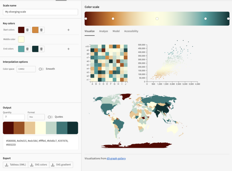
Leonardo is an open source project from Adobe that helps you pick accessible colors. There’s a JavaScript API along with a browser tool that lets you select colors interactively.
Color is a common encoding to visualize data. It can be used directly in choropleth maps or heatmaps, indirectly as a redundant encoding, it can be decorative, and it can be used for all the things in between. However, a color scheme doesn’t work if a big chunk of your audience is not able to see the differences. So it’s good to see these sorts of tools available.
Leonardo is an extension of Chroma.js. Gregor’s Chroma.js palette helper is still my go-to to keep color schemes in check.
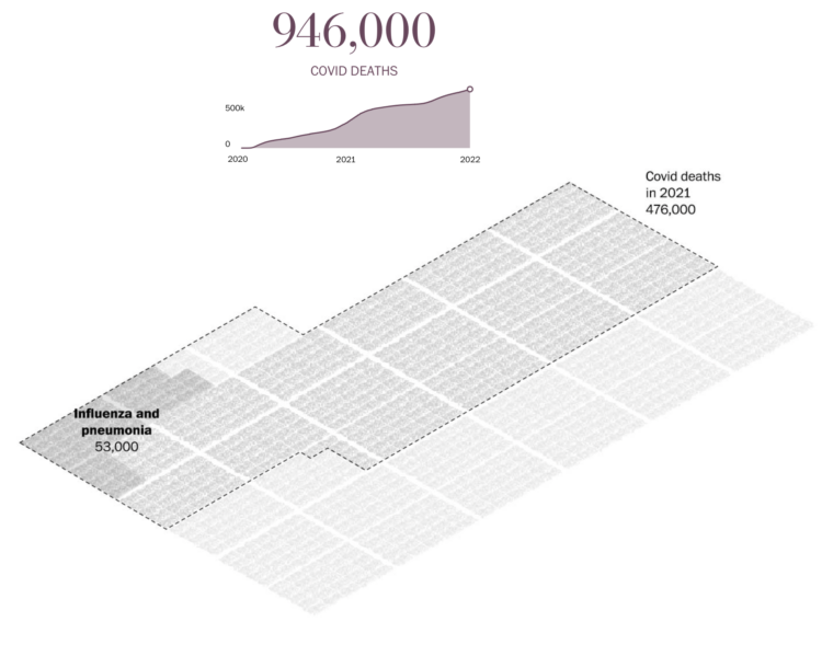
Sergio Peçanha and Yan Wu, for The Washington Post, used a combination unit chart with individual icons to represent the scale and weight of the near million Covid deaths in the United States.
Compare this with NYT’s particle-based charts and Axios’ scaled squares. It’s kind of in between the two in level of abstraction, but all three carry similar messages, with a focus on the one-million mark.

The Open-Source Psychometrics Project, which seems to have been around for a while, provides personality quizzes as an exercise in data collection and personality education:
This website has been offering a wide selection of psychological assessments, mostly personality tests, since late 2011 and has given millions of results since then. It exists to educate the public about various personality tests, their uses and meaning, the various theories of personality and also to collect data for research and develop new measures. This website is under continuous development and new tests and information are being added all the time.
One of the more recent quizzes matches your personality with fictional characters, and the results seem oddly close? I took the short version, and out of 2,000 characters, I was a 92% match to Data from Star Trek. I’m not totally sure how I feel about that.
You can also download anonymized data collected through the project.
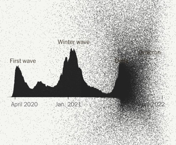
The New York Times narrated the path to one million Covid deaths in the United States. They start with one million dots, each one representing a death. As you read, the dots arrange into trends and significant events over these past years.
As we have talked about before, it’s impossible to communicate the true weight of a single death, much less a million, but the individual dots provide a visual foundation to better understand abstract trends.
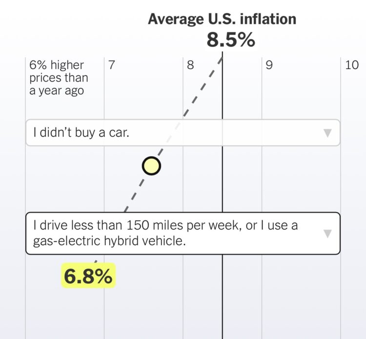
We’ve been hearing a lot about inflation rates lately on a national scale. However, how inflation impacts you depends on what you spend your money on. Ben Casselman and Ella Koeze for The New York Times provide an estimate for you.
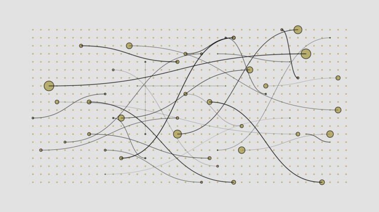
Oftentimes what we’re doing isn’t so important as who we’re spending our time with. Based on data from the American Time Use Survey, this is a simulated day for 100 people.

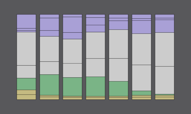
For Swee Kombucha, Bedow used a stacked chart as a food label to show the ingredient breakdowns for various beverages. The greater the area is, the more ingredient by volume there is in the drink.
This project takes me back. See also nutritional facts redesigned, alcoholic beverage pie charts, the engineer’s guide to drinks, and coffee drink breakdowns. The two-year span from 2010 to 2011 was quite the renaissance period for beverage percentages.
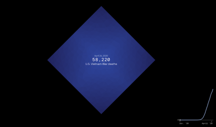
The United States is about to reach one million confirmed Covid deaths, or already passed the mark if you consider excess deaths. There’s no way to truly feel that number, but Axios visualized the scale, with comparisons against city populations and historical events.
A diamond shape represents counts, and as you scroll, shapes fill the screen until you only see the tips. The shapes overflow beyond what we can or want to understand. The time series line on the bottom shows cumulative deaths over time, leading towards the one-million mark.
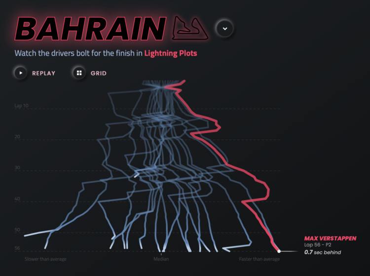
Joey Cherdarchuk used a lightning metaphor to visualize the outcomes of races from the 2021 season. The x-axis represents how far ahead or behind the each racer is compared to the average. The y-axis represents laps. Racing and thunder sounds play in the background for dramatic effect. I’m into it.
 Visualize This: The FlowingData Guide to Design, Visualization, and Statistics (2nd Edition)
New tools, refined process.