• Membership
  • Newsletter
  • Projects
  • Learning
  • About
  • Member Login
  • Chartball is sports data visualized in a playful way

    October 18, 2022

    Topic

    Infographics  /  Andrew Garcia Phillips, sports

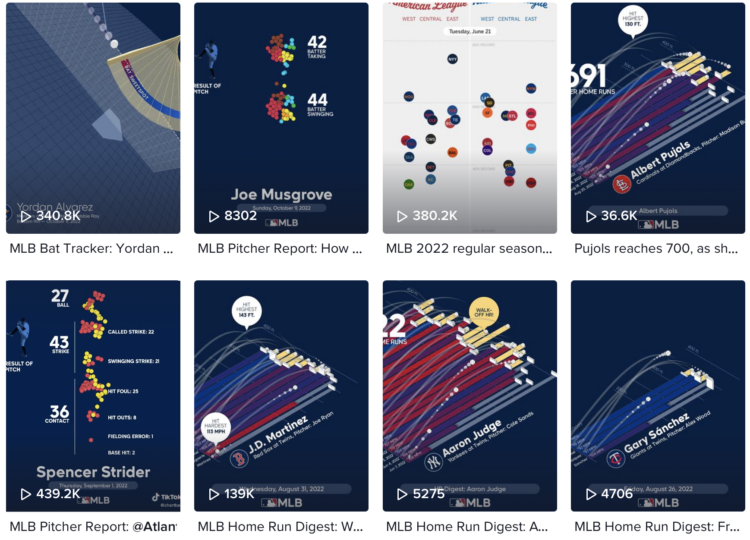
    With Chartball, Andrew Garcia Phillips has visualized sports data for a while, publishing to various mediums — Twitter, Tumblr, posters, and YouTube — to show animated and engaging insights on how individual teams and players perform. It’s clearly a passion project, because no one would make this many charts if they didn’t enjoy it.

    TikTok might be the best fitting platform for his short animations focused on a single insight. Here’s an example:

    @chartball MLB Pitcher Report: @Atlanta Braves Spencer Strider vs. @Colorado Rockies Sept. 1, 2022 @mlb #baseball #dataviz ♬ It Was A Good Day – Ice Cube

    This makes me wonder (1) how other animations and datasets would work in this short video format and (2) if you add music to any animated chart does it instantly make it more fun, because I think it does. [Thanks, Sarah]

  • Algorithmic rent increase

    October 17, 2022

    Topic

    Statistics  /  algorithm, housing, ProPublica, rent

    It’s growing more common for landlords to use software to set the rental prices of their properties. This of course leads to software companies promising optimized pricing for maximum profit, which leads to higher rent for residents. Heather Vogell, Haru Coryne, and Ryan Little, for ProPublica, look closer at the practice, with a focus on pricing company RealPage:

    To arrive at a recommended rent, the software deploys an algorithm — a set of mathematical rules — to analyze a trove of data RealPage gathers from clients, including private information on what nearby competitors charge.

    For tenants, the system upends the practice of negotiating with apartment building staff. RealPage discourages bargaining with renters and has even recommended that landlords in some cases accept a lower occupancy rate in order to raise rents and make more money.

    One of the algorithm’s developers told ProPublica that leasing agents had “too much empathy” compared to computer generated pricing.

    Oh.

  • Linear regression visual explainer

    October 14, 2022

    Topic

    Statistical Visualization  /  MLU-Explain, regression

    MLU-Explain continues with their visual explainers for machine learning and statistical concepts. Most recently, Jared Wilber gets into linear regression. Towards the bottom of the explainer, there’s an interactive chart that lets you place dots on the plot and the fitted line updates as you go. Nice.

  • Members Only

    Getting Better at Making Charts

    October 13, 2022

    Topic

    The Process  /  evolution

    There’s always room for improvement — no matter how long you’ve been at it.

  • Introduction to Data Science, an open source book

    October 13, 2022

    Topic

    Statistics  /  book, data science, R, Rafael Irizarry

    Introduction to Data Science, by Harvard biostatistics professor Rafael A. Irizarry, is an open source book that provides, as you might have guessed, an introduction to data science:

    The demand for skilled data science practitioners in industry, academia, and government is rapidly growing. This book introduces concepts and skills that can help you tackle real-world data analysis challenges. It covers concepts from probability, statistical inference, linear regression, and machine learning.

  • Impossible or improbable lottery results

    October 12, 2022

    Topic

    Statistics  /  lottery, probability

    There was a government-run lottery in the Philippines with a $4 million jackpot, and two improbable things happened. First, the numbers selected were all multiples of nine: 9, 45, 36, 27, 18, and 54. Second, 433 people won. The natural reaction from the public was that something sketchy happened, especially since the government has a history of sketchiness.

    However, as statisticians and mathematicians do when rare and improbable events occur, they setup hypotheses and calculate probabilities. Terence Tao calculated the odds and noted that the lottery outcome was a highly improbable event under certain assumptions. But:

    So this clearly demands some sort of explanation. But in actuality, many purchasers of lottery tickets do not select their numbers completely randomly; they often have some “lucky” numbers (e.g., based on birthdays or other personally significant dates) that they prefer to use, or choose numbers according to a simple pattern rather than go to the trouble of trying to make them truly random.

    Nine happens to be a lucky number in some cultures. Also, as Tao notes, the multiples of nine form a diagonal line on the physical lottery ticket, which could lend to more people just going with simple geometry.

    The chances of each winning number being a multiple of nine is improbable, but any other individual number selection is equally improbable.

    So if you assume one improbable event, the winning lottery numbers, paired with a less improbable event, the players’ selection of their own numbers, it doesn’t seem that unbelievable, statistically speaking.

  • Good Country Index

    October 11, 2022

    Topic

    Statistics  /  index, world

    The Good Country Index is an effort to highlight and rank the countries that are doing good for the rest of the world. Select the metrics that are pertinent to you, and the ranks adjust accordingly.

    I just heard about this project, but it’s been around since 2014. Still relevant.

  • Future monsoon patterns

    October 10, 2022

    Topic

    Maps  /  monsoon, New York Times, rain

    The monsoon season in South Asia brings water to the people and land, but signs point to more intense rain as overall temperatures go up. To show the change in rain, Zach Levitt and Jeremy White, for The New York Times, go with a rain drop aesthetic. The density of animated dots represents future rainfall and resembles drops of rain falling on the ground. Also wind maps with lines that resemble wind.

  • Difficulties reading the cone of uncertainty

    October 7, 2022

    Topic

    Design  /  forecast, hurricane, uncertainty, Washington Post, weather

    It seems that there is always surprise when a hurricane makes landfall in some areas, which some attribute to poor forecast communication with the cone on a map that shows possible paths. Scott Dance and Amudalat Ajasa for The Washington Post discuss the challenges that people have reading the cone of uncertainty:

    Indeed, many residents and authorities have said Ian’s track surprised them, even though the cone for days included the storm’s eventual landfall point on its southern edge. So some meteorologists and social scientists are saying the disaster is only the latest evidence that the Hurricane Center should revamp the way it depicts forecasts — communicating the scope and intensity of a storm’s threats, rather than just the expected path of a single point at its center.

    Maybe, when it comes to communicating hurricane forecasts, we should get rid of possible-paths maps altogether and focus on possible outcomes. The shape and direction of a storm matters a lot less than the chances the storm hits your town. So no path, just choropleth map that shows probabilities.

  • China’s fishing patterns shift globally

    October 7, 2022

    Topic

    Maps  /  China, fishing, New York Times

    China’s fish supply is running low along its own coast, so they’ve shifted their fishing activities globally. The New York Times visualized the shift with animated maps.

  • Members Only

    Fun with Limitations

    October 6, 2022

    Topic

    The Process  /  limitations

    Create boundaries in your work for focus and depth.

  • K-Means clustering visually explained

    October 6, 2022

    Topic

    Infographics  /  clustering, k-means, Yi Zhe Ang

    Say you want to identify clusters in a scatterplot of points. K-Means is commonly used method that might get you there. Yi Zhe Ang explains how the method works with a visual and interactive essay.

  • Coffee versus tea in charts

    October 5, 2022

    Topic

    Infographics  /  coffee, illustration, tea, Washington Post

    Anahad O’Connor, Aaron Steckelberg and Garland Potts, for The Washington Post, made charts that compare the benefits of coffee and tea. But let’s be honest here. All we really want to see in a battle between coffee and tea is an anthropomorphic bean and leaf wrestle.

  • Accessible visualization with Olli JavaScript library

    October 4, 2022

    Topic

    Statistical Visualization  /  accessibility, Matt Blanco, Olli

    The Olli library aims to make it easier for developers to improve the accessibility of existing charts:

    Olli is an open-source library for converting data visualizations into accessible text structures for screen reader users. Starting with an existing visualization specification created with a supported toolkit, Olli produces a keyboard-navigable tree view with descriptions at varying levels of detail. Users can explore these structures both to get an initial overview, and to dive into the data in more detail.

  • Wide range of data exploration tools

    October 3, 2022

    Topic

    Software  /  exploration, thread

    Simon Willison asked a straightforward question about the tools people use:

    If someone gives you a CSV file with 100,000 rows in it, what tools do you use to start exploring and understanding that data?

    Then he expanded the question asking what people use for files with 1 million rows, 10 million rows, and 1 billion rows.

    Browse the thousands of replies, and you quickly see that (1) there are many options to explore a dataset and (2) many people feel that what they’re using is the best option. There’s click-and-play programs, web-based products, programming languages, and command-line options. Some use a combination of whatever works for them at a given time for a certain dataset.

    This is why when people ask me what the “best” tool is, I usually have to follow up with what they know already and what they want to do with the tool. It’s also why best-of lists for data exploration are usually not worth your time, unless you account for the assumptions about usage.

  • Unemployed data scientist

    October 3, 2022

    Topic

    News  /  data science, job, layoffs

    It seems a lot of data scientists have either left or were laid off from their jobs during the past few months. Jacqueline Nolis and Emily Robinson, data scientists who hosted a podcast and wrote a book on building a career in the field, happened to be in the lot. So naturally, they brought back the podcast for a bonus episode on their experiences with sudden unemployment and the job search.

    I’ve never had a “real” job (as some tend to tell me), so workplace experiences are always interesting to me, like peering into an aquarium. The layoff process seems not fun.

  • Tree Talk

    September 30, 2022

    Topic

    Infographics  /  comic, Kelton Sears, time, trees

    Kelton Sears used a vertical scroll upwards to think about trees and time.

  • Mapping climate-related hazards in real-time

    September 30, 2022

    Topic

    Maps  /  climate, hazards

    Bringing in data from various federal agencies:

    Climate Mapping for Resilience and Adaptation (CMRA) integrates information from across the federal government to help people consider their local exposure to climate-related hazards. People working in community organizations or for local, Tribal, state, or Federal governments can use the site to help them develop equitable climate resilience plans to protect people, property, and infrastructure.

  • Members Only

    Visualization Tools and Learning Resources, September 2022 Roundup

    September 29, 2022

    Topic

    The Process  /  roundup

    Here’s the good stuff for September.

  • Days-since tickers for all the natural disasters

    September 29, 2022

    Topic

    Infographics  /  counting, disaster, Neal Agarwal

    You know those signs in workplaces that keep track of days since injury? Making use of NASA APIs, Neal Agarwal used that concept to keep track of natural disasters. As of this writing, it’s been 9,691,764 since the last Apocalyptic Volcanic Eruption (VEI 8). Pretty good.

  • Page 53 of 392
  • <
  • 1
  • ...
  • 50
  • 51
  • 52
  • 53
  • 54
  • 55
  • ...
  • 392
  • >

Analyze, visualize, and communicate data usefully, beyond the defaults.

Become a member →

Recently for Members

May 15, 2025
Step Chart, Enhanced

May 8, 2025
When the data is not what it seems

May 1, 2025
Finding the Right Charts

April 24, 2025
Visualization Tools, Datasets, and Resources – April 2025 Roundup

April 17, 2025
Breaking Out of Chart Software Defaults

Browse by Chart Type See All →

Grid Map Treemap Horizon Graph Bar Chart Race Frequency Trails Pyramid Chart Variable Width Bar Chart Stacked Bar Chart Bar Chart Alluvial Diagram

Browse By Topic

  • Visualization

    Seeing data

  • Maps

    Seeing geographic data

  • Infographics

    Explaining data

  • Networks

    Connecting data

  • Statistics

    Analyzing data

  • Software

    Working with data

  • Sources

    Getting data

  • Design

    Making data readable

Get the Book

Visualize This: The FlowingData Guide to Design, Visualization, and Statistics

Available now.

Order: Amazon / Bookshop

Made by FlowingData

  • The Process

  • Data Underload

  • Chart Everything

  • Guides

  • Books

  • Shop

  • About
  • Contact
  • Newsletter
  • LinkedIn
  • Instagram
  • Bluesky
  • RSS
Copyright © 2007-Present FlowingData. All rights reserved.