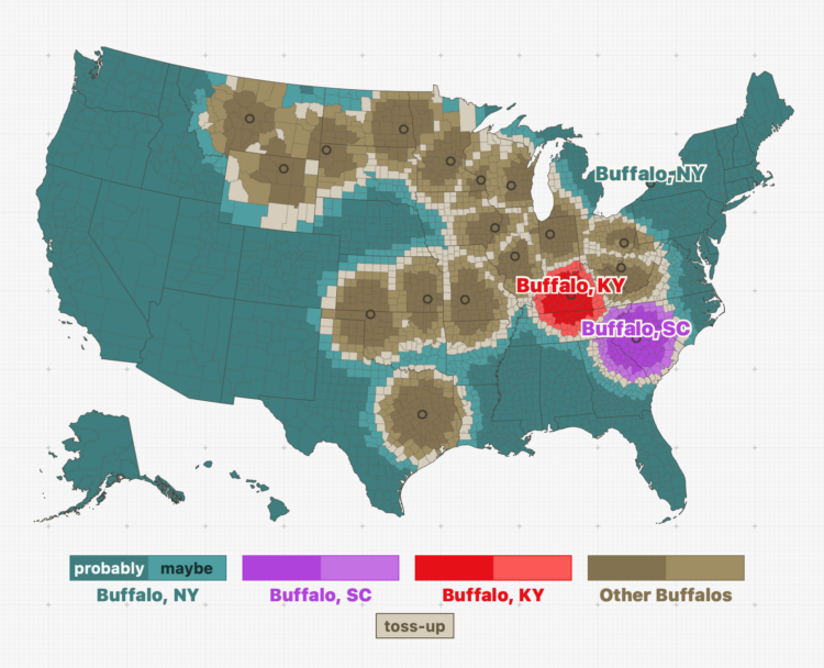
-
Members Only
-
When you pay for internet, it seems like a reasonable expectation that if you pay the same monthly rate as someone a few blocks from you, you get a similar speed. This is commonly not always the case. Leon Yin and Aaron Sankin, for The Markup, with the analysis:
The Markup gathered and analyzed more than 800,000 internet service offers from AT&T, Verizon, Earthlink, and CenturyLink in 38 cities across America and found that all four routinely offered fast base speeds at or above 200 Mbps in some neighborhoods for the same price as connections below 25 Mbps in others.
The neighborhoods offered the worst deals had lower median incomes in nine out of 10 cities in the analysis. In two-thirds of the cities where The Markup had enough data to compare, the providers gave the worst offers to the least-White neighborhoods.
When you compare by Mbps per dollar, you get prices hundreds of times more expensive for crawling internet.
-
We tend to talk about elections as this uniform thing. People vote for some other people. But who we vote for, who we vote with, and when we vote for who varies depending on where you look. USAFacts mapped all the different communities for the upcoming midterm elections, so you can see the elections where you are. Select other places and compare.
I played a small part on the data side of this project. Pulling data from a mixed bag of sources and linking them over consistent time and geography was a fun challenge.
-
With Covid came sudden shifts in daily life and work, which gave rise to certain companies that were able to fill specific needs. Some individuals’ net worth increased many times over. But as things move back closer to where they were pre-Covid, sudden wealth is also moving back. Bloomberg zeros in on the billionaires whose net worth increased and then decreased because of the life changes.
The chart above uses scaled bubbles to show the shifts from peak to present. The horizontal axis represents percentage change since the end of 2019.
-
With Chartball, Andrew Garcia Phillips has visualized sports data for a while, publishing to various mediums — Twitter, Tumblr, posters, and YouTube — to show animated and engaging insights on how individual teams and players perform. It’s clearly a passion project, because no one would make this many charts if they didn’t enjoy it.
TikTok might be the best fitting platform for his short animations focused on a single insight. Here’s an example:
@chartball MLB Pitcher Report: @Atlanta Braves Spencer Strider vs. @Colorado Rockies Sept. 1, 2022 @mlb #baseball #dataviz ♬ It Was A Good Day – Ice Cube This makes me wonder (1) how other animations and datasets would work in this short video format and (2) if you add music to any animated chart does it instantly make it more fun, because I think it does. [Thanks, Sarah]
-
It’s growing more common for landlords to use software to set the rental prices of their properties. This of course leads to software companies promising optimized pricing for maximum profit, which leads to higher rent for residents. Heather Vogell, Haru Coryne, and Ryan Little, for ProPublica, look closer at the practice, with a focus on pricing company RealPage:
To arrive at a recommended rent, the software deploys an algorithm — a set of mathematical rules — to analyze a trove of data RealPage gathers from clients, including private information on what nearby competitors charge.
For tenants, the system upends the practice of negotiating with apartment building staff. RealPage discourages bargaining with renters and has even recommended that landlords in some cases accept a lower occupancy rate in order to raise rents and make more money.
One of the algorithm’s developers told ProPublica that leasing agents had “too much empathy” compared to computer generated pricing.
Oh.
-
MLU-Explain continues with their visual explainers for machine learning and statistical concepts. Most recently, Jared Wilber gets into linear regression. Towards the bottom of the explainer, there’s an interactive chart that lets you place dots on the plot and the fitted line updates as you go. Nice.
-
Members Only
-
Introduction to Data Science, by Harvard biostatistics professor Rafael A. Irizarry, is an open source book that provides, as you might have guessed, an introduction to data science:
The demand for skilled data science practitioners in industry, academia, and government is rapidly growing. This book introduces concepts and skills that can help you tackle real-world data analysis challenges. It covers concepts from probability, statistical inference, linear regression, and machine learning.
-
There was a government-run lottery in the Philippines with a $4 million jackpot, and two improbable things happened. First, the numbers selected were all multiples of nine: 9, 45, 36, 27, 18, and 54. Second, 433 people won. The natural reaction from the public was that something sketchy happened, especially since the government has a history of sketchiness.
However, as statisticians and mathematicians do when rare and improbable events occur, they setup hypotheses and calculate probabilities. Terence Tao calculated the odds and noted that the lottery outcome was a highly improbable event under certain assumptions. But:
So this clearly demands some sort of explanation. But in actuality, many purchasers of lottery tickets do not select their numbers completely randomly; they often have some “lucky” numbers (e.g., based on birthdays or other personally significant dates) that they prefer to use, or choose numbers according to a simple pattern rather than go to the trouble of trying to make them truly random.
Nine happens to be a lucky number in some cultures. Also, as Tao notes, the multiples of nine form a diagonal line on the physical lottery ticket, which could lend to more people just going with simple geometry.
The chances of each winning number being a multiple of nine is improbable, but any other individual number selection is equally improbable.
So if you assume one improbable event, the winning lottery numbers, paired with a less improbable event, the players’ selection of their own numbers, it doesn’t seem that unbelievable, statistically speaking.
-
The Good Country Index is an effort to highlight and rank the countries that are doing good for the rest of the world. Select the metrics that are pertinent to you, and the ranks adjust accordingly.
I just heard about this project, but it’s been around since 2014. Still relevant.
-
The monsoon season in South Asia brings water to the people and land, but signs point to more intense rain as overall temperatures go up. To show the change in rain, Zach Levitt and Jeremy White, for The New York Times, go with a rain drop aesthetic. The density of animated dots represents future rainfall and resembles drops of rain falling on the ground. Also wind maps with lines that resemble wind.
-
It seems that there is always surprise when a hurricane makes landfall in some areas, which some attribute to poor forecast communication with the cone on a map that shows possible paths. Scott Dance and Amudalat Ajasa for The Washington Post discuss the challenges that people have reading the cone of uncertainty:
Indeed, many residents and authorities have said Ian’s track surprised them, even though the cone for days included the storm’s eventual landfall point on its southern edge. So some meteorologists and social scientists are saying the disaster is only the latest evidence that the Hurricane Center should revamp the way it depicts forecasts — communicating the scope and intensity of a storm’s threats, rather than just the expected path of a single point at its center.
Maybe, when it comes to communicating hurricane forecasts, we should get rid of possible-paths maps altogether and focus on possible outcomes. The shape and direction of a storm matters a lot less than the chances the storm hits your town. So no path, just choropleth map that shows probabilities.
-
China’s fish supply is running low along its own coast, so they’ve shifted their fishing activities globally. The New York Times visualized the shift with animated maps.
-
Say you want to identify clusters in a scatterplot of points. K-Means is commonly used method that might get you there. Yi Zhe Ang explains how the method works with a visual and interactive essay.
-
Anahad O’Connor, Aaron Steckelberg and Garland Potts, for The Washington Post, made charts that compare the benefits of coffee and tea. But let’s be honest here. All we really want to see in a battle between coffee and tea is an anthropomorphic bean and leaf wrestle.
-
The Olli library aims to make it easier for developers to improve the accessibility of existing charts:
Olli is an open-source library for converting data visualizations into accessible text structures for screen reader users. Starting with an existing visualization specification created with a supported toolkit, Olli produces a keyboard-navigable tree view with descriptions at varying levels of detail. Users can explore these structures both to get an initial overview, and to dive into the data in more detail.
-
Simon Willison asked a straightforward question about the tools people use:
If someone gives you a CSV file with 100,000 rows in it, what tools do you use to start exploring and understanding that data?
Then he expanded the question asking what people use for files with 1 million rows, 10 million rows, and 1 billion rows.
Browse the thousands of replies, and you quickly see that (1) there are many options to explore a dataset and (2) many people feel that what they’re using is the best option. There’s click-and-play programs, web-based products, programming languages, and command-line options. Some use a combination of whatever works for them at a given time for a certain dataset.
This is why when people ask me what the “best” tool is, I usually have to follow up with what they know already and what they want to do with the tool. It’s also why best-of lists for data exploration are usually not worth your time, unless you account for the assumptions about usage.
-
It seems a lot of data scientists have either left or were laid off from their jobs during the past few months. Jacqueline Nolis and Emily Robinson, data scientists who hosted a podcast and wrote a book on building a career in the field, happened to be in the lot. So naturally, they brought back the podcast for a bonus episode on their experiences with sudden unemployment and the job search.
I’ve never had a “real” job (as some tend to tell me), so workplace experiences are always interesting to me, like peering into an aquarium. The layoff process seems not fun.