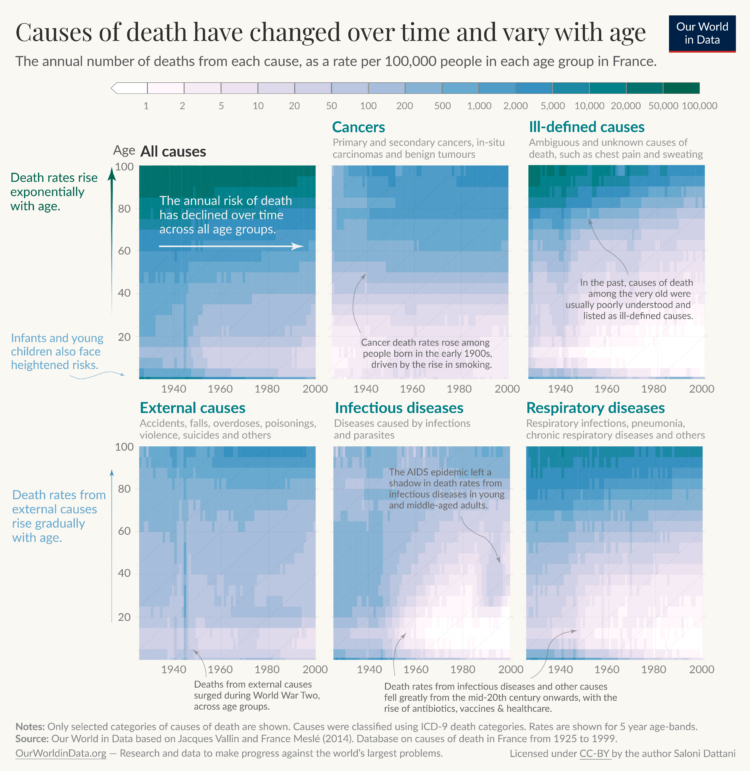
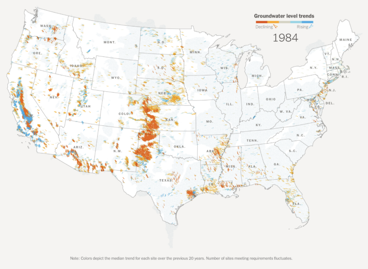
Neil Halloran, known for his documentary films that lean strongly on data visualization, collaborated with RAND to explain the possibility (or lack) of a nuclear winter. In the last third of the film, Halloran also discusses the pursuit of absolute truth and whether it’s truly worth it in the end. Lots to think about.
-
If you’re into R and analyzing sports data, you’ll want to save this CRAN task view:
This CRAN Task View contains a list of packages useful for sports analytics. Most of the packages are sport-specific and are grouped as such. However, we also include a General section for packages that provide ancillary functionality relevant to sports analytics (e.g., team-themed color palettes), and a Modeling section for packages useful for statistical modeling. Throughout the task view, and collected in the Related links section at the end, we have included a list of selected books and articles that use some of these packages in substantive ways. Our goal in compiling this list is to help researchers find the tools they need to complete their work in R.
-
Leonardo is an open source project from Adobe that helps you pick accessible colors. There’s a JavaScript API along with a browser tool that lets you select colors interactively.
Color is a common encoding to visualize data. It can be used directly in choropleth maps or heatmaps, indirectly as a redundant encoding, it can be decorative, and it can be used for all the things in between. However, a color scheme doesn’t work if a big chunk of your audience is not able to see the differences. So it’s good to see these sorts of tools available.
Leonardo is an extension of Chroma.js. Gregor’s Chroma.js palette helper is still my go-to to keep color schemes in check.
-
Sergio Peçanha and Yan Wu, for The Washington Post, used a combination unit chart with individual icons to represent the scale and weight of the near million Covid deaths in the United States.
Compare this with NYT’s particle-based charts and Axios’ scaled squares. It’s kind of in between the two in level of abstraction, but all three carry similar messages, with a focus on the one-million mark.
-
The Open-Source Psychometrics Project, which seems to have been around for a while, provides personality quizzes as an exercise in data collection and personality education:
This website has been offering a wide selection of psychological assessments, mostly personality tests, since late 2011 and has given millions of results since then. It exists to educate the public about various personality tests, their uses and meaning, the various theories of personality and also to collect data for research and develop new measures. This website is under continuous development and new tests and information are being added all the time.
One of the more recent quizzes matches your personality with fictional characters, and the results seem oddly close? I took the short version, and out of 2,000 characters, I was a 92% match to Data from Star Trek. I’m not totally sure how I feel about that.
You can also download anonymized data collected through the project.
-
The New York Times narrated the path to one million Covid deaths in the United States. They start with one million dots, each one representing a death. As you read, the dots arrange into trends and significant events over these past years.
As we have talked about before, it’s impossible to communicate the true weight of a single death, much less a million, but the individual dots provide a visual foundation to better understand abstract trends.
-
We’ve been hearing a lot about inflation rates lately on a national scale. However, how inflation impacts you depends on what you spend your money on. Ben Casselman and Ella Koeze for The New York Times provide an estimate for you.
-
Oftentimes what we’re doing isn’t so important as who we’re spending our time with. Based on data from the American Time Use Survey, this is a simulated day for 100 people.
-
For Swee Kombucha, Bedow used a stacked chart as a food label to show the ingredient breakdowns for various beverages. The greater the area is, the more ingredient by volume there is in the drink.
This project takes me back. See also nutritional facts redesigned, alcoholic beverage pie charts, the engineer’s guide to drinks, and coffee drink breakdowns. The two-year span from 2010 to 2011 was quite the renaissance period for beverage percentages.
-
The United States is about to reach one million confirmed Covid deaths, or already passed the mark if you consider excess deaths. There’s no way to truly feel that number, but Axios visualized the scale, with comparisons against city populations and historical events.
A diamond shape represents counts, and as you scroll, shapes fill the screen until you only see the tips. The shapes overflow beyond what we can or want to understand. The time series line on the bottom shows cumulative deaths over time, leading towards the one-million mark.
-
Joey Cherdarchuk used a lightning metaphor to visualize the outcomes of races from the 2021 season. The x-axis represents how far ahead or behind the each racer is compared to the average. The y-axis represents laps. Racing and thunder sounds play in the background for dramatic effect. I’m into it.
-
The rules around a car’s aerodynamics for Formula 1 racing changed a lot this year, which means new challenges and big shifts in team rankings. Josh Katz and Jeremy White, for The New York Times, illustrated the changes and how modifications affect a car’s performance.
-
The @LpzfuersKlima team have completed painting a giant representation of the Warming Stripes on the Sachsenbrücke in Leipzig, thanks to crowd funding.
Already starting conversations for those using the bridge. #ShowYourStripes pic.twitter.com/OFY9Jeq1zH— Ed Hawkins (@ed_hawkins) April 27, 2022
It amazes me how many places in the world Ed Hawkins’ Warming Stripes appears. My favorite has still gotta be the shower tiles.
-
The Washington Post has a set of charts showing the current status of abortion in the United States. The treemap above shows counts by state in 2017, based on estimates from the Guttmacher Institute.
Twelve percent took place in states that have trigger bans, laws passed that would immediately outlaw most abortions in the first and second trimesters if Roe were overturned. (Those states are already some of the most restrictive.) And 27 percent occurred in states that plan to enact other new restrictions.
-
If Roe v. Wade is overturned, over 200 clinics would potentially have to close. Bloomberg mapped it, along with charts showing more than half of child-bearing people in the United States with new restrictions.
-
People like beef. To raise more cattle, companies need more land. Sometimes to get more land, companies turn to unethical methods. Terrence McCoy and Júlia Ledur for The Washington Post:
By reviewing thousands of shipment and purchase logs, and analyzing satellite imagery of Amazon cattle ranches, The Post found that JBS has yet to disentangle itself from ties to illegal deforestation. The destruction is hidden at the base of a long and multistep supply chain that directly connects illegally deforested ranches — and ranchers accused of environmental infractions — to factories authorized by the U.S. government to export beef to the United States.
-
Matt Dray is developing a package in R that runs a text-based game. Part of that game requires procedural dungeons that are different each time you play.
-
If Roe v. Wade were overturned, abortion policies would change in many states. From last year, Daniela Santamariña and Amber Phillips, for The Washington Post, mapped what would happen.
-
I’ll probably never tire of these sort of videos. It starts at human scale and then zooms in closer and closer until it gets to quarks.