Based on migration data recently released by the IRS, Nami Sumida for the San Francisco Chronicle mapped where people moved to and away from. Enter your county to see what’s happening in your area.
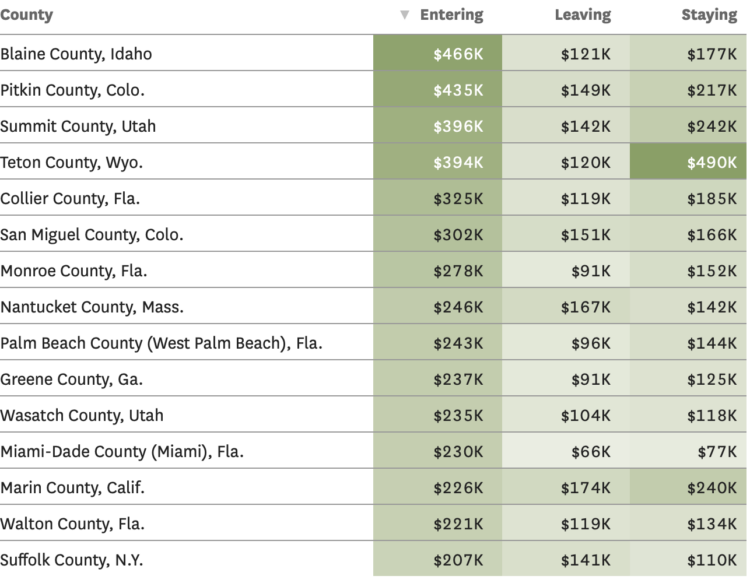
In addition to the maps, there are tables for average income of those moving to and from counties. I wonder what the scatterplot would look like for leaving versus staying incomes.
Also, the IRS migration dataset always makes me think of Jon Bruner’s now defunct map from 2011.

 Visualize This: The FlowingData Guide to Design, Visualization, and Statistics (2nd Edition)