What Qualifies as Middle-Income in Each State (2017)
What qualifies as lower, middle, and upper income? There are various definitions, but the Pew Research Center defined middle-income as two-thirds to double the median. Upper is then everything that is greater than double the median, and lower is everything that is less than two-thirds the median.
Here’s what you get when you apply this definition to each state and adjust for household size.
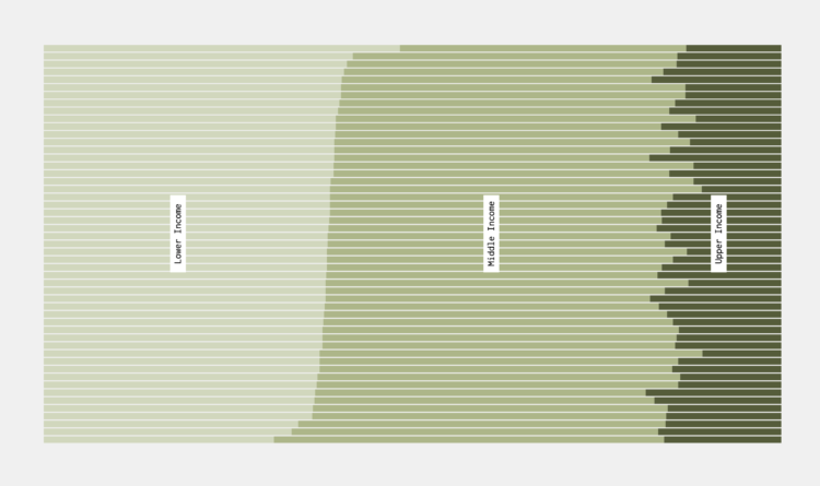
Household Middle-Income
Bars represent a range for each state, sorted by median and adjusted for household size.
This is based on data from the 2017 five-year American Community Survey. I was surprised to see so much variation in rankings when you move between household sizes.
For example, California is towards the top for smaller households, but then shifts towards the middle once you get to five-person households. Montana, on the other hand, shifts in the opposite direction. Makes me wonder how these differences relate to family types.
Percentage of Households in Each Income Level
With the thresholds, we can estimate the overall breakdowns.
Notes
Chart Type Used

Become a member. Support an independent site. Get extra visualization goodness.
See What You Get