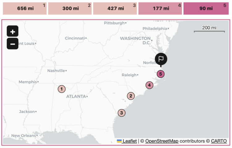
With a cross between the games Wordle and GeoGuessr, Russell Samora for The Pudding made a daily game that challenges you to geolocate a place based on images of the place from Wikimedia Commons. You get five guesses to click on a map, and after each guess you get a new image and the number of miles you were off.
-
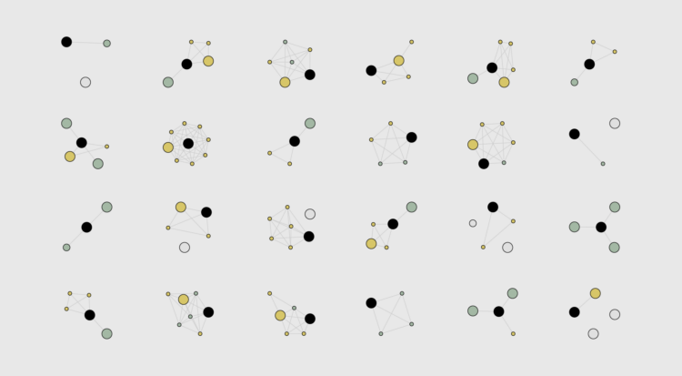
When you think of household types in the United States, the most common ones probably come to mind: single, married couple, married couple with a kid, or married couple with two kids.
But there are thousands of others. Let’s look at all of them.
-
You’ve probably heard about big data breaches over the years. They’re in the news or you get an email from a company that kindly reminds you to reset your password, because a few million accounts might have been exposed. Julian Fell, Ben Spraggon, and Matt Liddy for ABC News show how bits of information from all the known breaches can add up to form a complete profile of you.
Enter an email address and see how many breaches it went through, plus what information was stolen. Yay, 14 breaches for me.
Also check out Have I Been Pwned, where the data for the interactive comes from. It provides more background on individual breaches. [Thanks, Matt]
-
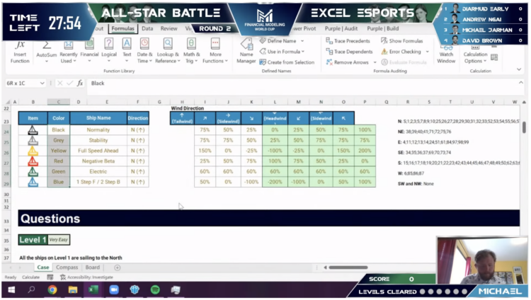
You’ve probably heard of esports, where people compete against each other in multiplayer video games. Financial Modeling World Cup runs esports for Microsoft Excel. Players get a fixed amount of time to accomplish complex spreadsheet tasks, and whoever figures out the correct answers in the least amount of time wins.
The two-hour all-star battle last year even had running commentary and post-competition interviews. It is so gloriously nerdy. [via kottke]
-
Cutting the national debt is a complex process that involves a lot more than personal preferences of an individual. But what if you simplified the task to a bunch of yes-no answers and made it into a Tinder-style swiping game? Szu Yu Chen, Chris Alcantara, and Jeff Stein for The Washington Post put you in charge of the choices.
-
Members Only
-
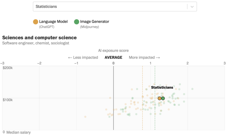
Research by Edward W. Felten, Manav Raj, and Robert Seamans provides estimates for how occupations will be impacted by artificial intelligence, such as ChatGPT and Midjourney, based on AI exposure and demographics. Yan Wu and Sergio Peçanha, for The Washington Post, provide a rundown and searchable charts for the work so that you can check your own occupation.
-
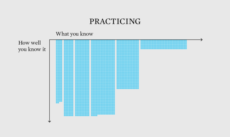
How to Make Unit-Based, Variable Width Bar Charts
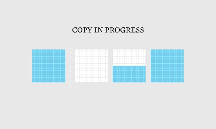
In a cross between unit charts and variable width bar charts, we can show total counts and relative proportions at the same time.
-
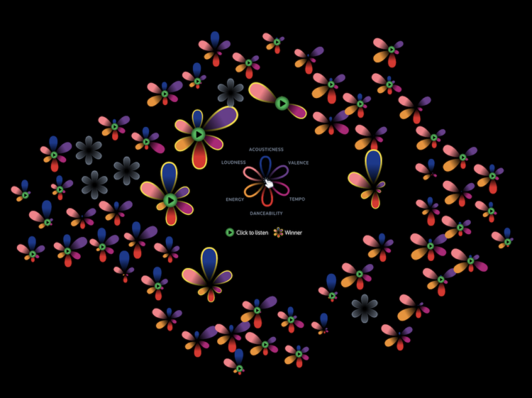
The 2023 Eurovision Song Contest finished up this past weekend with the winning song coming from Sweden. Hundreds of millions of people watch the contest worldwide, but I’m pretty sure most Americans’ impressions come from the satirical Will Ferrell movie, so this visual guide by Reuters should be helpful.
-
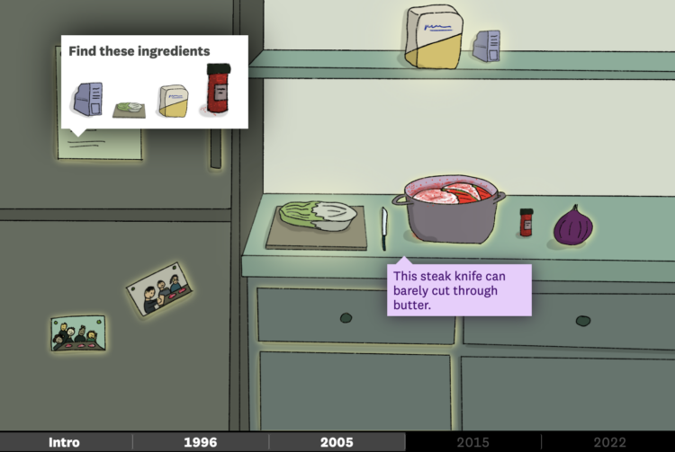
Alvin Chang, for The Pudding, illustrated the search for his kimchi, which is a metaphor for other things. Interact with the items in the story and be sure to turn the sound on. There are charts tucked away for historical context.
Many of my best memories throughout life are tied to food, so this one struck home for me.
-
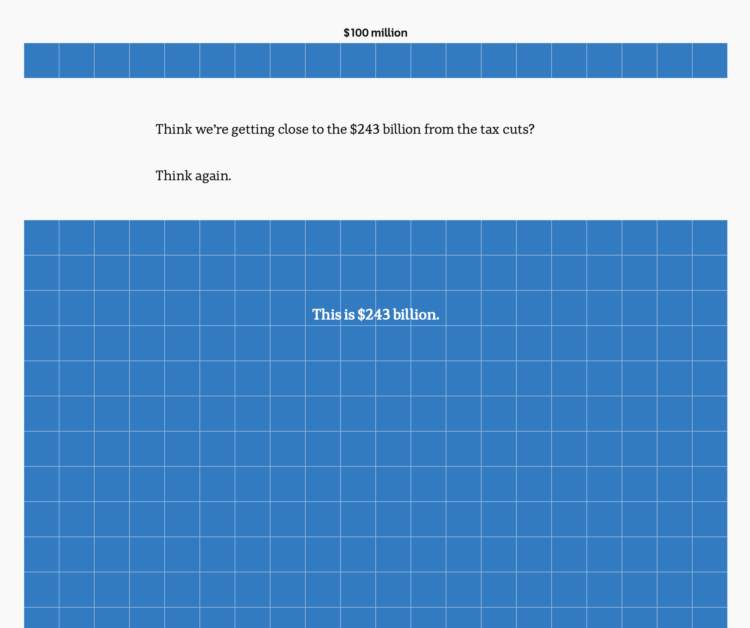
To show the scale of tax cuts and Australia’s budget, ABC News takes the long, vertical unit chart approach, and the squares just keep coming. This is one of those scrollers that works best on mobile.
-
Filed under random but fun calculations, Alasdair Rae estimated the number of people within interstate boundaries:
I loaded up a MapTiler streets backdrop layer in QGIS, created polygons from the the US national road network file from the Department of Transportation website (this required a lot of error checking/fixing) and then summed the population of all areas bounded by Interstates – including those in Hawaii, Alaska and Puerto Rico.
-
Members Only
-
People scored their current life from 0 to 10, where 0 is their worst possible life and 10 is their best possible life. The older they were, the more likely they were to say they were living their best.
-
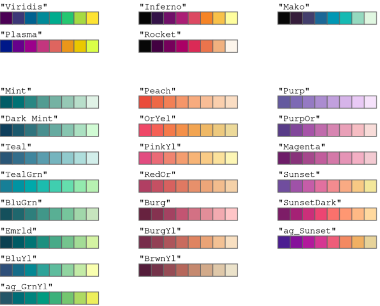
Achim Zeileis and Paul Murrell provide a rundown of the more user-friendly color palettes available in R by default since version 4.0. The new palettes make it easier to see differences and less like saturated output from an old computer.
-
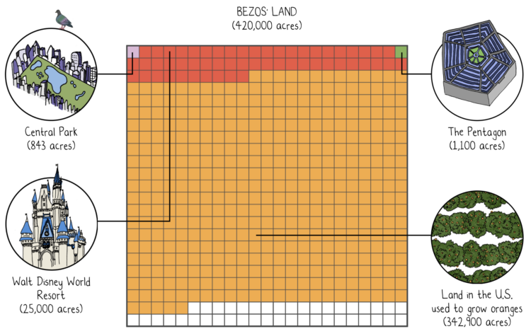
Mona Chalabi, known around these parts for her illustrative approach to data journalism, was awarded a Pulitzer Prize for her New York Times piece on Jeff Bezos’ extreme wealth. She compared the scale of Jeff Bezos wealth against median wealth, and the absurdity of the scale leant itself to ridiculous comparisons.
Amazing. Congratulations to Mona.
-
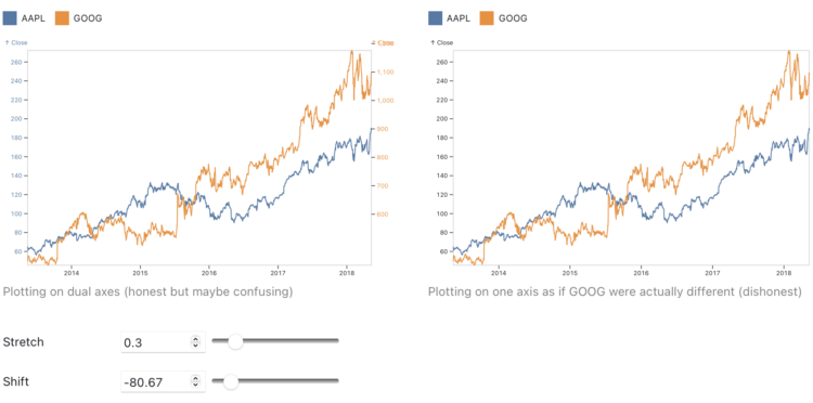
Charts that use two different scales on the same vertical often get the automatic “misleading” label, because if you stretch and shrink two data series enough, you’ll eventually find a way to make them look related. Toph Tucker argues that the automatic dismissal is misguided:
So yes, dual axes transform the series, and that transformation can lie. But it is the same kind of transformation that is already built into the Pearson correlation coefficient. Insofar as dual axes are bad, so is the Pearson correlation coefficient. Their merits and their badness go together. Dual axes are good at showing spurious correlation because they are good at showing correlation.
The challenge is that when you see a line chart with time on the horizontal axis and multiple data lines, it’s hard to separate coordinate systems and we’ve learned to read the lines as patterns over time. On the other hand, a scatterplot (or a connected one for time) highlights the relationship.
So while you don’t need to avoid dual axes completely, you should be careful when you do.
-
As the climate changes, the places that different types of trees will grow also shifts. Harry Stevens, for The Washington Post, provides the searchable maps to show the changes, based on data from the Davey Tree Expert Company.
Maybe the most interesting part is that there’s a “check my work” section at the end, which points you to the code to make the maps.
-
You might’ve heard about large language models lately. They’re the “brains” behind recent chatbots that seem to know an awful lot. Aatish Bhatia, for NYT’s The Upshot, walks you through how such a model “learns” to write based on a relatively small body of text.
There’s a little bit of Choose Your Own Adventure mixed in, so you can select the type of text. Bhatia used nanoGPT, an open source library, to model Jane Austen, Shakespeare, and Star Trek: The Next Generation.








 Visualize This: The FlowingData Guide to Design, Visualization, and Statistics (2nd Edition)


