We’re already more than halfway through the year. Time…moving…too…fast. Is there a pause button somewhere? In case you missed them, here are the most popular post from the last month:
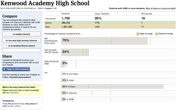
- Largest data breaches of all time
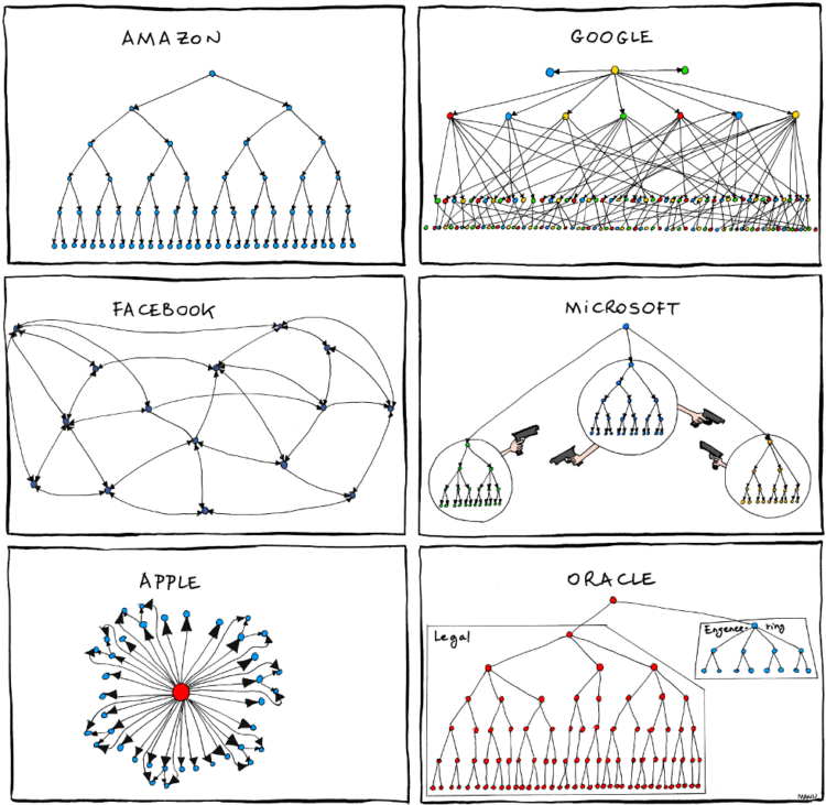
- Organizational charts in major tech
- All roads lead to philosophy, on Wikipedia
- Most common iPhone passcodes
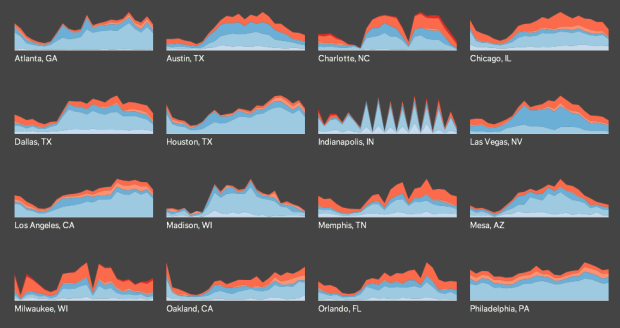
- Long-exposure air traffic
- Gender and time comparisons on Twitter
- Flowchart to decide if you should share that pic of your privates
- DataBot mouse makes larger files physically harder to move
- Anatomy of a computer virus explained
- Analysis of passwords in Sony security breach
As usual, thanks for sharing, tweeting, and liking. Every little bit helps FlowingData reach a wider audience.


 While information graphics have been around for decades, their current form is brand new (or kind of old, if you’re counting in Internet years). Just like the Web, information and data graphics will continue to evolve in line with improving technology and growing amounts of data.
  Visualize This: The FlowingData Guide to Design, Visualization, and Statistics (2nd Edition)


