• Membership
  • Books
  • Projects
  • Learning
  • About
  • Member Login
  • In investing, timing is everything

    January 13, 2011

    Topic

    Infographics  /  grid, investments, nytimes

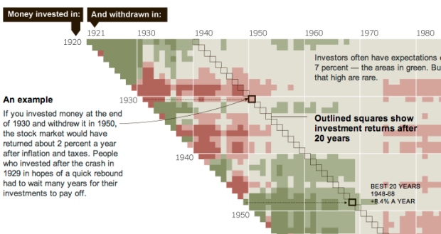
    When you invest in stocks, it’s not just what you invest in, but also when you put the money in and when you get it out. The New York Times explains with this grid diagram:

    This chart at right shows annualized returns for the S.& P. 500 for every starting year and every ending year since 1920 — nearly 4,000 combinations in all. Read across the chart to see how money invested in a given year performed, depending on when it was withdrawn.

    Darker red represents greater loss while darker green represents the greater gains. Tan color indicates more modest gains.

    The method probably isn’t new, but it’s the first time I’ve seen it. I like it. I’ve only seen those “what if” calculators where you enter a value to see how it would’ve paid off. That only lets you see one scenario at a time. This type of chart lets you see multiple time spans at once.

    [New York Times]

  • Haiti’s earthquake in context

    January 12, 2011

    Topic

    Maps  /  animation, earthquake

    Haiti’s earthquake in 2010 was by far the most devastating in a long time. There were an estimated 222,570 casualties as a result. However, as Peter Aldhous shows in this graphic, the Haiti quake was not the most powerful.
    Read More

  • Aerial photos of destruction in Haiti, one year later

    January 12, 2011

    Topic

    Maps  /  earthquake, Haiti, interactive, nytimes

    In memory of the devastating earthquake that hit Haiti one year ago on January 12, 2010, the New York Times shows aerial photos of Port-au-Prince from GeoEye and Google in this interactive. See views form before the earthquake, a few days after, and now.
    Read More

  • Mapping and documenting a year of travels

    January 12, 2011

    Topic

    Maps, Self-surveillance  /  Andy Woodruff, travel

    Cartographer Andy Woodruff documents all the places he goes, resulting in the pretty map above.
    Read More

  • Price and adoption timeline of gadgets

    January 11, 2011

    Topic

    Statistical Visualization  /  bubbles, gadgets, interactive, Washington Post

    New gadgets, from Web-connected TVs, to smartphones, to Fax machines, always seem to start expensive and then decrease in price a few months later. We all know this. But by how much? Alicia Parlapiano of The Washington Post takes a look in this interactive. It shows units sold by year for different gadgets. Bubble size indicates average price.

    Poor tape player. The Consumer Electronics Association didn’t even bother tracking its sales after 2005.

    [Washington Post]

  • Visualizing deletion discussions on Wikipedia

    January 11, 2011

    Topic

    Data Art  /  edits, tree, Wikipedia

    Fact is not always clear cut. Sometimes fact is driven by opinion. People might have conflicting points of view or maybe the truth is simply unknown. We can see this via Wikipedia, where anyone can edit and create documents. Sometimes people propose that articles should be taken down, and if the proposal is approved, people can discuss. Dario Taraborelli, Giovanni Luca Ciampaglia, and Moritz Stefaner have a look at the most active of these discussions.
    Read More

  • Football supporter map of London

    January 11, 2011

    Topic

    Maps  /  choropleth, football, London

    Map of London colored by what team the majority supports. Not much of a soccer… ahem, sorry, football fan. Accurate? [QPRdotorg via We Love Datavis]

  • Our changing world in cartograms

    January 10, 2011

    Topic

    Maps  /  demographics, FedEx, interactive

    In this series of interactive cartograms, FedEx shows our changing world (and I guess, how they are changing with it) through a variety of worldwide demographics such as access to mobile Web, growth, and happiness. Above is the cartogram for richest countries i.e. GDP. Choose a topic, press play, and the cartogram changes accordingly to match the current metric.
    Read More

  • Physics of dynamic braking in slow motion

    January 7, 2011

    Topic

    Misc. Visualization  /  GE, physics, video

    When you slow down your car, energy dissipates into the air as heat. What if your car could instead make use of that energy? Your car could run that much more efficiently and get more miles per gallon. GE explains such a system called dynamic braking (video below).
    Read More

  • Comment to win a copy of Data Analysis with Open Source Tools – winner announced

    January 7, 2011

    Topic

    Contests  /  book, giveaway, open-source

    Looking to get more serious about your data analysis? Data Analysis with Open Source Tools by Philip K. Janert can help you with that.

    The back cover reads:

    Collecting data is relatively easy, but turning raw information into something useful requires that you know how to extract precisely what you need. With this insightful book, intermediate to experienced programmers interested in data analysis will learn techniques for working with data in a business environment. You’ll learn how to look at data to discover what it contains, how to capture those ideas in conceptual models, and then feed your understanding back into the organization through business plans, metrics dashboards, and other applications.

    It’s a little over 500 pages and thorough about describing how to analyze your data. However, it is light in the “with open source tools” part of the title. Most of the time is spent explaining concepts, and then each chapter ends with a workshop, which includes some code. There are examples throughout, but few provide an explanation of how a plot was made or the implementation of a method. So definitely not a book for beginners.
    Read More

  • Data conference: only a few days left for early registration + reader discount

    January 6, 2011

    Topic

    News

    In case you haven’t heard, O’Reilly’s new Strata Conference on “making data work” is coming soon February 1-3 in Santa Clara, California. It’s three days chock-full of data talks, tutorials, and events. And January 9 is the last day to get the early registration price.

    So if you’re thinking about going, I’d register soon. You might as well save a couple hundred bucks. Plus if you register via FlowingData, you get 25% off (and support your favorite data site in the process), which is applied at checkout.

    There are a ton of speakers, including DJ Patil from LinkedIn, Philip Kromer from Infochimps, Hilary Mason from bit.ly, and Kim Rees from Periscopic (and technical editor for the upcoming FlowingData book). No doubt you will learn a lot and meet plenty of interesting people who are also into data.

  • This Tract provides a view of Census data on your block

    January 6, 2011

    Topic

    Apps  /  census, map, open-source

    This Tract, by Michal Migurski of Stamen, with some help from Craig Mod, lets you view details of your block by way of Census data. It’s still using 2000 data but was built in anticipation of the 2010 release, which should come in a couple of months. So we’ll probably see some improvements from now until then.

    Enter your location or browse the slippy map for information on race, income, gender, education, age, and housing. There are also aggregates for your Census tract, county, state, and country.
    Read More

  • What you do online is data

    January 6, 2011

    Topic

    Self-surveillance

    Zachary Seward for the Wall Street Journal gives some thought to what he does online via applications like Twitter and Foursquare. He notes, “[I just] ended up with this wealth of data.”

    Lifelogging is often attached to obsessive tickmarking in notebooks and counting things that don’t need to be quantified. It keeps getting easier to collect data about yourself though, and in due time, lifelogging will feel so natural, you won’t even have to think about it until you’re reviewing your very own [insert name here]-tron report.

    [Wall Street Journal]

  • Map of North American English dialects and subdialects

    January 5, 2011

    Topic

    Maps

    Rick Aschmann has made a hobby out of studying and mapping North American English dialects:

    This is just a little hobby of mine, that I thought might be interesting to a lot of people. Some people collect stamps. Others collect coins. I collect dialects.

    Aschmann goes on to explain the map:

    There are 8 major English dialect areas in North America, listed below the map at left. These are shown in blue, each with its number, on the map and in the Dialect Description Chart below, and are also outlined with blue lines on the map. The first 6 of these begin at the eastern seaboard and proceed west, reflecting western settlement patterns.

    There are even several hundred YouTube links clickable through the map that serve as subdialect samples. What dialect do you speak?

    [Aschmann]

  • 7 billion people in motion graphics

    January 4, 2011

    Topic

    Infographics

    National Geographic argues a need for balance across the world population in the latest motion graphic video. As is usually the case with these, the video hits you with a lot of aggregate percentages and averages, but it’s well-produced and good enough to make you care.
    Read More

  • Delicious mass exodus

    January 4, 2011

    Topic

    Statistical Visualization

    On news that Delicious is on Yahoo’s sunset list, thousands of people decided it was time to take a look at simplified competitor Pinboard. The much lower blue area is normal activity for the Pinboard servers, during a three-day period. The green represents activity after the Yahoo leak.

    As a Delicious user for years, I really hope sunset means move to another company rather than shutdown.

    Or maybe I’ll start bookmarking on my desktop via browser. Gasp. I don’t want to think about it. Oh the horror. The horror.

    [Idle Words via @PinboardIn]

  • Open thread: What’s the difference between a visualization and an infographic?

    January 3, 2011

    Topic

    Discussion  /  definitions, Quora

    Interesting thread on Quora. I never gave it much thought, although I do have an infographics category, along with a few visualization categories. If I were to take a stab with a sentence I’d say: a visualization is the representation of data via geometry and math while infographics are a subset of visualization, where an actual human being had a hand in explaining the (hopefully interesting) points in the data in question.

    Your turn. Sound off in the comments below.

  • The Dow Piano audiolizes the stock market in 2010

    January 3, 2011

    Topic

    Misc. Visualization  /  audiolization, Dow Jones, stock market

    CNNMoney audiolizes the stock market in 2010 with the Dow Piano. Each day’s closing level determines the pitch played, and trading volume determines how loudly a note is played. Welcome to Dow Jones the musical.

    [CNNMoney | Thanks, Dominique]

  • The real Inception flowchart by Nolan

    December 30, 2010

    Topic

    Infographics  /  Christopher Nolan, flowchart, Inception

    Inception was a complex film, so there was understandably some confusion over the levels and who was where. A couple of flowcharts tried to explain, but there was still some debate. So here is the flowchart to trump all other Inception flowcharts. It’s by Christopher Nolan himself. Any questions?

    [In Contention via Waxy]

  • The Joy of Stats available in its entirety

    December 30, 2010

    Topic

    Statistics  /  documentary, Hans Rosling

    The Joy of Stats, hosted by Hans Rosling, is now viewable in its entirety (video below):

    Hans Rosling says there’s nothing boring about stats, and then goes on to prove it. Only with statistics can we make sense of the world and harness the data deluge to serve us rather than drown in its confusion.
    A one-hour long documentary produced by Wingspan Productions and broadcast by BBC, 2010.

    Originally, it was only viewable in the UK, and then there were some clips, but finally, you can watch the whole thing. It’s an hour long so you might want to bookmark it for later, but it’s entertaining all the way through. Plus, it’s the week between Christmas and New Year’s so I know you’re not working.
    Read More

  • Page 326 of 393
  • <
  • 1
  • ...
  • 323
  • 324
  • 325
  • 326
  • 327
  • 328
  • ...
  • 393
  • >

Analyze, visualize, and communicate data usefully, beyond the defaults.

Become a member →

Recently for Members

June 5, 2025
Caring Data

May 29, 2025
Visualization Tools and Resources, May 2025 Roundup

May 22, 2025
Conflicting points of view over the same data

May 15, 2025
Step Chart, Enhanced

May 8, 2025
When the data is not what it seems

Second Edition

Visualize This: The FlowingData Guide to Design, Visualization, and Statistics (2nd Edition)

New tools, refined process.

Order: Amazon / Bookshop

Browse by Chart Type See All →

Line Map Radar Chart Calendar Sankey Diagram Parallel Coordinates Network Graph Venn Diagram Heatmap Streamgraph Pictogram

Browse By Topic

  • Visualization

    Seeing data

  • Maps

    Seeing geographic data

  • Infographics

    Explaining data

  • Networks

    Connecting data

  • Statistics

    Analyzing data

  • Software

    Working with data

  • Sources

    Getting data

  • Design

    Making data readable

Made by FlowingData

  • The Process

  • Data Underload

  • Chart Everything

  • Guides

  • Books

  • Shop

  • About
  • Contact
  • Newsletter
  • LinkedIn
  • Instagram
  • Bluesky
  • RSS
Copyright © 2007-Present FlowingData. All rights reserved.