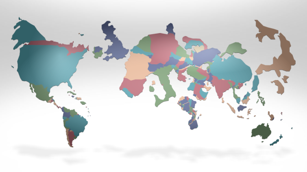
In this series of interactive cartograms, FedEx shows our changing world (and I guess, how they are changing with it) through a variety of worldwide demographics such as access to mobile Web, growth, and happiness. Above is the cartogram for richest countries i.e. GDP. Choose a topic, press play, and the cartogram changes accordingly to match the current metric.
In case you’re unfamiliar with cartograms, they’re the same idea as choropleth maps, but instead of using color to represent a metric, the country areas are used. A caveat of choropleth maps is that large geographic areas inevitably end up looking more prominent even if their value is lower than that of a smaller country. A cartogram on the other hand will make even a smaller country more prominent if it has a higher value for whatever metric. The caveat with cartograms of course is that you can easily end up with a big blob.
For example, here’s the cartogram for high-technology exports. Looking kind of blobby in Europe.

Have a look for yourself. There are quite a few other topics to click through.
[FedEx]
 Visualize This: The FlowingData Guide to Design, Visualization, and Statistics (2nd Edition)
This is a really innovative, fun and interesting application of cartograms. Be careful however, some of the data topics work better than others. Scroll over the countries and there is often no relationship between the data value and the degree to which the country area has been adjusted.
A cartogram by them self is a problematic representation in it self. It is asking us to compare the relative size of odd shaped areas (countries scaled by data) to a memorized area (the non-scaled world map). Even the idea of using the area of a country as the primary factor can cause all kinds of trouble, and for economical data population will often be a better choice.
Finally I wounder about the relatedness of the data presented on the map. A quick visual comparison and you will lean towards ‘bigger is better’ but only some data are ‘normalized’ in one way or another. e.g. the view with newspapers -> radio and television stations -> access to mobile web. The two first datasets are “different titles available with the geographical area” and the third is “percentage of population with access to mobile web”.
In my opinion this is one of the worst examples of data visualizations I have seen on this blog. It offers no help towards the comparison of related values and is based on poorly selected data.
The problem with these ‘cartograms’ is that they play off an implicit comparison: the maps with which we are familiar. First, my wrong interpretation: that they compare implicitly to area, which would make sense if all land were equally fertile and everyone agricultural (so one could visualize differences in agricultural productivity easily using a cartogram) or if there were equal population distributions (so one could visualize per capita numbers by extension). However, none of this is true because the maps to which we are accustomed are not equal area maps (think Greenland, which always looks huge, and Africa is compressed). So the implicit comparison is to something pretty artifactual in the first place. Especially since the lowest population density, least productive land is the most stretched (Antartica).
So, then, what do these maps show us? They show us some sort of massive conflation. When people say that Europe ‘looks blobby’ – first, we don’t have a good sense of how big Europe should be on an equal area map. Even if we did, is this because Europe has high population densities? Or high efficiencies? All we know is that it looks larger than it does on a mercator projection…
Is there a projection issue? Canada (warning, I might be biased) consistently appears under-represented in those figures. We have one of the highest life expectancies in the world at 81 years, and yet the size difference compared to a Burundi (50.4) or Mongolia (66) isn’t apparent to me in the figures.
Very cool animation, but with the distortions due to width/height ratio, shape, etc. of different countries, I don’t find the figures informative.
Pingback: Reading While Eating for January 10: Eat, Drink and Feel Ancient - TIME NewsFeed
Very interesting, creative idea :)
Maybe it would be better if the countries has different sizes but “old shapes”, of course then there should be spaces between them. Just like on this map http://www.cbs.nl/en-GB/menu/themas/internationale-handel/cijfers/extra/2008-animatie.htm
(Dutch Statistics Bureau)
Pingback: » Informação que cabe na tela