In an op-ed for CNN and perhaps adding fuel to the fire, Martin Wattenberg and Fernanda Viegas, leaders of Google’s Big Picture project, talk visualization and its future.
In reference to rules of simplicity and the data-to-ink ratio derived from works such as that of William Cleveland and Robert McGill:
The single-minded pursuit of clarity and precision led to designs that were, sure enough, clear and precise. Grid lines receded discreetly into the background; Tufte’s beloved beiges and tans became standard recommendations.
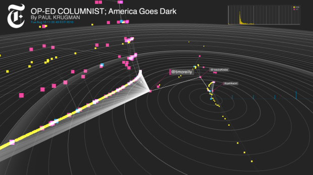
However, is there something more? Using Hans Rosling’s widely-viewed TED talk as an example:
Was animation really the most precise way to show the data? Probably not, but the motion, color, and energy helped capture the imagination of millions of viewers across the world.
Finally, Viegas and Wattenberg end with:
Emotions and a strong voice aren’t necessarily sins in other media, and they shouldn’t be in visualization, either. By recognizing that being expressive and engaging doesn’t mean giving up clarity, we will have fulfilled the promise of visualization.
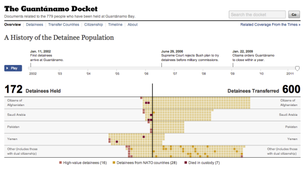
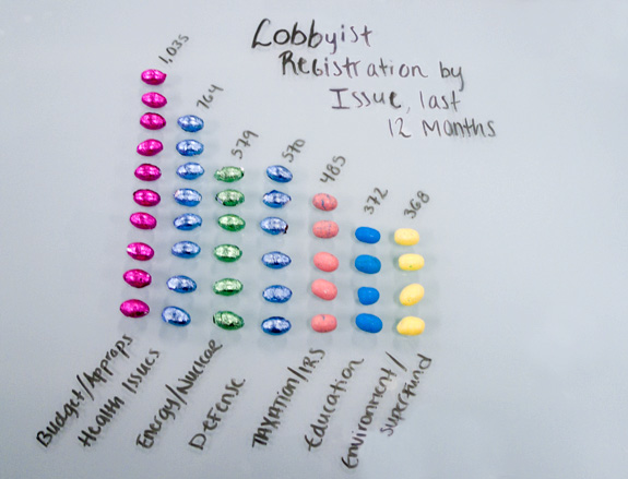
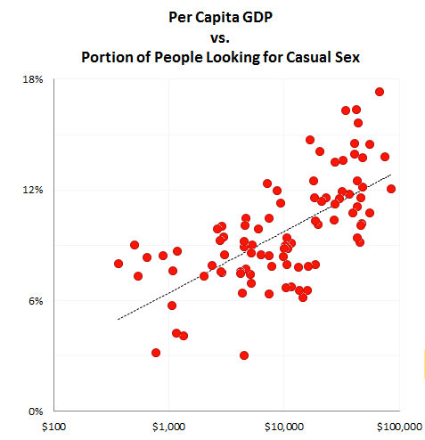
It’s common to look at data through a factual lens, where all meaning and insight is quantitative. This fits well in many settings, but there are other stories to tell that are personal and even moving.
[CNN via @infosthetics]


 Visualize This: The FlowingData Guide to Design, Visualization, and Statistics (2nd Edition)


