National Geographic has a look at where and how we live:
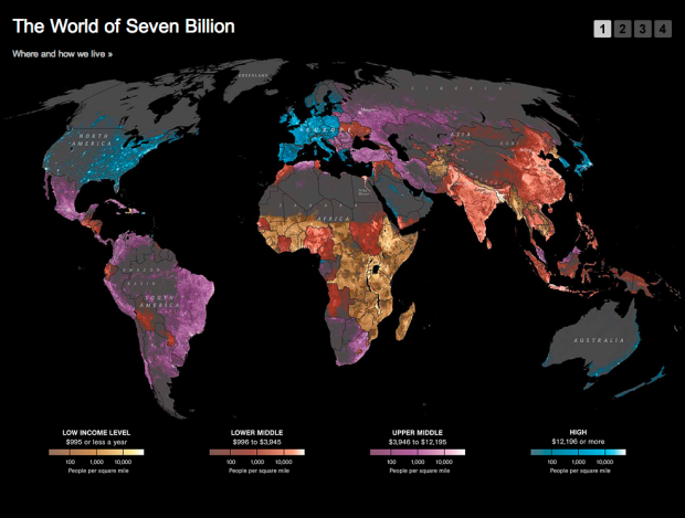
The map shows population density; the brightest points are the highest densities. Each country is colored according to its average annual gross national income per capita, using categories established by the World Bank (see key below). Some nations — like economic powerhouses China and India — have an especially wide range of incomes. But as the two most populous countries, both are lower middle class when income is averaged per capita.
It’s interesting, but the map is a little wonky, because the income levels and population densities differ in granularity. It kind of works. Kinda doesn’t. There seems to be a lot of missing data — or does population density in northern Africa really drop off that quickly (it is desert land, albeit)? A little more explanation in the description or the legend would have been useful.
Read More


 Visualize This: The FlowingData Guide to Design, Visualization, and Statistics (2nd Edition)


