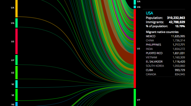
Hundreds of thousands of people immigrate every year, with some countries seeing higher rates than others. To compare and to gain a better sense of the number of people moving around, Carlo Zapponi created peoplemovin.
Each side is a super long stacked bar that represents international migration in 2010, and countries are in alphabetical order. Click on the left to see emigration from the selected country or click on the right to see where people have immigrated from.

I’m kind of struggling with the line lengths because the bars are so long. You’re looking at migration — people moving from point A to point B — but a long line doesn’t mean anything. The color scheme, which I think represents migration rates, is also not clear. So take it for what it is. It’s still interesting to click around.
 Visualize This: The FlowingData Guide to Design, Visualization, and Statistics (2nd Edition)
I’ve done a lot of work on migration, and this is really neat…. Except in one small it seems to violate a basic tenet of all graphics: Where is the label? Which vertical is the outflow and which is the inflow? Sure you can begin to logic it out by clicking around, but that rather underscores the point that you *have* to click around to figure out it.
Wouldn’t a simple 1 word label work?
Otherwise, I love the data itself here, and I know that this sort of tool will be used by policymakers internationally. I like the colors, because I like variety, though I’m not clear on what they mean.
Meant to say, “Except in one small *way* it seems to…”
Thanks for commenting this. I never thought about this issue when I built it. I gave for granted a flow from left to right.
I’ll try to fix this issue soon.
Thanks
Any idea of the data source?
Sorry, I just saw now the text between the two columns. The lines had obscured it.
I wonder if this is possible using a map instead, and clicking on each county to see the flow of people. It would give a better sense of the geography of the migrations.
I would also like to point out that the UK is referred to as the ‘United Kingdom’ in the details box and then ‘GB’ on the columns. Tut tut. ;o)
Such as this: http://www.forbes.com/2010/06/04/migration-moving-wealthy-interactive-counties-map.html
I’m curious as to the definition of migrant. I’m living and working in another country but I haven’t applied for citizenship. Does that make me one of the statistics?
Why do Puerto Ricans count as immigrants? Aren’t they US citizens by birth?
The data source uses World Bank country classifications which includes any entity with >30k population and its own sets of national statistics. It also notes the current limitations of global migration data sets. http://data.worldbank.org/data-catalog/migration-and-remittances
What type of graph is this?
I found an online generator of this kind of graph the other day and can’t find it!
Has anyone seen any?
Thanks!
This is another one of those genuinely wonderful, beautiful pieces of work that makes me feel a little guilty, because I don’t think the choice of presentation style really works.
The whole connecting lines concept didn’t really work here; personally, I gleaned all the info from the tables alongside each country. As John mentions above, this data lends itself naturally to a map construction.
But I like it anyway, it is great work technically and visually, and interesting.
I don’t totally agree on this, I think this visualization expresses quite well the concept of flows. Unfortunately, as the article points out, I should have given some meaning to the length of the lines (not only width). I will probably update it grouping the countries by continent and distances, this way even the length of the lines will communicate “how distant from home” people moved. What do you think about it?
The article also rises some doubts about coloring, the idea is that the hotter the color, the more migrations has happened. Unfortunately in the right column (immigration) the data from US are creating a flat effect to all the others, being so much higher than any other country. I think I should work on this too.
Ok guys I’ll notify you when I will update it.
Thanks for all the comments.