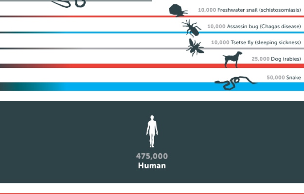
This graphic from the Gates Foundation is from a few months ago, but it was just National Mosquito Control Awareness Week. The small illustrations in this case make the graphic. Although I’m interested in seeing those “wide error margins.”
This graphic from the Gates Foundation is from a few months ago, but it was just National Mosquito Control Awareness Week. The small illustrations in this case make the graphic. Although I’m interested in seeing those “wide error margins.”
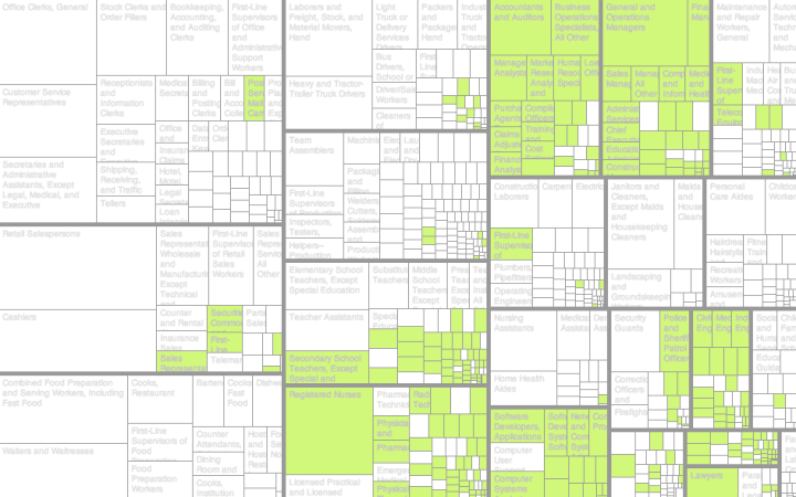
For small-ish amounts of hierarchical data, most JavaScript libraries can handle the load. However, it gets tricky when you get into hundreds and thousands of levels and groups. FoamTree is a library that helps you with this problem.
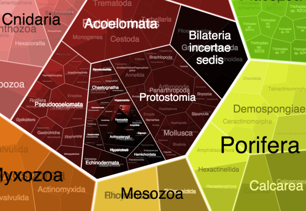
It’s a Voronoi Treemap, which sure, looks kind of neat, but the nice part is how well it handles large amounts of groups. It’s puts off computation and rendering until it’s needed, so it cuts down on load and run times. Just check out the Tree of Life demo and select “Homo sapiens” in the ride sidebar to see how it works.
The library is free to download, but you have to pay a license fee to get rid of the branding.
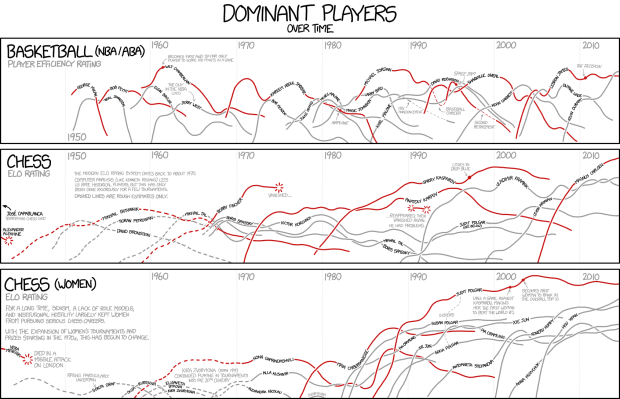
I’m pretty sure xkcd is the only one who gets away with showing player ratings for both basketball and chess players in the same frame, without the y-axis labels. And somehow it seems logical.
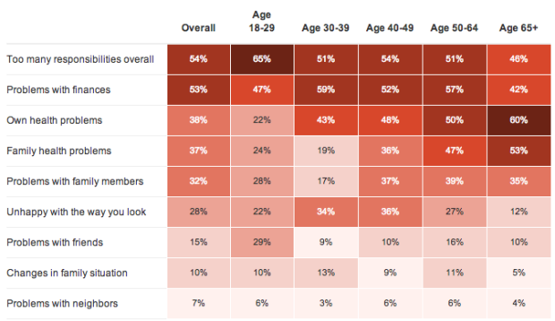
NPR, the Robert Wood Johnson Foundation and the Harvard School of Public Health conducted a survey about peoples’ stress levels and factors contributing to the stress. It took place for about a month. NPR started a summary of their findings, of what will be a two-week segment on the air and online.
The above shows the percent of respondents in the age brackets who said the factors (the rows in this case) contributed to their current stress. It looks like I might be in a less stressful stage of my life, between the age of 30 and 39.
It’s just an early summary of poll responses right now, so I’m hoping they go into more detail about statistically significant differences between demographics and how the 2,500-person sample correlates to the the US population.
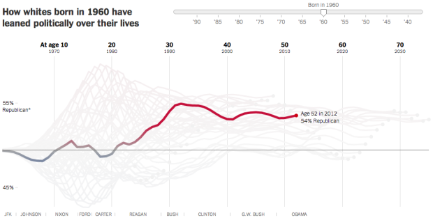
A statistical model, from Yair Ghitza of Catalist and Andrew Gelman of Columbia University, estimates when people form their political preferences. The analysis uses presidential approval ratings from Gallup to approximate political events “that estimates when people form their political preferences.”
Amanda Cox for the Upshot demonstrates the model in an interactive. Simply drag the slider to see how the political leanings of you and your birth cohort changed over time. The takeaway: Events between the ages of 18 to 24 are far more influential than those that occur at an older age.
It seems like the model might apply to a lot of things in life.
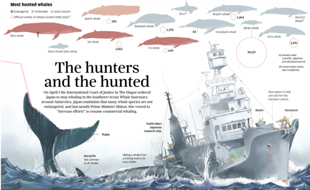
After a ruling by the United Nations International Court of Justice, Japan was ordered to stop whaling in parts of Antarctica. However, Japan’s Prime Minister Shinzo Abe recently sees the whaling practice differently. Adolfo Arranz for the South China Morning Post explains in a detailed graphic. Above is only about a third of it, so be sure to click through for the full version.

Many lists of maps promise to change the way you see the world, but this one actually does.

Smarty Pins is a simple, fun map game by Google. You get a trivia clue about some location, and the goal is to drop the pin as close as you can to the correct place. You start with 1,000 miles, and you get docked each time for how far your choice was from the actual location.
For more on how little you know about where stuff is, see also the state matching game and the Mercator map puzzle.
We produce data all the time, everywhere we go, and this process implies something about how we live. Jer Thorp explains in this short explainer video animated by Erica Gorochow.
Jaap de Maat, a graduate student at the Royal College of Art, rigged a filing cabinet to follow people around for his final project. It reminds people of the data traces we leave behind. It’s called I know what you did last summer.
It is physically impossible for the human brain to remember every event from our past in full detail. The default setting is to forget and our memories are constructed based on our current values. In the digital age it has become easier to look back with great accuracy. But this development contains hidden dangers, as those stored recollections can easily be misinterpreted and manipulated. That sobering thought should rule our online behaviour, because the traces we leave behind now will follow us around for ever.
Terry Speed, a emeritus professor in statistics at University of California at Berkeley, gave an excellent talk on how statisticians can play nice with big data and data science. Usually these talks go in the direction of saying data science is statistics. This one is more on the useful, non-snarky side.
Jobs and pay can vary a lot depending on where you live, based on 2013 data from the Bureau of Labor Statistics. Here’s an interactive to look.

Ditch the computer screen for your data. It’s all about the food. Moritz Stefaner and prozessagenten, process by art and design ran a second round of the Data Cuisine workshop to explore how food can be used as a medium to communicate data. Naturally, you’ve got your basic visual cues, but when you introduce food, you open lots more possibilities.
[W]e have all kinds of sculptural 3D possibilities. We can work with taste — from the basic tastes of sweet, sour, salty, bitter, umami to complex combinations or hotness. There is texture — immensely important in cooking! Then we have all the cultural connotations of ingredients and dishes (potatoes, caviar, …). We can work with cooking parameters (e.g. baking temperature or duration). Or the temperature of the dish itself, when served!
The above shows piece of bread shows youth unemployment in Spain. See more data dishes here.
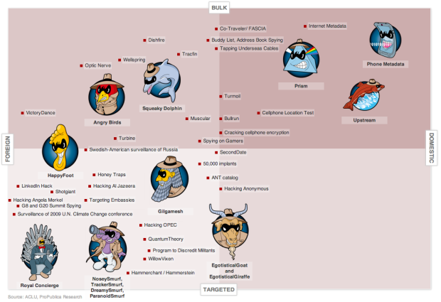
Julia Angwin and Jeff Larson for ProPublica made a chart of NSA programs revealed in the past year. Programs were plotted subjectively from foreign to domestic surveillance on the horizontal axis and targeted to bulk surveillance on the vertical. So you get more controversial the further you move up towards the top right corner.
Interesting stuff.
The best part though is the goofy program names, as illustrated by Alberto Cairo. ParanoidSmurf and his siblings Nosey, Tracker, and Dreamy; EgotisticalGoat and EgotisticalGiraffe; WillowVixen. First off, who names these programs? And second, how do I get in on the naming action (without becoming creepy)?
Animation Domination High-Def has a Captain America video of things that America is not so good at, relative to other countries. And they even cited their data source, the CIA World Factbook. How about that.
Media artist Nick Hardeman’s audio visualization app Bass Shapes was rejected by the Mac App Store because “it’s not useful.” So Hardeman released the software as a free OS X download instead. It’s a beauty.
The app takes in sound input from your microphone or an external audio source through Soundflower (also free), and the visuals come to life. Watching Bass Shapes, you’d swear that you were seeing a custom, hand-drawn animation that served as some kind of old-school-ish intro to an animated film. But you’d be wrong.
Download Bass Shapes and try it yourself.
Mike Bostock, who you might recognize from such things as Data-Driven Documents or the New York Times, writes on the value of visualizing algorithms for entertaining, teaching, learning, and debugging.
Algorithms are a fascinating use case for visualization. To visualize an algorithm, we don’t merely fit data to a chart; there is no primary dataset. Instead there are logical rules that describe behavior. This may be why algorithm visualizations are so unusual, as designers experiment with novel forms to better communicate. This is reason enough to study them.
But algorithms are also a reminder that visualization is more than a tool for finding patterns in data. Visualization leverages the human visual system to augment human intellect: we can use it to better understand these important abstract processes, and perhaps other things, too.
At the very least, you’ll have fun scrolling through the animated visuals that show how various algorithms work, but read the whole thing. It’s good.
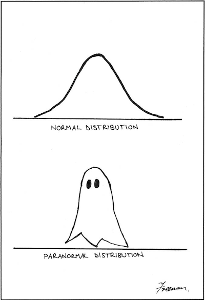 By Matthew Freeman. This is important.
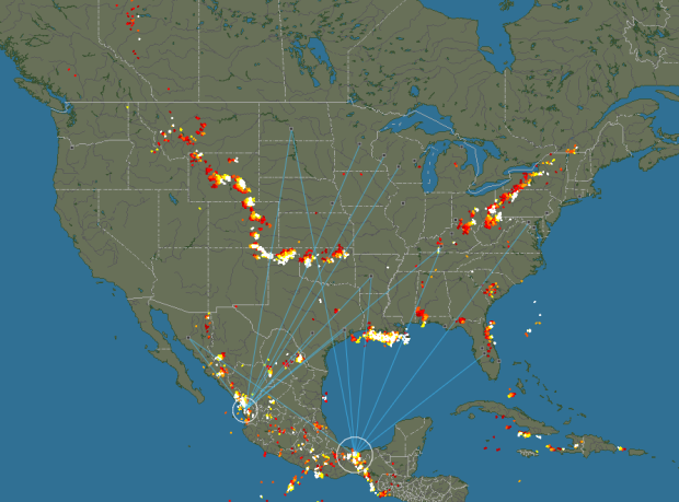
Blitzortung is a community of volunteers who install inexpensive lightning sensors and transmit their data to a central server. In return, those who run the sensors have access to the network’s data. The map that runs on the site shows the data in near real-time, providing a view of lightning strikes around the world. Pretty neat that this exists.
 Visualize This: The FlowingData Guide to Design, Visualization, and Statistics (2nd Edition)
New tools, refined process.


