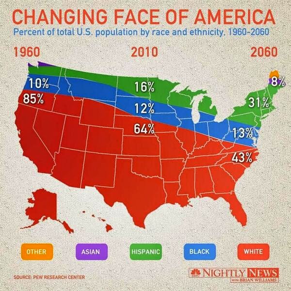
This chart-map-looking thing from Nightly News is making the rounds, and it’s not good. I’m opening the comments below for critique so that you can release your angst. Signed copy of Data Points goes to a randomly selected commenter the end of this week. Have at it.
 Visualize This: The FlowingData Guide to Design, Visualization, and Statistics (2nd Edition)
I think it is not fair to concentrate all the “Other” People at the East.
They have the right to enjoy Vegas too.
Yes, and at this rate all-white Alaska will never have any Inuit.
At least we shoved them way into northern Maine where they can’t harm anyone. “Other” people UNITE!
Ah, the famous Black Belt.
I think I’ve figured out what’s going on here.
The clue is in the title: ‘Changing face of America’. What they’re saying is that people’s faces have been changing colour. Whites are now red faced, black have blue faces, hispanics have green faces, asians have purple faces and other races have conveniently banded together to have orange faces. This is great because they are now much easier to tell apart.
But the really interesting insight here is that the colour change has been accompanied by a change in density. This has led to the precipitation of red-whites to the bottom of America, while the now buoyant orange-others have floated up and got stuck on the right hand side.
Unfortunately they’ve confused the issue by putting random numbers all over the place, but I eventually saw past that.
I thought there were more Hispanics in the South of the US.
Oh, wait…. That’s not a weather map. :-)
Although they’re not labeled, it’s at least possible to figure out about how much of the population is asian or hispanic in 1960. But where did the asians go in 2010? Was there some massive emigration between 1960 and 2010 that is expected to reverse by 2060?
Apparently, all the asians are in Canada in 2010. But they come back.
I always knew California was stuck in the 60s.
I can see where they’re going with this, but forcing it into a map of the US really makes it look poorly done.
They couldn’t have at least made Alaska to scale?
Okay who let Rush Limbaugh play on their computer?
Makes me think there is some kind of epidemic taking over with all of that red.
Clearly there is a temporal rift across the United States that is causing an increase in stratified racial diversity. If anything I think that the title and legend are excessive and could be removed without loss of clarity.
They should have at least ran the time series from east to west in reference to how the country was formed.
And who are these “others” that show up in 2060 that apparently don’t currently exist?
They’re just leaving the option there in case aliens decide to drop by for a while.
At least the chart gets the red states right…..
Oh theres Hawaii and Alaska, makes perfect sense now…
So, am I to believe from this chart that the Asian-American population disappeared sometime between 1960 and 2010, but is projected to reemerge out of nowhere come 2060?
Oh, where to begin… a quick glance thinking the Asians and Others only live in Maine. Then realizing it’s just the apparent exodus of the Asian and Other communities in the late 60s, only to return 100 years later.
Yeah but it’s “sourced by Pew” so you know it’s legit.
or the transition from the communist party to the green party…from hippies to hipsters?
I would love/hate to see the news organizations create some charts depicting the poor charting of their competitors. A recursion of ugly.
I am not sure which is worse – the use of a horrible color palette, trying to make a bar chart out of a map, or making it look like only the south has white people.
WHY add state borders if you’re not using them? Why have an odd shape to represent size? What do the years mean?
On the positive side – Amazing find for ranking of worst Viz’s of 2014 :)
Why the map, really?
It’s not often you see Maine depicted as a rainbow of diversity.
This is horrible. Alaska and Hawaii are entirely red. I see what they were going for, but the complete disregard for the top portion of the original chart, aka Asians and Other, is really disturbing. I think the inclusion of the state lines really is the most confusing factor though.
I think I’ve got it down… Montana is populated by almost the entire Black population US and the entire Hispanic population of the US. Although I’m having trouble determining what year it was populated, and if that means it is no longer populated? And does that mean there were never/still aren’t any Native Americans living in Montana?
When I think diversity I think Maine
I’m a HS Probability and Statistics Teacher, so this graph bothered me on many levels. Rather than form my own opinions, I brought it to my student’s attention and asked them what questions they had about it. After staring at it for a while, they did come up with some great inquiries. Here are some examples:
– What qualifies as “other”?
– How did they come up with the 2060 data?
– Why is Minnesota (our state) represented by only Hispanics and Blacks?
– Why does the south have so many white people?
– What happen to the Asian population in 2010?
Overall, The nightly news should have known better.
those are some crazy time zones
I am more annoyed by the continual lumping of race and ethnicity together. Its probably a safe assumption that all white & black hispanics are categorized as ‘hispanic’, but I wonder if Indians are considered ‘Asians’, or what about Middle Easterns? What the hell is Other? Australians? Moon people?
I think I get it. The map has nothing to do with geography, it’s just there to remind the viewer that we’re still talking about the United States. You must know your audience.
Yikes. I don’t even know where to *start*. There are so many avenues for critique here. I think what irks me the most is that even if you get past the many little issues, there’s still the challenge of extracting meaning from the chart. And this graphic makes that harder — much harder — that it should. A simple Excel chart would be much easier to create AND would better facilitate understanding the data. A table chart’s like the baseline graphic.. if you can’t improve upon that don’t bother.
This graphic is a great companion piece to the recent dripping “blood” chart discussion. Was this confusion/deception intentional? I doubt it but, yikes…
I don’t think this map/graph/chart hybrid went far enough. Where is Puerto Rico? Given the coloring scheme, it would be all green, which means it would have to be placed up between Michigan and New York.
Clearly Canada is now the land of Asians and Others.
First, the migration from one side of the country to the other is sure going to take a long time, 100 years to be exact, and it will have a brutal toll on the whites.
Second, the asians and others must be having a similar exodus in the dangerous wilderness of Canada that the Jews had in the wilderness of Sinai, only about twice as long.
That is clearly what they are trying to tell us with this graph.
Fox News must be furious that they didn’t come up with this first!
The two things that bug me the most:
1. Should not have a U.S. map as a backdrop to represent the distribution … Where did the Asians go in 2010? The proportions do not appear correct – for example in 1960 the remaining 5% between Hispanic and Asian look greater than the 13% in 2060 between Asian and Other. And seriously, where did those Asians go in 2010??? Also misleading that a state’s color is dependent on its location. To my knowledge New York is not 100% Hispanic.
2. I think the legend should be flipped from White to Other to align with the size of each group’s share from 1960.
Simple line chart colored by group would drive the point I think.
Obligatory comment for entry into contest.
I don’t have a rant to add here, but I have sent a complaint to NBC to rant. Let’s create some new jobs for data viz people!
Definitely a strong contender for worst visual of 2014 though we do not know what monstrosities await us in the remaining months.
We cannot even assume that a simple table of data (or bar chart) has been “made visual” in a hurried act of desperation with the map (with the state borders) as background because the percentages are weirdly tilted.
[Confession: Though could not think of any profound observation or sarcastic remark, commented here for the Data Points give-away, though unsure if you would ship overseas :-)]
Trying to actually tease any meaning out of the graphical content just made my head explode. A table of numbers would have conveyed the information just as well. Just because you have data doesn’t mean you need to represent it as an “I’m so clever I’m in love with my own cleverness” visualization…
Does sort of succeed in getting you to look at it though… in a kind of train wreck, car crash sort of way.
It is hard to know where to begin. It looks to me like they took a rectangular plot and then simply did an overlay with a transparent American map. This causes several problems and leads to opportunity for confusion. First is the implication comes from easily overlooking the dates at the top of the map which caused it to look like a distribution of which “colors/ethnicities” lived where. And it is easy to over look the orange-red headers as red is such a dominate color on the map. Next there is the compete lack of Asians in the 2010, probably due to the general dip in the northern border when you use a flat map projection. Add to that, that percentages are not listed for Asians or Hispanics in the 1960s, and who does the 8% in the 2060s belong to- Asians, Hispanics, or both- we can do the math, but that defeats the purpose of an infographic. Furthermore, who is “Other” and are these the race/ethnicity names the Pew used, otherwise it seems to be all over the place between casual and politically correct. Also, this is maybe picky, but the key seems to have no order; usually alphabetical or predominance is used to order the headers, and theirs is backwards from predominance. Lastly, I think the point of the graphic is to emphasize the decrease in the white population and emphasize the increase in other races, but the shape of the United States makes this difficult to see that trent and instead it looks like everyone is decreasing because the sharp downward slope of the Whites causes all of the other lines to slope downward even as they widen. Additionally, although it is based on percentages it does overlook population growth. There are ways to combine those two factors to show how the population has grown, while at the same time show how the distribution of race and ethnicity has shifted. Lastly, Alaska and Hawaii being present just adds to the confusion because they are truly using the land area of the US to represent percentages.
I’m going to open this up to my 7th grader students today and see what they have to say about it.
If Maine will have 8% of the population in 2060, they really should have more congressmen.
Minnesota is the whitest place on the planet, which means it should be red, not blue or green. Wait, it should be white. I am so confused.
What is this “Other” that will exist in 2060, but doesn’t exist now?
Is this some form of Alien life, that have assimilated into the US?
While I appreciate the diplomacy of the US in allowing these extraterrestrials into their country, the fact they have them segregated within Maine is disheartening.
Maine: We are the 8%.
I know for a fact that I’ve seen a black person in california. Reggie… he’s a good dude.
Why are, there so many, charts that use rainbows?
And where does the data underliiieeeeee?
This map is showing that the US is already 92% full… not much room left. Probably why all those Other and Asian people had to leave.
Ah yes, this infographic perfectly illustrates the Great Other Migration of 2045. It deeply impacted the face of America because the aliens came with face changing ray guns and data morphing picture books.
This also brings up a good point about crediting the Pew Research Center. I’d guess that they’re not too excited to be lumped with this schlock.
Separately, wouldn’t this cater more to the Mercator projection?
I am really not surprised considering the source. This is the graphics department that completely lost NH back in July 2013.
Parfaits have layers! So do colored folks!
Everyone knows that America is surrounded by freedom, not linen.
When I first saw it, I thought it was a weather map showing the jet stream.
I can only assume that they literally just overlaid a map on an area chart, and paid no mind to the fact that it removed data from the chart.
The future state also looks a lot like extrapolation based on too few data points…
I can’t think of any critique of this chart that shouldn’t be completely obvious to everyone. I’d really like to see someone defending this chart, so there is somewhere to start.
Using a map as the background of a graph is clearly confusing — the time trend is represented by moving eastward across America? White all live in Southern states?
Using an axis would be more clear than labeling.
And why have they decided to cut off the top of the graph? Nothing sums to 100%!
I’m surprised I haven’t seen this mentioned yet. What bugs me the most is that in 1960 the two numbers add up to 95% and there is some purple and green suggesting that the other 5% is Asian and Hispanic, but in 2010 the numbers add up to 92% with the purple disappearing. This makes me as the viewer of this graphic have to think, which isn’t enjoyable, and guess at what the other 8% is and wonder why all the Asians left in 2010 only to return in greater numbers in 2060.
I never thought it would be possible to explain race population in the States by having a rainbow country-shaped cake…
Where on earth is the x-axis? You have no sense of the baseline here.
Crazy pants.
Ahh, the timeless “layered Jello” visualization. Coming soon to Tableau.
Mainers are so “other.”
Maybe if they added Canada and Mexico to the map, it would all be more clear. At least we could see where the Asians went in the middle years.
Wow. First of all, the proportions of racial groups layered over specific states have *nothing* to do with the actual state makeup. Racial mix xhanges are so gepgraphically specific that this tells the complete wrong story – not to mention the 10% and 13% are relativly the same size, with a chunk of ‘other’ only in upper Maine. Shame on you Pew, shame on you…..
I’m guessing the “Other” people are sneaking over the border from Canada?
I always knew Alaska was pretty much white…
Has anyone submitted this to wtfviz.net? Definitely worthy….
Obviously the North East of the US is the future and most people there will speak Spanish. Fantastico.
I think they are missing the dotted lines to show their 2060 # are projections. Other than that…well..just about everything else could change.
The sad thing is that the original chart from the Pew Research Center was not disturbing at all, but a simple area chart. See the 2nd graphic down on this page: http://www.pewresearch.org/next-america/
NBC should have just picked it up as is and saved themselves the embarrassment.
10-fold better but the colors…
With apologies to HST: anyone who makes a data viz like this deserves whatever happens to ’em.
I’m glad to see that the Asian extinction of 1969 is predicted to reverse course in 2060 with their return in Maine.
Clearly the person that made this has never used an R package before
As you can see, we’re in for some very cold weather with another round of the hispanic vortex.
I don’t see the problem with the colors and numbers, but Geographically speaking, Hawaii belongs in 1860 and the area chart aspect is totally wrong because Alaska should be much larger. This is a poor bubble chart indeed.
The boundary between colors has a white line in some places but not others… IA is half blue, half red, while IN has been split into two new states, one blue, one red.
I get it, color by numbers. Must tell Brian Williams to refrain from having his kids create the Nightly News charts.
This comment thread is better than reddit.
Why are all the minorities fleeing to New York?
Experts are predicting that Hispanics will face significant difficulties in the coming decades, and will disappear completely from the US from 2040-2045 in what some are calling ‘The Ontario Effect.’
“It is Erie” said Mich Igan from the Huron Institute, “We don’t know where they will go, but that’s what our graphs say, so it must be true”
Oh, I missed an opportunity there, it should have read ‘Hispanics will face Superior difficulties in the coming decades…’ FAIL
OMG! Yikes! So it’s an area trend chart that shows distribution of ethnicities, but you can’t see the whole thing because the stupid map is in the way! So there used to be Asians living in the US in 1960, but then there weren’t any, and by year 2060 they will account fo 8% magically? They’re just not showing them because they tried to get fancy and have the shape of the chart be a map! Rookie! Who even uses those ethnicities anymore?!
The Whites are red! The Blacks are blue! The Hispanics are green! Time moves in an opposite direction. Surely this disproves evolution.
Great comments!
It doesn’t look like the colours match the percentages either. The 43% of white folk in 2060 doesn’t look like it’s half of the 85% of white folk in 1960.
Excerpt from American Dark Ages: A history of America 1960-2060 –
“Though we look back at them as a misguided and backwards people now, the average American didn’t even notice that for nearly 100 years there were no Asian-Americans…”
This is a mask over a stacked area chart right? or is it an accurate area chart?
Hey everybody, remember back in 2010, when 8% of the US population was … ummm … actually where did that 8% go?
—-
I am tempted to mine even more conclusions from this viz and create an even more “informative” one.
Here’s my plan:
1) Add individual pie charts per state showing racial make-up. (Strangely, I thought I saw an Asian person here in California in the ’60s but this data clearly says I didn’t.)
2) Then I’ll size the area of each pie chart by cross-referencing with state population. But since the states are such different sizes, my plan is to color code them in some way to show grouping between the differing scales of scaled charts.
3) Still need a way to show the progress over time … I don’t have it figured yet but I’m thinking stacked pie charts?
Nathan, I think this is contest worthy beyond the giveaway. Perhaps a best news article headline drawn from the data herein? OR Make this graph even worse?
I think someone forgot the native American population, unless they’re grouped in with “other”, but who knows. What an unclear map.
Who’s to say that what is entertaining must also be accurate?
Wow – talk about being all but useless to see any sort of a trend (unless your focus is solely on the decreasing white population). No meaningful way to compare even within a “year” band either, since the geography isn’t exactly a standard height all the way across.
And are there just three data points (two real, one forecasted), with a whole lot of inference? Or are other years hiding in there?
Oh, and what happened to the “Other” population? They show up in 1960, and then not again until the forecasted 2060.
The Red Danger comes from South, bitch. That’s the message, aha. I completely go FUD.
Where did the Asians go in 2010?
the x and y axis are a bit wobbly
Dang printer started to run out of ink mid print.
This chart predicts we will make alien contact by 2060.
Canada is clearly 100% linen.
So many things wrong visually but the numbers are pretty annoying as well. I think the changing face of America must be anonymous as there are 5% unaccounted for in 1960, 8% in 2010 and then back to 5% in 2060. I suppose their 2060 predictions where based on complex linear regression models with a healthy dose of probability thrown in for good measure. These people are specialists right? I’m intrigued by the ‘other’ ethnic group as well, maybe it’s us Europeans, unless they’re hoping SETI comes good and the east coast gets overrun by little green men. I take it all back, I love this graph it’s like a visual Nostradamus.
North woods of Maine is as good a place for the “Other” group as any.
This is easily the worst graphic I’ve seen in a long time; however, the original is actually a stacked chart that uses the map in the background. The original (http://www.nbcnews.com/nightly-news/infographic-multi-racial-ethnic-shift-america-n79721) makes a little more sense.
Beyond the obvious faults (or obliviousness of the creator), more subtle faults include the failure to indicate if the data is actually discrete (as implied from the labeling of three points in time) or continuous (as implied by the curvy ribbon).
Another is that presumably 1960 and 2010 data were statistically measured, while 2060 data are projected by some unknown model. They should have visually indicated where the projection data launches off the actuals, which should/could/would have been the real point of this data set.
Ethnicity vs. Race — “Hispanic or Latino Origin” definition (from U.S. Census Bureau, Summary File 1 2010 Census of the Population and Housing Technical Documentation, Jun 2011, p. B-3): “Origin can be viewed as the heritage, nationality group, lineage, or country of birth of the person or the person’s parents or ancestors before their arrival in the United States. People who identify their origin as Hispanic, Latino, or Spanish may be any race.” Some organizations, unlike the U.S. Census Bureau, treat ethnicity as a race, such as The Broadway League’s annual report of The Demographics of the Broadway Audience. Also wonder where the other other is to sum to 100%.
I feel like we’re unfairly focusing on the negatives here. Although there are many “technical” problems with this data representation, the colors are lovely and the textured background looks very smart. So Asian’s disappeared in 2010, at least we have nice font! And the fact that they’ve accounted for this unknown race in 2060 fills me with excitement and anticipation.
All of you are wrong. We do not know what the proportions will be in 2060. You can clearly see that we’ll be 43% white in 2050, 13% black in 2051, 31% hispanic in 2059, and 8% asian in 2061. Do you see 2060 in there? I don’t.
Three strikes for this graphic.
1) Time-series data is being mapped to a geospatial plot. Was the data aggregated across the US or specific to states? One might be led to think the populations of California, Texas, and Florida are 100% white.
2) Assumptions are inconsistent and likely inaccurate for sub-population growth rates. The Asian population decreased from say 1% in 1960 (we can’t know since it’s not labeled) to 0 in 2010 and increased to 8% (maybe?). The sub-population growth rates are assumed to be held constant over 40 years for the White, Black, and Hispanic subgroups and not for Asians.
3) The source of the data is the Pew Research Center. How about a source for the data and a brief description of how it was obtained?
Stacked-bar-graph-time-series-geospatial-data fail.
I think an ether-huffing hobo could have provided more insight. Awful on every quantitative and aesthetic level. It does not quickly inform about the trend it is forecasting and it isn’t particularly attractive either. Putting the numbers on specific states so far from the context of the chart is the biggest offense.
This should be re-titled to, “Changing face of WHITE folks in America: Percent of total U.S. population that is WHITE in 1960, 2010, and 2060 (and, yes, Alaska and Hawaii are WHITE)”
I’m not sure what’s more appalling, the design of this plot or the failure of some people to understand what it actually represents.
I think the only valid criticism anyone can make is that the map should’ve been anthropomorphised into a smiling face – therefore truly representing the “changing face of America”.
So if I’m reading this correctly… The “Nightly News” is white while the Pew Research Center is other.
Am I the only one who gets a little sea sick when viewing this graph?
Also strange to see there are no asians at all in 2010. Is there some government conspiracy about some genocide we don’t know about?
Nice to know that Hawaii has become half the size of Alaska these days..
And the fact that in 2060 the whites will be all orange is also a good thing I can say, coming from The Netherlands :)
This chart is fantastic! Who knew Vermont would become 8% Asian by 2060 – the things we learn
At this rate by 2210 the Americans of all races, having lived for over a century in the middle of the Atlantic, will colonize the area between central Germany and southern Algeria causing the majority of the western European population to be absorbed by Russia. Meanwhile North America will be nearly devoid of humans before the coming tidal wave of Chinese.
This type of graph would actually work for Colorado and Wyoming!
Non-spatial data being forced into displaying spatially. Good jorb.
I can explain the Asian thing. My family arrived in the US in 1963 (close enough to 1960); I went skiing @ Whistler/Blackcomb in 2010 which explains the disappearance; and expect to be around in 2060 w much bionic augmentation.
So making everything add up to 100 was just too much detail, but state lines were necessary.
Personally I would have much preferred had they used like a real face and just colored that.
Did Nightly News hire an InfoGraphic “expert” away from Fox?
Oh I get it! West coast is still stuck in the sixties. East coast is the future-to-be. And, all Asians have been banished from the country somewhere around the 70s and will only return in 2060. But only to Maine.
The Others are descending from the far North! Quickly, let’s build a massive wall through central Maine and staff it with volunteer and convicted criminal men sworn to celibacy!
I feel bad for the creator of this map. Someone looked at this and thought to themselves, “This is good. I did good.”
Amazing. Setting aside the 27 more obvious problems with this, I have never before seen a graphic that used two different projections/perspectives overlaid without comment or correction. It’s the equivalent of putting a flat scatterplot in front of a 3-D perspective chart’s axes. Nggghh.
Did somebody misplace their map of the U.S.? Found it on top of a perfectly reasonable data graphic.
It looks like someone took a cookie cutter and used it on a would-be-interesting chart. It’s almost statistical blasphemy to deface a chart that would be worth looking at!
This would be interesting if I could read it!
Welcome to the Divided States of American. I’m very looking forward to the debut of “Other” people in Maine in 2060..!
This is really a lame representation of the data. The data have absolutely nothing to do with the map, and the author is merely using the map as a background for what essentially is a standard x- and y-axis chart. But it’s confusing to those of us that are reading symbols on the map.
There’s a lot to not like. I didn’t even notice it all at first. I saw the map, not showing any position, and the strange way some groups appeared only in the far north. Then I noticed later, on the third look, the time trend running west to east. I think it’s a testament that it takes so long to find the many problematic choices. The Pew Research Center is credited. I wonder if it came like this.
The “Others” are clearly the frost-zombies from Game of Thrones who are currently breeding within the icy wastes of Canada and will start invading Maine during the Great Wight Terror of 2044.
They forgot a scale of miles and a compass rose. And water is blue, right? So Washington DC and state can be connected by that big canal.
baaaahhhhhh!!!!!
The invasion came from the North. The struggle has been long…with initial contact failing in the 1960s. But the Black Vanguard made great progress towards the presence of “Others” in 2060 – with the invasion nearly halfway complete. WE WILL PREVAIL! Zoltan out.
The headline says the categories are Race and Ethnicity, but they are “code” for skin colour: White Black Brown Yellow and Other.
Once again, its a divide-and-conquer strategy by the rulers to stoke fear of Us and Them, so we do not unite against our common enemy.
Pew Research Center, Indeed.
“As you can see, there’s a black front pushing in from the northeast, expect some clouds with a chance of Hispanics. We’ll see an 8% change of scattered Asians this weekend, but expect Other skies as we round the corner into next week. Now here’s your forecast for 2060…”
In 1960, is that 85% of the US or 85% of Oregon was white? And are those predictions in 2060 about the east coast? What’s up with Hawaii and Alaska — all white, all the time?
Maine reminds me of Neapolitan ice cream! Also, Maine and Washington are undoubtedly the most interesting states in which to live, as they are the only ones with any diversity – 3 different face colors! :-)
While we don’t know the population totals for each fifty year time mark, I’d love to see their completely infeasible regression analysis… without data, it’s just some hairbrained opinion made into an interesting chart.
It might not adhere to Data Visualisation best practices at all, nor does the categorically coloured map of America add anything in terms of making the data stand out more. But the numbers are simple enough to tell the story all by themselves. In that particular subject matter: all you need, really.
I don’t mind it…
You are correct. The numbers are simple. So simple that it should not take anymore more than a fraction of a second to understand it. Unfortunately, it’s confounded with an unnecessary image and takes more than a fraction to understand. In this way, it’s bad.
This fails to make use of the spatial relevance that maps provide and poorly incorporates temporal information. This map chart thingy suggests that certain ethnic groups tend live in certain regions and as time goes on they either expand or shrink their “ethnic region band”. If this were an interactive infographic, it might be better to have a single static map of a region and a dynamic time lapse slider below and as the slider moves across time, each region ethnicity as a color code (it will probably be bad to color based on race) would appear, disappear or move according to geographical data. This way we would see a shift of ethnic regions, where certain groups tend to stay and ethnic density for a region would increase or decrease.
The new version seems to at least fix the complete vanishing of most of Asian & Others data in this infographic: http://www.nbcnews.com/nightly-news/infographic-multi-racial-ethnic-shift-america-n79721
I also find amusing how the data predicts 50 years in the future, including that sudden low in Asian population in 2020 and then a rise back to 6%.
The Alaska – Hawaii inset is vital. Without it I’d be lost.
White=red, black=blue…this is like one of those intelligence tests where the words and colors don’t line up and they show how difficult it is for the brain to say the right thing when the various modes of data don’t align!