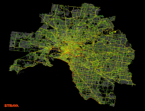
I’m not entirely sure how to interpret this music video from Franz Ferdinand, but I’m taking it as a critique on internet culture, with less-than-meaningful charts playing a part. There are lots of colors, geometric shapes, and pictograms flying around the band, with no information attached. I guess that’s about right. [Thanks, @augustjoki]
-
The people I follow on Twitter almost never use emojis, but every now and then I peek into trending topics or tweets near me, and it’s a completely different experience. People use emojis. A lot. The emojitracker, a small project by the Rocket Workshop, does exactly what the name says. It keeps track of the emojis people use on Twitter in real-time.
Warning: The view might cause a seizure.
-
-
Names are incredibly personal things. It’s how we identity ourselves. We associate others,…
-
-
GE has a short video series on a fictional town called Datalandia where machines talk to each other and data is exchanged in a hero-like fashion. “This summer the most cliched movie plots won’t be coming to a theatre near you. This summer the most cliched movie plots are about to collide with big data!”
It’s like IBM’s Smarter Planet commercials combined with Team America. [Thanks, Chris]
-
Erica Fischer, known around these parts for her dot maps, describes the lessons she learned (along with practical tips) from mapping millions of tweets to be visible on many devices. The views above show what you get when you vary dot size when you zoom in to a dot-filled map.
The first thing that becomes clear when you start drawing the same dots at different scales is that it doesn’t look right if you just scale the dots proportionately as you scale the area. Each time you zoom in on a web map, only a quarter of the area that was visible before is still visible, but if you match that and draw the dots four times as big as you did at the previous zoom level, the image is very crowded and fuzzy by the time you get zoomed in all the way. The Gnip maps instead double the area of the dots for each level you zoom in. Here’s what it looks like to zoom in on Times Square with dots that quadruple, double, or don’t change size at all with each zoom level.
-
Louise Ma, along with Chris Parker and Lola Kalman, started a six-part short video series on what love looks like. Above is the first one. This is part of an ongoing project that Ma started last year, and it’s still going strong.
-
Using Opta data for assists in the Premier League, Kickdex made this straightforward chart to look at where assists typically come from on the field.
It is clear that to rack up the assists, a direct style isn’t the way to go. Only 14% of all assists come from long balls, and 29% from crosses (many of which are also classified as long balls). Over two thirds of all assists are short, precision passes made from just in front of the box and wide within the box. – See more at: http://blog.kickdex.com/post/56157934804/the-perfect-assist#sthash.lwE8wHgc.dpuf
As you might expect, most of the passes are aimed towards the goal. [via The Daily Viz]
-
Artist Charles Sowers specializes in public art works and display of physical phenomena. In Windswept, Sowers displays wind patterns in the actual space.
Read More -
-
Inspired by The Wizard of Oz, where Dorothy clicks her heels to get home, artist Dominic Wilcox created “No Place Like Home,” a pair of GPS shoes to show you the way.
Read More -
In a study conducted by researchers at Harvard and UC Berkeley, data shows spatial variations for the chances of rising out of poverty into higher income brackets. The New York Times reports:
Climbing the income ladder occurs less often in the Southeast and industrial Midwest, the data shows, with the odds notably low in Atlanta, Charlotte, Memphis, Raleigh, Indianapolis, Cincinnati and Columbus. By contrast, some of the highest rates occur in the Northeast, Great Plains and West, including in New York, Boston, Salt Lake City, Pittsburgh, Seattle and large swaths of California and Minnesota.
“Where you grow up matters,” said Nathaniel Hendren, a Harvard economist and one of the study’s authors. “There is tremendous variation across the U.S. in the extent to which kids can rise out of poverty.”
Two things. First, the NYT piece is really nice. Graphics and interactives are typically shown separate from the written story, but NYT has been shifting as of late and I’m sure other publications will follow. (Although, as you can see in the credits, eight people made the graphics, and most places don’t have such resources yet.) The story is all tied together, so you read and interact in a continuous flow.
Second, the Harvard/UC Berkeley research group released the data, so you can have a go yourself.
-
Allison McCann for Businessweek graphed rappers’ claimed wealth in their songs versus their actual wealth.
Fresh off of Jay-Z’s new album is the track Versus, on which he chides fellow hip-hop artists and their dubious tales of extraordinary wealth: “The truth in my verses, versus, your metaphors about what your net worth is.” Like Jay-Z, we’ve long been skeptical of just how wealthy some hip-hop stars claim to be, so we created a way to separate the truly rich from the loud-mouth lyricists.
As you’d expect, some rappers tend to exaggerate. Speaking of which, this seems like a good time to revisit the map that shows the area codes where Ludacris claims to have hoes. Unfortunately, there is no data to verify or debunk.
-
Hannah Fry and her group at University College London investigate data from the 2011 London riots and found that the complex activity of rioters is reminiscent of shopping behavior and contagion. They propose a mathematical model for riots that could help prevent escalation.
In August 2011, several areas of London experienced episodes of large-scale disorder, comprising looting, rioting and violence. Much subsequent discourse has questioned the adequacy of the police response, in terms of the resources available and strategies used. In this article, we present a mathematical model of the spatial development of the disorder, which can be used to examine the effect of varying policing arrangements. The model is capable of simulating the general emergent patterns of the events and focusses on three fundamental aspects: the apparently-contagious nature of participation; the distances travelled to riot locations; and the deterrent effect of policing.
The video above explains in more general terms. [via Spatial.ly]
-
Moviesound is a goofy yet charming look at sounds in movies. Imagine sound waves visualized and then replace some of the spikes with illustrations that have to do with the movie of interest, and there you go. The project is mostly static posters, but the handful of short videos are the best. Here’s the sound of Darth Vader breathing:
The Jurassic Park poster is pretty good too.
-
Inspired by Nelson Minar’s map of US rivers, Mike Bostock demonstrates how to generate your own TopoJSON from the same river data. As indicated by the name, the file format is a way to encode topology, and it does so in a compact way.
Read More -
Whoa. There are a lot of things wrong with this chart. Gold star for every mistake that you find. And there are many stars to hand out.
Read More -
Here’s where to go next once you’ve covered the basics of visualization. When it’s time to actually start making things.
-