What? I don’t see anything wrong with it.
Alright, alright, so it’s local news, but still, come on. I wonder if the newscaster even bats an eye as he’s reading the numbers off the teleprompter:
[via @kevinthepang & @eagereyes & Wonkette | Thanks, all]
 Visualize This: The FlowingData Guide to Design, Visualization, and Statistics (2nd Edition)
Classic!
Classic, that you beraters-of-the-right-wing didn’t catch that OBVIOUSLY MORE THAN ONE ANSWER WAS PERMITTED, and thus the chart was showing distribution of positive responses *plus* percent with a favorable rating of each. And yet, you think you are so much smarter than Neanderthal righties. How’s your crowd doing with the economy, the war in Afghanistan, and getting the world to be responsive to critical national interests of ours (like preventing Iran from getting the bomb)? I guess your crowd ain’t so smart after all …
And your side did good with those things you list? Talk about elective memory. I suppose you also agree that there were no terrorist attacks during Bush’s presidency?
did you seriously just ask how “lefties” are doing with the war in Afghanistan a year after a “lefty” president walked into a war a “righty” president started? then you bring up Iran “getting a bomb” as if they actually have one or are trying to make one? how would you know? do you work in the intel community? don’t even get me started on the economy. any accomplished economist will tell you that one year into a presidency isn’t enough to affect the economy enough to matter more than the previous EIGHT YEARS of the last president (as if the state of the economy rest solely on the shoulders of the president at all).
get an education and learn to look at the world objectively instead of subjectively.
In no sense is that obvious. I had to dig to find the link on the station’s web site, and as I point out in my earlier comment, saying that respondents “back” a candidate usually implies mutual exclusivity of responses as does using a pie chart. This is a very bad job of representing data on their part, and informed public discourse demands critical analysis of what people say when engaging in it. That includes when your own side does so.
It’s not about the data, you moron! The data’s fine. It’s the representation as pie chart that sucks. If more than one answer is permitted, you make a bar chart to compare.
Get an education so that you can understand why the elitist lefties think we are so much smarter than Neanderthal righties.
Yeah! Those stupid lefties! Always hammering the right thinking they are sooooo intellectual. It’s obvious that the pie chart is correct. You just need to understand that the chart shows data out of a total of 193%. So all you have to do is divide each data point by 193, then add each quotient together and divide again by 3 to achieve the arithmetic mean across all quotients, then compare each individual quotient against the mean quotient to determine percent variance of each potential 2012 candiate.
It’s so obvious! Stupid lefties.
LOL, your education on statistics is definitely questionable. For survey data like this which comprises of multiple answers for the same question, you CANNOT do a pie chart representation.
As far as other issues are concerned, I am not an American to quote on it, but if my memory serves right, it was 8 years of republican government who initiated all these issues which are inherited by Obama. Did I miss the point?
ps: No point bashing me on Left or Right wing of politics, I observe politics from an international point of view. I have no bias
Sorry, but when there’s more than one answer allowed, you CAN’T use a pie chart because it shows how the WHOLE is divided. There are other charts and graphs for more than one answer. Any Neanderthal knows that.
OMG, classic that lefties understand basic math reasoning? It’s so obvious! How’s our crowd doing with the economy? This has nothing to do with political party, this has to do with the fact that you obviously did not pass any basic math classes in high school or college.
Joe, that may be so, but then a bar graph would have been a better choice of graphic. Still not very bright of the journalists. And as for all the shouting below can serve to demonstrate just how awful we are becoming.
That’s fair enough, but why put it in a pie chart, which is not reflective or indicative of popularity distribution with allowances for two or more preferences at the same time?
Why it do it that way anyway? People can’t vote for more than one person either way so why would the person people prefer second be relevant?
Then maybe a Pie Chart, which shows the relation of the parts to the whole, wasn’t the best choice of charts!
Yeah, shut yer pie whole!
Joe, you are completely missing the point. Of course it can add up to more than 100% if people can favor more than two candidates. However, if it adds up to more than 10% it cannot be shown on a pie chart because in a pie chart each segment is supposed to represent actual fraction of the population.
all inherited from Republican Bush
but pie charts ALWAYS equal 100%– that’s the point of making it a PIE CHART instead of a bar graph. Thank you for proving that they’re smarter than at least one more “Neanderthal rightie.”
I actually did think right off the bat that more than one answer must have been permitted, but you don’t make a PIE CHART when you allow multiple answers! A pie chart implies that the circle of the “pie” is 100%, and the wedges are an accurate visual depiction of portions of that 100%.
Neanderthal is an apt description of the right wing ‘teabaggers’.
What about the chai-tea baggers, do they count?
Pingback: abejero | from the Big Apple to the banks of the Mekong
I guess all that home schooling really paid off!
Home schooled kids would have known better than to represent overlapping sets using a pie chart..
Excellent! They obviously learned about primary colors and shapes in kindergarten but didn’t make it to grade 1 math.
Obviously, No Child Left Behind has been a huge success…
The fact that Palin would even be in the picture for the GOP is even scarier than their lack of grade 1 math skills.
if i could vote for best comment, this would be my vote.
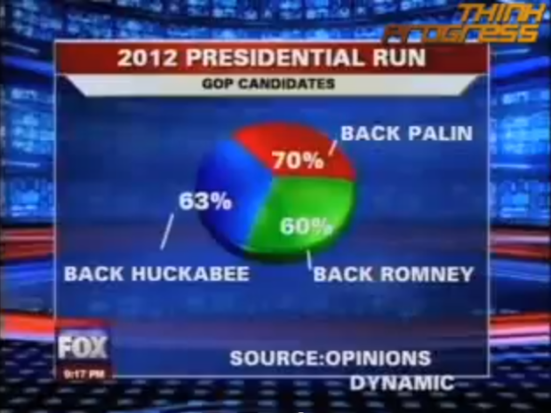
Actually, it’s just a bad job of representing data. The poll is at http://www.foxnews.com/projects/pdf/111909_PalinPoll.pdf.
The question was whether the respondent had a favorable rating of these people (and of Oprah–she won among all voters), so a respondent could give more than one answer. “Back” of course seems to imply that the question was more along the lines of “which would you prefer” and a pie chart is about the worst tool possible to visualize a question where respondents give more than one answer, for reasons that now must seem obvious even to Fox News. But, as much as I like to see Fox News look like idiots, their math is OK on this.
The numbers may be OK, but pie charts are exclusively used to represent things that add up to 100%. Now you might use some sort of multi-layer pie chart to show how many Palin ‘backers’ also back the others, but this chart IS ‘a bad job of representing data.’
It might not be a mistake, In primary straw polls you are routinely allowed to vote for multiple candidates since the idea should be to find the candidate with the most support not the candidate who can get 51% if people are forced to choose.
Well, sure the data is probably good, buy it makes no sense at all to show that as a pie chart. Pie charts are supposed to show how big of a “piece of the pie” each got (and kept from the others).
That’s not a Fox News pie chart. It was made by MyFox Chicago. Big difference, in spite of the name.
Interesting/silly use of a pie chart. But surely you all remember the true BEST PIE CHART EVER:
missing link, but i’m gonna take a wild guess that you meant this:
https://flowingdata.com/2008/09/19/pie-i-have-eaten-and-pie-i-have-not-eaten/
Pingback: Stupid Viral Issue of the Day: Fox News Poll is Flawed « The Constitution Club
Is it just me, or does the 3d effect make the “back Palin” slice look smaller than the other two?
It really does.
I love that this stuff up is about Sarah Palin. Just says SOOO much.
Pingback: Jeff Hoard - The Idiocracy Index – Mmmm Inaccurate Pie - True/Slant
Pingback: Daily interesting articles | Aww Dip
This is a good story, except that if you open the image in a forensic image analysis package you find that it has been thoroughly manipulated (in multiple layers, unnecessary if one is simply converting a screen cap) by a Linux based programme leaving its calling card in the (ADS/Extended Attribute/Exif) data integrated into the file thus: CREATOR: gd-jpeg v1.0 (using IJG JPEG v62), quality = 95.
Pulling stupid stunts like this does nothing to enhance the position of progressives in the eyes of the “man-in-the-street”. Unfortunately this sort of thing will have the same sort of knock-on effect of distrust as is the goal of the posters of the stolen emails… destroy all credibility (amongst the deeply unsophisticated/educated) so that the conservative/denier/loony agenda can push ahead.
Pingback: Daily Digest for November 27th
uhm xenotoxin – what are you talking about?
a) there’s a clip with the graph above – do you think that has been manipulated, too?
b) gd-jpeg is a standard Linux package for converting images to JPEG. There’s nothing sinister about that – either the person who made the screenshot was running linux, or it was converted automatically by a site it was uploaded to – that would most likely be done by running a linux script.
c) Forensic image analysis is something entirely different from what you think it is
d) JPEG doesn’t save layers, so you wouldn’t know if this had layers before
etc.
Sebastian, it’s obvious.
xenotoxin has brought to light a clandestine splinter branch of the Global Warming Global Conspiracy that seeks to discredit Fox News.
Pingback: Fox News Makes the Best. Pie Chart. Ever. | The Big Picture
Pingback: Fox News Makes the Best. Pie Chart. Ever. | Aktiebloggar.se
Pingback: Pie chart fail
Pingback: How not to report statistics | Techonomist
Pingback: Fox News Makes the Best. Pie Chart. Ever. | HighYields.com
Pingback: Fuzzy Math At Fox - OnePegGenius
If only all pies were so magically full of pie.
On the slim chance that might actually happen, I move to call them pizza charts. And bar charts should henceforth be called beer charts.
Whatever your politics, the person who made that graphic is innumerate and illiterate. The numbers speak for themselves. The source is listed as “Opinions Dynamic”, but the polling firm is “Opinion Dynamics”.
Love the pizza and beer chart idea…
I find it worrying that there’s no back bacon.
This actually could’ve been a meaningful representation if they’d shown the overlap between the candidates — very likely 10% or so supported all three, and then you could see if, say, Palin had a large exclusive base but Romney and Huckabee largely overlapped in supporters. More of a Venn diagram, I suppose, than a pie chart.
To those of you pointing out that “more than one answer was allowed”: I agree that this is probably the case, however, in that instance the use of a pie-chart to represent the data is the completely moronic element! Either way there’s no excuse for this level of idiocy.
Erm, oh dear.
You see, the right wing (on the US side of the Atlantic, I notice it’s not so bad on this side) really do think that complete mess ups like this can be easily explained away either by the mistakes being highlighted by “liberals” or, as has occured on this thread, by some spurious reasoning of multiple choices.
It really does make me wonder if, just once, the right wing could put up their hands to admit mistakes. It’s not hard. The more open minded of us do it all the time.
Not to nitpick (there’s enough going on here already), but it occurs to me that the headline here says “Fox News Makes the best pie chart ….” ie someone is crediting Fox for making the chart.
blame or credit really should have to go to the polling firm (who presumably created the chart) – before purests jump on this by saying that the network should take responsibility for whatever it airs (this is true too), but consider this: if it were the BEST chart ever shown on TV, the credit would go to the firm who *created* the chart and not to Fox. So the firm should get the credit or blame either way, no?
And to be accurate – “Fox News” is not the same as the local station “Fox Chicago”
Journalism has a fun history of inaccurate, misleading or plain wrong headlines – starting with “Dewey Defeats Truman” … to half of the clips on Americas Funniest Videos that come from newscasts. But I guess people don’t need much kindle to start the flames ….
Blame or credit should go to the originator of the chart, of course, for originating the chart. Blame or credit should also go to those who allow it to keep getting reproduced. I guess we’re culpable there.
Not to nitpick (there’s enough going on), but it occurs to me that the headline here says “Fox News Makes the best pie chart ….”
I wish the pie I made last week had 193%, maybe I would have been able to eat a second piece after my boys were done with their so-called Friday morning breakfast!
I am not going to scroll through all the ridiculous justifications for a pie chart that has more than 100% represented.
I will simply state that, if you go back to 3rd grade mathematics, you’d have to agree that the information presented should not have been represented as a pie. A pie MUST always break into 100% to be a true pie.
So, it is safe to conclude that 3rd graders (who are paying attention) are, in fact, smarter than FOX news. And 50% of the population…I speaking to all you Red states out there…you know who you are…
Don’t believe me? Go try plugging the numbers in here and see what happens.
http://www.shodor.org/interactivate/activities/PieChart/
The comment trail is simply ridiculous. This pie chart says nothing whatsoever about the political left or political right, or even Fox News. All it meansis that a local station produced a dumb chart which no one caught before it aired. The words “Fox News” function like a Rorschach test.
Thank God! I found the link to unsubscribe from this flame war.
i’m glad you found it too.
Sorry, Nathan; that wasn’t directed at you and I apologize if I made it appear that it was. I was strictly referring to what the comments on this post degenerated to, not the blog in general.
oh i know. and i was just saying i’m glad you found it too. i wouldn’t want to be subscribed to it either :)
You guys lack imagination. Say, for example, our friends Idiot Leftie:
“It’s not about the data, you moron! The data’s fine. It’s the representation as pie chart that sucks. If more than one answer is permitted, you make a bar chart to compare.”
and Craig:
“The numbers may be OK, but pie charts are exclusively used to represent things that add up to 100%.”
But in fact you CAN make a pie chart out of data which not only do not add up to 100% but which are are entirely un-addable. You can and they did. Right up at the top of the page, see for yourself! Do you mistrust your own eyes? If you have the heart you can draw a graph chock-full of crucial data, and ordinate the axes “Luis Melian Lafinur,” “Olimar,” “Brimstone,” “Clubs,” “The Whale”, “Gas,” “The Cauldron,” “Napoleon,” “Agustin de Vedia,” “nine.” The question is, who is to be master!
Wow. For seemingly educated people arguing for education and the rightness of this pie chart makes you appear very uneducated. This is why I avoid politics at all costs. I have no interest in throwin’ down over some other idiots pie chart
Anyone else smell possible bias in the choice of colours?
Pingback: To London And Back « Planning the Spontaneous
Actually, FOX pulls this quite often:
http://www.thedailyshow.com/watch/tue-december-8-2009/gretchen-carlson-dumbs-down
Wow they are so bad in number the fox one is so hilarious Rollo
I meant daily show one.
There is the RIGHT, and everybody else is WRONG!
Pingback: Reading « WebGlide - Data-Visualization
Pingback: Mr. Tweet: Your Personal Networking Assistant!
This is the funniest chart I’ve seen not only because it is so blatantly misleading and incorrect, but also because it was hugely and publicly viewed on what many would argue is a “credible” news source.
Pingback: Fox News y el gráfico del sondeo por la carrera presidencial del 2012 [Eng]
Pingback: Redesigned Visualizations « Visualization Blog
You could so tell by the way he spoke those words that he was full of shit!
Pingback: Fox News Makes the Best Pie Chart. Ever. | FlowingData « The Gypsy Tells It
Hey, if Jesus can feed two thousand people with a fish and a loaf of bread, the Repubs can get two pies out of one crust.
That’s what makes them so great.
Nobody is winning in all of this. There are millions of people out of work. No one president or congressman is to blame for this. Just get these people back to work. Bring all those manufacturing jobs back. Tell the unions to stand back and let private business operate as it is supposed to under a free enterprise system.
oh dear, so many insults flying around, especially the politically motivated. May I suggest that you consider the truth about politicians, they join parties on widespread assumptions based upon minimalistic statements but invariably support those assumptions only if the individual’s beliefs are served. Their allegiances are simply to obtain the backing of multiple identical self-interested individuals with similar ambitions. It is said of Tony Blair that before he became a politician, he was heard to say, in a restaurant, that he was Conservative by nature but that Labour offered the fastest route to the top.
Accept your pye chart as a flawed means of stating the obvious; that anyone will give multiple viewpoints according to their moods but, unless the subject is really of interest to them, they won’t care about any of the answers.
Are we seeing proportional representation at work?
Actually, you can use a pie chart for this data. You simply need to have one category for Palin, one for Romney, one for Huckabee, one for Palin and Romney, etc. But it gets clumsy.
It’s possible to use a pie chart, but may not be the best choice. Or could have had a pie chart that shows their top preference.
Pingback: O Pior Gráfico de Pizza de Todos os Tempos | Movido por Desafios