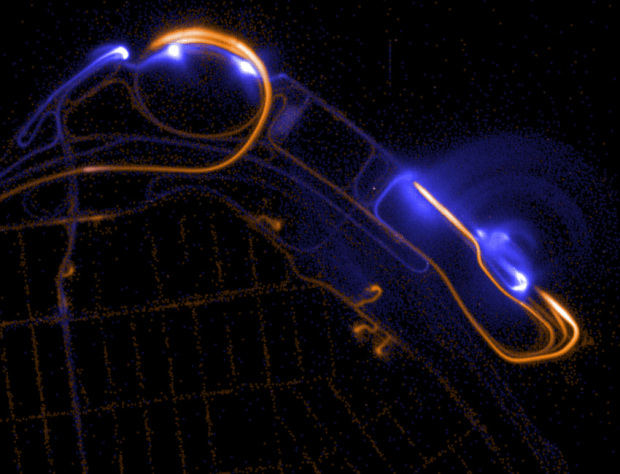
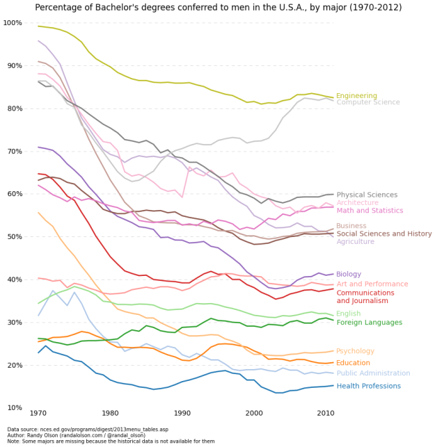
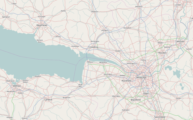
• How to Make a Connected Scatter Plot

    The combination of a time series chart and a scatter plot lets you compare two variables along with temporal changes.

  • Alexander Chen visualized “You Still Believe in Me” by the Beach Boys.

    This is a visualization of Beach Boys vocals inspired by the physics of church bells. Using a mathematical relationship between a the circumference of a circular surface and pitch, I wrote code that draws a circle for each note of the song.

  • Google released a 21-part short video series that introduces R. Most of the videos are about two minutes, with none of them going over six, and each one is a on focused task or concept. So this could be a good way to start. Just open R, start a video, and follow along.

    Here’s the first video in the series. It shows you how to write a simple script and navigate:

    [via Revolutions]

  • Some readers asked about career choices in visualization recently, and I was about to write a response until I remembered I already did in 2008. A few group names changed and examples in some areas are easier to come by, but most of it is still valid.

    You still find a lot of jobs in journalism, business-related analytics, at design studios, research labs (academic and industry), and freelance. It seems like there are more opportunities now than there were then. There are also a lot more tech-related jobs now. In 2008, Twitter hadn’t quite hit mainstream yet and most parents weren’t on Facebook, whereas now, web companies sit on more data than they can interpret.

    There are visualization jobs pretty much wherever there is data. Which is practically everywhere.

    That said, there’s also more competition for these jobs, and high school science fair Microsoft Excel experience probably won’t be enough to get you the job you want.

    So one more important addition to the 2008 post: Learn statistics. It still surprises me how little statistics visualization people know (generally speaking of course). Look at job listings though, and most employers list it in the required skill set, so it’s a big plus for you hiring-wise.

  • It’s easy to think of online activity as a whirlwind of chatter and battles for loudest voice, because, well, a lot of it is that. We saw it just recently with the burst of emojis and what happens in just one second online. But maybe that’s because people tend to present the bits that way. Stephen LaPorte and Mahmoud Hashemi approached it differently in Listen to Wikipedia.

    The project is an abstract visualization and sonification of the Wikipedia feed for recent changes, which includes additions, deletions, and new users. Bells, strings, and a rich tone represent the activities, respectively. Unlike other projects that attempt to hit you with an overwhelmed feeling, Listen oddly provides a calm. I left the tab open in the background for half an hour.

    Listen is open source.

  • Dustin Cable, a demographer at the University of Virginia’s Weldon Cooper Center for Public Service, added another dimension to Brandon Martin-Anderson population map. The racial dot map by Cable draws a dot for each person in the United States based on the 2010 census and colors by ethnicity.

    This map is an American snapshot; it provides an accessible visualization of geographic distribution, population density, and racial diversity of the American people in every neighborhood in the entire country. The map displays 308,745,538 dots, one for each person residing in the United States at the location they were counted during the 2010 Census. Each dot is color-coded by the individual’s race and ethnicity. The map is presented in both black and white and full color versions. In the color version, each dot is color-coded by race.

    It’s like a dottier version of the maps by The New York Times back in 2010. Or the originals by Bill Rankin who drew a dot for every 25 people.

    Keep in mind this is all based on freely available data from the National Historical Geographic Information System. They have data that goes back to 1790.

  • In a straightforward view of online activity, Designly shows the approximate number of tweets, likes, votes, and so forth that happen in one second. There’s a lot of stuff going on, as you might guess. The tickers for each activity are a nice touch.

  • Google search suggestions have transformed into a never-ending source of entertainment and a candid peek into what people look for in the world. We’ve seen insecurities change with age and stereotypes of states in the US. Noah Veltman banked on the locality of suggestions for a country-specific view of the world. He shows suggestions for the same query for the United States, Canada, the United Kingdom, Australia, and New Zealand.

    For example, a search for “why is America” in each country depicts stereotypes and national curiosities about why America is so fat, rich, and better than Canada. Scroll down and you see suggestions for “how to”, “why is there”, and “why does everyone” which interestingly shows many of the same wonderings.

    Now if you’ll excuse me, I have to go eat bacon and swim in my pool of gold coins while I browse through my vastly superior Netflix selection.

  • If you’re like me, you often wonder how big the Stay Puft Marshmallow Man is relative to Godzilla or how Godzilla compares to King Kong. Wonder no more. Sixteen-year-old deviantART user Lexinator117 compared the size of everything. The giant graphic is a mix of fictional characters and objects with a handful of real-life, like the Statue of Liberty and the Mayflower.

  • Wired has a fun Netflix interview on the behind-the-scenes work on the recommendation engine.

    If you liked 1960s Star Trek, the first non-Trek title that Netflix is likely to suggest to you is the original Mission: Impossible series (the one with the cool Lalo Schifrin soundtrack). Streaming the latest Doctor Who is likely to net you the supernatural TV drama Being Human (the UK version). Watch From Dusk Till Dawn and 300 and say hello to a new row on your homepage: Visually Striking Violent Action & Adventure. Trying to understand the invisible array of algorithms that power your Netflix suggestions has long been a favorite sport, but what’s actually going on in that galaxy of big data, those billions and billions of ratings stars? Turns out there are 800 Netflix engineers working behind the scenes at their Silicon Valley HQ. The company estimates that 75 percent of viewer activity is driven by recommendation.

    Some days you just want slouch back on the couch after a long day’s work and watch Hot Tub Time Machine.

  • Gratuitous piesI’m not entirely sure where this came from, but it’s from someone who describes himself as “an innovation leader in delivering analytics.” Yep. The 3-D. The layering. The piemaster. [via]

  • August 6, 2013

    Topic

    Maps  / 

    What would Pangea look like if today’s political boundaries were drawn on it? Like this. [via]

  • I have yet to see a full episode of Doctor Who, “the longest-running…

  • The title caption reads: “A classmate was caught using his phone in maths. The teacher took his phone and set a passcode. He gave him this back with his phone and said good luck unlocking it.”

    Passcode problem

    Hopefully the student was the guy who sits in the back and goofs off because the class is too easy. [via @FryRsquared]

  • BreweryMap, a Google Maps mashup and mobile app, provides two main functions. The first is that it tells you where the nearest brewery is so that you’ll never go thirsty again. The second and far more important function is that you can punch in two addresses, and BreweryMap tells you all the breweries that are on the way from point A to point B.

    Let your fantasy become a reality. Just make sure to spread out your trips.

  • BreathingEarthJohn Nelson of IDV Solutions strung together satellite imagery for dramatic animated GIFs.

    Having spent much of my life living near the center of that mitten-shaped peninsula in North America, I have had a consistent seasonal metronome through which I track the years of my life. When I stitch together what can be an impersonal snapshot of an entire planet, all of the sudden I see a thing with a heartbeat. I can track one location throughout a year to compare the annual push and pull of snow and plant life there, while in my periphery I see the oscillating wave of life advancing and retreating, advancing and retreating. And I’m reassured by it.

  • Patrick Burns for Deadspin watched 23,000 minutes of SportsCenter, keeping track of the specifics of what the show covered over the year, such as what teams, players, and player descriptions.

    The graphic above, by my fellow Deadspinner Reuben Fischer-Baum, shows the correlation between winning percentage—or points, in the case of the possibly nonexistent NHL—and SportsCenter mentions for teams across the four major leagues.* Our focus here is on just what about a team attracted the attention of SportsCenter’s all-seeing eyebeams over the course of a normal season. Our conclusion is that there was a reasonably strong correlation between winning percentage and SportsCenter mentions. It was statistically significant for all leagues except the NHL.

    Unfortunately, they did not track how many times commentator predictions were completely wrong.

  • Mike Pelletier experimented with quantified emotion in his piece Parametric Expression. This is what you get when you break facial expressions and mannerisms into bits: part human, part creepy.

    [via Boing Boing]

  • After budget cuts a couple of years ago, I assumed Data.gov was all but dead, but apparently there’s a new site in the works.

    The original version of Data.gov was hard to use, and you rarely found the data you wanted. I always ended up on Google and landed on the department’s source instead. It looks like they improved the interface, and their aim is towards a community built around the data where people can share projects and analyses.

    However, the data available on the site still looks slim and dated, which was a challenge with the original version. I mean the homepage says you can search 100s of APIs and over 75,000 datasets, but then click over to the Data Catalog and it says only 409 datasets found. So there’s still work to be done.

    I’m glad the project is still alive though. We’ll have to see where this goes.