Earthquakes are in the news a lot lately. A quick search shows a 7.6 off the coast of the Solomon Islands, a 6.6 in Nicaragua, and a 7.1 off the southwest coast of Papua New Guinea, and this was just last week. Not good news at all, but just how common are these earthquakes? Can we look back farther? Yes. In addition to a real-time feed of earthquakes, the United States Geological Survey maintains an ever growing archive of earthquakes detected around the world, and they make it easy to query and download.
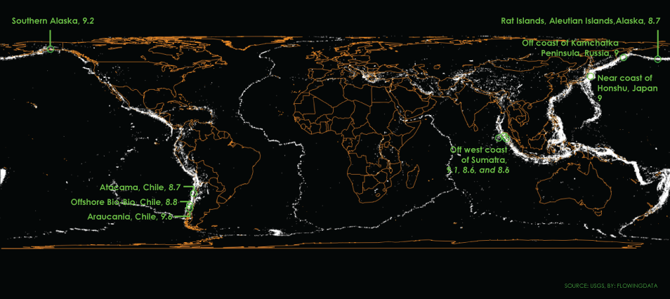
The map above shows the past century of known earthquakes with a magnitude of at least 5. (There are actually nearly a million earthquakes per year, but most of them are not felt. A earthquake of magnitude 5 might cause damage to buildings.) Each white dot is a quake, of which there were about 72,000, and as you’d expect, you get a sense of plates tectonic boundaries.
The ten earthquakes of highest magnitude in the past 100 years are highlighted green.
Make the map
Because the data is already there, it’s trivial to map in R. Just (1) download CSV data from USGS; (2) use map() from the maps package to draw a base map; and (3) project points with mapproject() and add them to the map.
library(maps)
library(mapproj)

# Load data
quakes <- read.csv('http://datasets.flowingdata.com/earthquakes1974.csv')

# Draw map
par(mar=c(0,0,0,0))
map("world", col="orange", bg="#000000", fill=FALSE, interior=TRUE, lwd=0.5, projection="cylequalarea", par=0, wrap=TRUE)

# Add points
ptsproj <- mapproject(quakes$longitude, quakes$latitude)
points(ptsproj, pch=20, cex=0.15, col="#ffffff40")

# Circle the highest magnitude quakes
quakes.o <- quakes[order(quakes$mag, decreasing=TRUE),]
majorpts <- mapproject(quakes.o$longitude[1:10], quakes.o$latitude[1:10])
symbols(majorpts, circles=rep(0.03, 10), add=TRUE, inches=FALSE, fg="green", lwd=2)
Note that the dataset linked in the code is just a small sample of what’s available.
Of course, there’s much more to look at here than just an aggregate map. In addition to latitude and longitude, the data includes time, depth, magnitude, and more specifics about location. USGS also goes back farther than a century. Hopefully this helps you get started.
Become a member. Support an independent site. Make great charts.
See What You Get
