
David Taylor looked for words in Billboard song titles that appeared during a given decade more than other decades. Then he charted usage for the top five of each decade, going back to 1890.
Read More
David Taylor looked for words in Billboard song titles that appeared during a given decade more than other decades. Then he charted usage for the top five of each decade, going back to 1890.
Read More

China blocks sites from its citizens. We know this. But, what do they block and to what extent? Sisi Wei for ProPublica tracked major news homepages with the help of transparency site GreatFire.org and archived the pages for the sampled days.
Read More
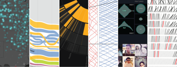
It’s always tough to pick my favorite visualization projects. Nevertheless, I gave it a go.

I’m pretty sure there’s a ton of untapped potential in data represented physically. Maybe not in the analytical insights sense but in that fuzzy unmeasured way of feeling data somehow. That might be my new point of interest for next year, and it’ll probably involve beer and LEGOs. Pierre Dragicevic and Yvonne Jansen maintain a chronological list of physical visualization, dating back to 5500 BC up to present.

When a baseball player is hitting well, commentators will sometimes say that it looks like he’s hitting with a bigger bat out there. The ACME Catalog, a creative technology studio, took the phrase to a more literal sense. They used baseball bats to represent on-base plus slugging (OPS), “the ability of a player both to get on base and to hit for power,” for standout players during the regular season versus the World Series.
Read More
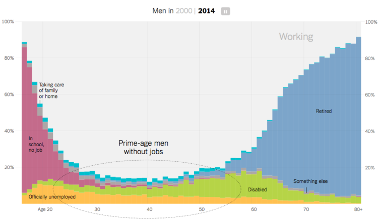
Recent data from the Census Bureau suggests the rate of non-working men has increased. As more women go to work and more men stay at home to take care of the kids, you’d expect for the number of stay-at-home dads to contribute significantly to that rate. But maybe not. There are more noticeable factors to consider like retirement age, disability, and going to school. Amanda Cox for the Upshot has graphs for you.
See also where the men aren’t working.
You make and publish bits of data about yourself, intentionally and unintentionally, and it goes to the indexed public web or to companies’ private black boxes. Ben Goldacre explains why it’s worth caring about these traces. It’s less hoorah and more example-driven than these sort of articles tend to be, and there’s isn’t a single mention of being awash in data.
At the simplest level, even the act of putting lots of data in one place — and making it searchable — can change its accessibility. As a doctor, I have been to the house of a newspaper hoarder; as a researcher, I have been to the British Library newspaper archive. The difference between the two is not the amount of information, but rather the index. I recently found myself in the quiet coach on a train, near a stranger shouting into her phone. Between London and York she shared her (unusual) name, her plan to move jobs, her plan to steal a client list, and her wish that she’d snogged her boss. Her entire sense of privacy was predicated on an outdated model: none of what she said had any special interest to the people in coach H. One tweet with her name in would have changed that, and been searchable for ever.
Before you say you’re not the woman on the phone and that you have nothing to hide, also read this.
When you have your phone’s Wi-Fi turned on, even if you’re not connected to anything, you broadcast the networks you’ve connected to, which in turn can reveal your location history. Ars demonstrated with a handful of test phones and a low-powered Wi-Fi monitor.
The results were not surprising to us, but they are still eye-opening, and indicative of the security and privacy risks that result from wandering around with Wi-Fi turned on but not connected. We were able to match specific devices with recent (and some not really recent) movements of the owners of the phones—where they worked, where their homes were, and in some cases where they had shopped recently—using publicly available Wi-Fi base station mapping data.
Off goes the Wi-Fi.
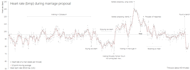
The moments leading up to a marriage proposal can be both exciting and nerve-racking. Will s/he say yes? What if I fumble up the words? Am I walking towards a disaster? Then it happens, everything blurs together, and the moment makes its way back to normal.
Reddit user sesipikai tracked his proposal during a trip to Italy. He happened to be wearing a heart rate belt, and you can see the rise and fall of beats per minute leading up to the question.
Walk. Ask. She says yes. Bask in the happiness. Find a bench.
Ah, the little bits of narrative totally make the chart.

Before you can do anything with data, you have to get it into the application. Working with an Arduino is no different. Although the process is changes, if you’re used to working with desktop software.

Photographer Marion Luttenberger used physical objects and people as her visual cues in lieu of digital bars and lines. The results are striking. Note: The annotation is in German but nothing Google Translate can’t handle.
Reminiscent of Peter Orntofts’ series from a few years ago.

Martin Wattenberg and Fernanda Viegas from Google Research ran with the book metaphor for visualization in their talk at Tapestry 2014. Unlike some who bash projects that don’t fit a narrow specification, Wattenberg and Viegas argue that visualization spans various genres. The key is to know your genre and create accordingly.
Read More
Gift-buying season is in full swing, and it’s time to get stuff for your loved ones. But, it has to be tangible, because stuff that occupies space in the physical world is how you tell someone you love him or her by that amount. I know this, because the UPS truck that delivers to my neighborhood had an additional trailer rigged to the back full of it.
Here are some data-ish printed things to show your loved ones that you care. We’re approaching last-minute territory for packages that don’t arrive with an Amazon smiley on the side.
Read More
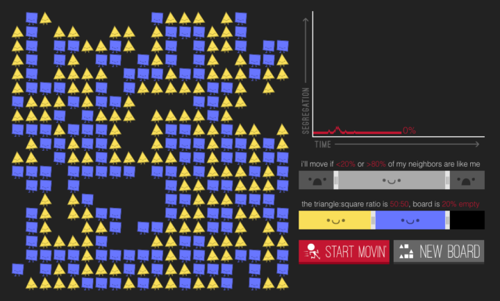
In 1971, Nobel laureate economist Thomas Schelling proposed that a desire to have neighbors of the same race — even a small percentage — can lead to segregation. The model has been simulated through a variety of interactives before, but in Parable of the Polygons, Vi Hart and Nicky Case put extra effort into teaching the model, bringing playfulness to an otherwise serious subject.
Two groups of people are encoded as shapes — squares and triangles — and they take you through each step of the model. Use the sliders to adjust thresholds and population distributions, and run the simulation. The shapes on the left move if they’re looking for similarity, and the line chart on the right shows segregation over time.
You end up with an understanding of how segregation works (however simplified this model might be) and a glimmer of hope of how we might shift directions.
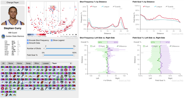
Sports loves conditional distributions. What does Joe Billy Bob typically do against such and such team? How does play differ in wins and losses? And a lot of the data is easily accessible, which makes it straightforward to answer these questions. Buckets, by Peter Beshai, uses NBA data to explore shot selection with plenty of conditionals.
Read More
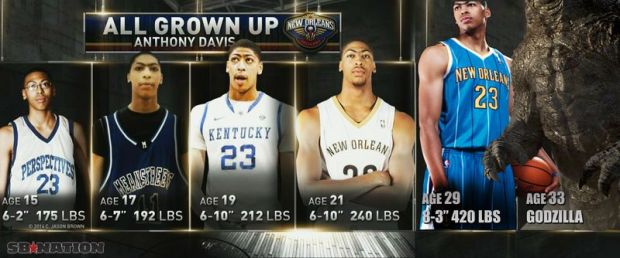
TNT described NBA player Anthony Davis’ growth and accompanied the discussion with a graphic that showed a picture of Davis over the years. To drive the point home I guess they made the image of Davis bigger each step. SB Nation had some fun with predictions of Davis’ future. The NBA is going to have a heck of time adjusting the rules for Godzilla.
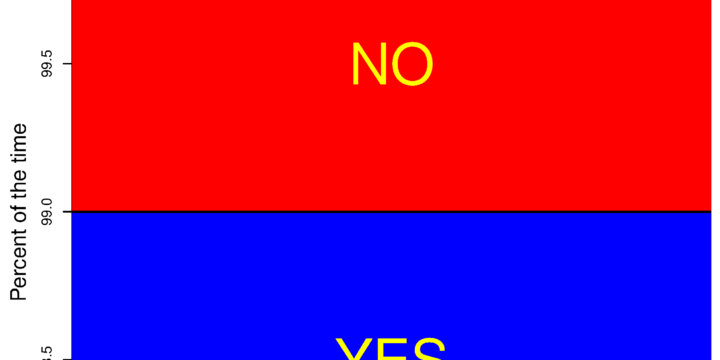
Sweet, I guess Fox News had it right all along. I’m going to save a ton of space by truncating my vertical axes from now on. I just might go back and retrofit all of my old charts too. [via Reddit]
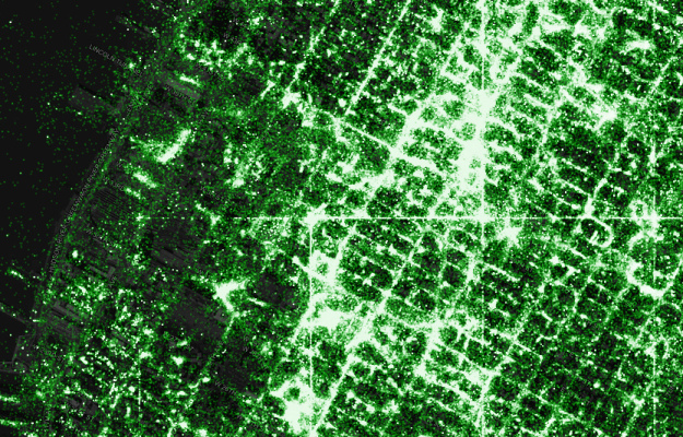
Eric Fischer, known around these parts for his detailed dot maps, describes his process along with a code release.
I’ve been tracking geotagged tweets from Twitter’s public API for the last three and a half years. There are about 10 million public geotagged tweets every day, which is about 120 per second, up from about 3 million a day when I first started watching. The accumulated history adds up to nearly three terabytes of compressed JSON and is growing by four gigabytes a day. And here is what those 6,341,973,478 tweets look like on a map, at any scale you want.
I’ve open sourced the tools I used to manipulate the data and did all the design work in Mapbox Studio. Here’s how you can make one like it yourself.
Three main steps (not including data collection): filter out noise and duplicates, generate map tiles, and style to your liking.

Motion Exposure, a photography project by Stephen Orlando, captures movement patterns with light.
I’m fascinated with capturing motion through time and space into a single photograph. Using LED lights with custom color patterns and long exposure photography, I’m able to tell the story of movement. This technique reveals beautiful light trails created by paths of familiar objects. These light trails have not been artificially created with Photoshop and represent the actual paths of the objects.
The above shows kayaking movements, which is just one of many activities including canoeing, soccer, karate, and bike polo. See it all in the Orlando’s galleries. [via Colossal]
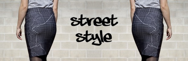
Monochome, a new service brought to you by Rachel Binx, lets you make custom clothes printed with maps. It’s not just major cities though. No that’s for chumps. Using OpenStreetMap data, you select a location, choose the style of map, and pick your clothing item, and you’ve got your custom map print to wear. You can currently choose among a tank top, pencil skirt, flare skirt, and t-shirt.
Get your order in this week to ensure you receive your item for Christmas. Even if you’re not looking to get anything, it’s kind of fun to play around with the interface that lets you create an item.
 Visualize This: The FlowingData Guide to Design, Visualization, and Statistics (2nd Edition)
New tools, refined process.


