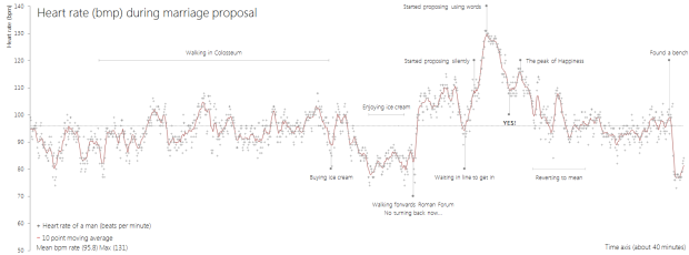
• Visualization online can be a challenge if you don’t know how to program. Analytics startup Trifacta just lightened the load with Vega, a “visualization grammar” that lets you create and share by editing a JSON file. Check out the demo live editor to see how this works. Select different chart types from the drop down menu on the top left, which you can render in HTML5 Canvas or SVG.

    Of note: Vega is built on top of Data-Driven Documents.

    To get right to the point: Vega is NOT intended as a “replacement” for D3. D3 is intentionally a low-level system. During the early design of D3, we even referred to it as a “visualization kernel” rather than a “toolkit” or “framework”. In addition to custom design, D3 is intended as a supporting layer for higher-level visualization tools. Vega is one such tool, and leverages D3 heavily within its implementation.

    Gonna keep an eye on this one.

  • For the past few months, Stamen Design has been working with 3-D data from Nokia’s Here. Something pretty came out of the experiment.

    For your viewing, embedding, linking, and otherwise internet-ing pleasure: http://here.stamen.com/ is live today. It uses 3D data from HERE for San Francisco, New York, London, and Berlin to create city-wide 3D browsable maps, and it does this in the browser (though you’ll need a WebGL-enabled browser to see it). As in many of our other mapping projects, the urls change dynamically depending on location and other factors, and the data conforms, more or less, to the Tile Map Service specification. What this means, among other things, is that it’s not only possible to link to and embed these maps at specific locations and zoom levels, but that it’s easy—and as we’ve seen with Citytracking, easy is good.

    There are a bunch of views to play with, and you should try all of them. My favorites though are the city-planning look in Pinstripe and the glowing aesthetic of the height view.

  • Tips on making it through, what I would tell my previous self going in, and advice on taking advantage of the unique opportunity that is graduate school.

  • FlowingData reader Amir sent this along. In lieu of a list of coffee drinks, this place in in East London opted for ingredient breakdowns. I’m guessing there’s a standard menu outside the frame, because otherwise, coffee neophytes (like me) would have no clue what to do. Anyone care to fill in the blanks?

    Spot any charts in the wild? You should email me a picture.

  • The shooting at Sandy Hook Elementary School was horrible, but there have been thousands of gun deaths since. Huffington Post is mapping them.

    Circles represent the number of deaths in a city, and the larger a circle the higher the count. A bar chart on the bottom shows the data over time and serves as a navigation device. Click on a day or a location, and the names of victims appear on the right with a link to the related news story.

    See also: Periscopic’s work on the topic, which now has filters and is updated in real-time.

    Also: episodes 487 and 488 of This American Life, which focus on Harper High School in Chicago, where gang violence is a daily concern.

  • Metrico is a puzzle action game for PlayStation Vita that centers around charts and graphs. The creators call them infographics, but whatever.

    The idea has been in our heads for a few years, and was born out of noticing how beautiful infographics can look as an art form. It was reinforced by seeing that infographics have become increasingly important in contemporary pop-culture. While they haven’t made their way to videogames yet, we think it’s a place where they can work exceptionally well. This is not just because of their pretty aesthetics as much as it is about actively changing data and how that can be visualized.

    The teaser above shows a guy running on and jumping over bar and line charts, and the last sentence of the paragraph seems to suggest that these things will be based on actual data. I kind of doubt it though.

    How about a SimCity-like game that uses real-time crime, traffic, and government data? Now that’d be something. They already kind of do that for sports games with injuries and starting lineups. [Thanks, Raphael]

  • When you go to one of the major sites to look up the weather, it’s often hard to find what you’re looking for. The sites feel dated, there isn’t much hierarchy to the information, and navigation gets buried in the show-as-much-information-as-possible-on-the-same-page approach. Forecast, a site by the makers of the Dark Sky app, hopes to improve that experience during those times you need more than the high and lows for the day from the nearest widget.

    When you visit Forecast, you notice a difference right away. There’s a map with local, regional, and global views, the temperature in large print on the right, and there are descriptions about what to expect that are easy to understand.

    From there, you get your daily forecasts below the map with details on demand. So you can get a lot of the same information that you get from larger sites, but you don’t get hit with a bunch of data at once, and when you request more information, you get it quickly.

    There’s also an API. Forecast and the Dark Sky app both run on it, which is the cherry on top of the goodness.

    I usually go to Matthew Ericson’s minimalist weather page when I’m figuring out when to ride my bike or mow the lawn. Forecast might be my new weather destination for a while.

  • Deputy editor at Ars Technica Nate Anderson was curious if he could learn to crack passwords in a day. Although there’s definitely a difference between advanced and beginner crackers, openly available software and resources make it easy to get started and do some damage.

    After my day-long experiment, I remain unsettled. Password cracking is simply too easy, the tools too sophisticated, the CPUs and GPUs too powerful for me to believe that my own basic attempts at beefing up my passwords are a long-term solution. I’ve resisted password managers in the past over concerns about storing data in the cloud or about the hassle of syncing with other computers or about accessing passwords from a mobile device or because dropping $50 bucks never felt quite worth it—hacks only happen to other people, right?

    But until other forms of authentication take root, the humble password will form a primary defense of our personal information. The time has come for me to find a better solution to generating, storing, and handling them.

    I use 1Password.

  • Along the same lines as their NFL fan maps, Facebook had a closer look at March Madness fandom, based on likes for team pages. In the map below, each county is colored by the conference liked the most.

    March Madness map

  • It’s hard to know the impact of drone attacks as outsiders looking in, because the United States government doesn’t disclose the information. Using data maintained by the Bureau of Investigative Journalism, which is estimates based on reports from the ground, Pitch Interactive sheds some light on every known drone attack in Pakistan.

    Since 2004, the US has been practicing in a new kind of clandestine military operation. The justification for using drones to take out enemy targets is appealing because it removes the risk of losing American military, it’s much cheaper than deploying soldiers, it’s politically much easier to maneuver (i.e. flying a drone within Pakistan vs. sending troops) and it keeps the world in the dark about what is actually happening. It takes the conflict out of sight, out of mind. The success rate is extremely low and the cost on civilian lives and the general well-being of the population is very high. This project helps to bring light on the topic of drones. Not to speak for or against, but to inform and to allow you to see for yourself whether you can support drone usage or not.

    Again, these are estimates, so the numbers might be higher or lower, but the point is that these attacks exist, and civilians and children are often involved.

  • As the publication of Data Points nears, I’m excited to hold it in my hands just like I was the first time. It feels weird to say that. In college, a 5-page report seemed like too much to handle, and I would hunt for fonts that took the most space and fiddled with margins to produce more pages, without making it look like I did. I guess a lot can happen in 10 years. Heck, a lot can happen in a few months.

    I think the difference is that now I’m writing about something that’s interesting to me — topics that I immerse myself in for fun — which makes the book-writing process fun.

    Sure, it can be challenging at times, but in the best way possible. Here’s my experience with Data Points.
    Read More

  • On Kickstarter: A project that uses a visualization of pi to connect Brooklyn high school students to their community.

    They’ve already made a histogram of emotions in their school’s hallway and a stacked area chart mural at a nearby senior center. Next up is a wall currently covered in graffiti.

    In Math class, students will construct the golden spiral based on the Fibonacci Sequence and begin to explore the relationship between the golden ratio and Pi. The number Pi will be represented in a color-coded graph within the golden spiral. In this, the numbers will be seen as color blocks that vary in size proportionately within the shrinking space of the spiral, allowing us to visualize the shape of Pi and it’s negative space.

    Backed.

  • Upon discovering hundreds of thousands open embedded devices on the Internet, an anonymous researcher conducted a Census of the Internet, mapping 460 million IP addresses around the world.

    While playing around with the Nmap Scripting Engine (NSE) we discovered an amazing number of open embedded devices on the Internet. Many of them are based on Linux and allow login to standard BusyBox with empty or default credentials. We used these devices to build a distributed port scanner to scan all IPv4 addresses. These scans include service probes for the most common ports, ICMP ping, reverse DNS and SYN scans. We analyzed some of the data to get an estimation of the IP address usage.

    It’s a pretty thorough analysis, but the conclusion interested me most:

    The why is also simple: I did not want to ask myself for the rest of my life how much fun it could have been or if the infrastructure I imagined in my head would have worked as expected. I saw the chance to really work on an Internet scale, command hundred thousands of devices with a click of my mouse, portscan and map the whole Internet in a way nobody had done before, basically have fun with computers and the Internet in a way very few people ever will. I decided it would be worth my time.

    It makes me feel…uneasy. [Thanks, Roger]

  • Do singer-songwriters age well like a fine wine, or does quality decline with age? Kyle Biehle analyzed fan ratings by age.

    I understand all of the reasons for not comparing artists in this way. Despite twenty-one Academy Award nominations, Woody Allen never attends the Oscars. His reason is that art isn’t competition — judging art is so subjective who’s to say who or what is best? After all one man’s Poison is another man’s Cream. Similarly, Elvis Costello (featured in the viz) is famously credited with saying: “Writing about music is like dancing about architecture – It’s a really stupid thing to want to do.” I agree that using ratings – whether from fans or critics — to judge artistic merit is at best flawed and at worst a fool’s exercise.

    But I wanted to do it anyway.

    Most peak in their 20s and either stabilize later on or continue to decline. Occasionally, as in the case with Bob Dylan, there’s some see-sawing. Take a look at the Tableau interactive for a closer look. [via Waxy]

  • If you listen to the radio long enough, you’ve probably noticed that many songs sound similar or remind of you of a song you’ve heard before. Hooktheory shows you just how similar some songs are via chord progressions in over 1,300 songs. The small group analyzed the data last year and presented some static charts, but this interactive version takes it a step further.

    Simply start by selecting a chord in the network diagram. Songs that use that chord appear on the right. Then select another chord in the network diagram to find songs that use the chord progression from the original to the new. Keep selecting chords to filter further.

    So in the end, there are two main things you can do: (1) Find songs that use the same chord progression and (2) see the most likely chord given the current selection.

    My musical knowledge from middle school jazz band is long gone, but it’s fun to explore, and you’ll likely find relationships to songs that you didn’t expect. [Thanks, Dave]

  • Emily Underwood on new cartographers and the growing field:

    Geographers have traditionally studied how the natural environment contributes to human society and vice versa, whereas cartographers have focused more explicitly on the art and science of mapmaking. Over the past couple of decades, a new field has emerged: geographical information systems (GIS), blending the study and expression of geographic information. Cartography and geography have overlapped and spawned innumerable subspecialties and applications. Modern geographers and cartographers are involved in diverse projects: tracking fleets of vehicles or products, helping customers locate a Dunkin’ Donuts, modeling environmental scenarios such as oil spills, and studying the spread of disease.

    You could substitute visualization and statistics for cartography throughout, and it’d almost all still be valid. The reoccurring theme is that although academic programs can be fine resources, most of your success has to do with what you can learn on your own, as data-related fields are changing fast.

  • How to be InterestingJessica Hagy, the one who made Venn diagrams on index cards popular, has a new book out today: How to be Interesting.

    You want to leave a mark, not a blemish. Be a hero, not a spectator. You want to be interesting. (Who doesn’t?) But sometimes it takes a nudge, a wake-up call, an intervention!—and a little help. This is where Jessica Hagy comes in. A writer and illustrator of great economy, charm, and insight, she’s created How to Be Interesting, a uniquely inspirational how-to that combines fresh and pithy lessons with deceptively simple diagrams and charts.

    The book started from this, which could probably also stand in as a guide on how to enjoy life.

  • cubesIt wasn’t long ago that sensors and personal tracking seemed like pure nerdery. In the early stages of graduate school — before smartphones were popular or even widely available — I played around with sensors that had finicky battery life and Internet connectivity, the software was buggy, and the hardware looked clunky.

    New tracking devices pop up regularly these days. They’re built and designed for a wider audience, and sometimes to my surprise, the devices are embraced by the target audience. It started with personal trackers that are fitness and health-related, but people are branching out now to monitoring their surroundings.

    Two showed up on my radar this past week: CubeSensors and Thermodo.
    Read More

  • Each year, Oscar speeches seem to follow a similar format, with familiar names and groups sputtered in 30 seconds. For her master’s project, Thank the Academy, digital media student Rebecca Rolfe explored these patterns.
    Read More