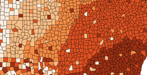
• Viviana Ferro, Ilaria Pagin, and Elisa Zamarian had a look at all of Zeus’s relationships according to many authors over the years. Each person on the inside of a circle represents a lover, and the colored branches connect to children. Start with Zeus, the largest black dot near the middle, and then work your way out.

  • My life in graphsMy friends just got this for me, and it’s pretty much the perfect gift, especially since my dissertation is about journaling and personal data collection. My Life in Graphs: A Guided Journal is a book of blank charts and graphs, and you fill in the blanks. For example, there’s a map to mark your travel destinations and an x-y plot to evaluate “bucket-list viability.”

    I worked on mine a couple of days ago and showed it to my wife. She said I was like a kid showing off his homework. I think that’s a good thing.

  • Tom Cheesman of Swansea University, along with Kevin Flanagan and Studio NAND, dives into translations of Shakespeare’s Othello with TransVis.

    TransVis collects, digitises, analyses and compares translations and variations of literary works. In an initial prototype named VVV (»Version Variation Visualisation«), we have proposed analysis methods, interfaces and visualization tools to explore 37 translations of Shakespeare’s Othello into German with more works translated into other languages to come.

    The map is more of a browser to see where specific publications were written, rewritten and published, but I wonder if you’ll see anything interesting if you looked at just where something is rewritten or translated. It’d be like seeing ideas spreading. Or you know, Twilight copies.

  • Reality Prose has an excellent analysis on the changing price of LEGO bricks over the years and a misconception that cost has gone up. According to the chart above, based on data from BrickSet and adjusted for inflation, the average cost per brick has come down.
    Read More

  • David Brooks for The New York Times on the philosophy of data and what the future holds:

    If you asked me to describe the rising philosophy of the day, I’d say it is data-ism. We now have the ability to gather huge amounts of data. This ability seems to carry with it certain cultural assumptions — that everything that can be measured should be measured; that data is a transparent and reliable lens that allows us to filter out emotionalism and ideology; that data will help us do remarkable things — like foretell the future.

    Be sure to read the comments. There’s actually quite a bit of anti-data talk.

  • From Reddit user ddurrr while visiting London. Pretty much my current status and mental capacity. [Thanks, Tom]

  • Information visualization firm Periscopic just published a thoughtful interactive piece on gun murders in the United States, in 2010. It starts with the individuals: when they were killed, coupled with the years they potentially lost. Each arc represents a person, with lived years in orange and the difference in potential years in white. A mouseover on each arc shows more details about that person.
    Read More

  • In Waters Re~ artist Xárene Eskandar placed video of the same landscape at different times of day in parallel.

    They capture the subjective and perceptual qualities of time expressed as events, moments, memory and landscape. The goal is to break the linear experience of time, allowing viewers to perceive multiple times within a single viewpoint. As a result insignificant moments become significant events, heightening one’s experience of the landscape and one’s existence in that particular moment in time and space.

    The results are beautiful. [via FastCo]

  • ad-spending-and-profits-smallerRitchie King for Quartz compared money spent on Super Bowl ads — now about $3.75 million for a 30-second spot — to how much the companies make on average in 3 and a half hours (the average length of a game).

    It’s impossible to say exactly how much a successful Super Bowl ad ultimately earns a company. Surely the Wassup commercials were a huge boon for the Budweiser brand—but how huge?

    One thing is clear though: for the biggest advertisers, that $3.75 million is truly a pittance. In fact, some of them make almost as much in profits in an average 3.5 hours—roughly the time it takes to air the Super Bowl itself.

    Note that spending (on the bottom) is total between 2002 and 2011, and the vertical scales are different (so it probably would’ve been good to give more visual separation between the two charts), but still, kind of an interesting perspective.

  • Biostatistics PhD candidate Hilary Parker dived into the most poisoned names in US history. Her own name topped the list. There were several fad names such as Deneen, Catina, and Farrah that saw a quick spike and then a plummet, but the trend for Hilary is different.

    “Hilary”, though, was clearly different than these flash-in-the-pan names. The name was growing in popularity (albeit not monotonically) for years. So to remove all of the fad names from the list, I chose only the names that were in the top 1000 for over 20 years, and updated the graph (note that I changed the range on the y-axis).

    I think it’s pretty safe to say that, among the names that were once stable and then had a sudden drop, “Hilary” is clearly the most poisoned.

    There it is minding its own business, enjoying a steady rise in popularity over a few decades, and then boom, Bill Clinton is elected, and the name dies a quick death.

    Be sure to check out the rest of the analysis. Good stuff. [Thanks, @hspter]

  • The Mercator projection can be useful for giving directions, but when it comes to world maps, the projection doesn’t hold up well as you move far north and south. By how much? Give this puzzle game a try and match the red boundaries to their respective countries.

  • Carlos Scheidegger and Kenny Shirley, along with Chris Volinsky, visualized Major League Baseball Hall of Fame voting, from the first class in 1936 (which included Babe Ruth) up to present.

    All a fan can do is accept that Baseball Hall of Fame voting, conducted by the Baseball Writers Association of America (BBWAA), is a phenomenon unto itself. If we can’t understand baseball Hall of Fame voting, though, maybe the next best thing is visualizing the data behind it. The set of interactive plots on this webpage is our attempt to do that. We were especially interested in two things: (1) viewing the trajectories of BBWAA vote percentage by year for different players throughout history, and (2) simultaneously viewing the career statistics of these players, to help find patterns and explain their trajectories (or to reassure ourselves that the writers really are crazy).

    The interactive is on the analysis side of the spectrum, so you might be a bit lost if you don’t know a lick about baseball. However, if your’re a baseball fan, there’s a lot to play around with and dimensions to poke around at, as you can filter on pretty much all player stats such as home run count, batting average, and innings played. At the very least, you’re getting a peek at how statisticians pick and prod at their data.

    Start at the examples section for quick direction. I eventually found myself looking for downward trajectories. Poor Mark McGwire. [Thanks, Chris]

  • As the Super Bowl draws near, Facebook took a look at football fandom across the country.

    The National Football League is one of the most popular sports in America with some incredibly devoted fans. At Facebook we have about 35 million account holders in the United States who have Liked a page for one of the 32 teams in the league, representing one of the most comprehensive samples of sports fanship ever collected. Put another way, more than 1 in 10 Americans have declared their support for an NFL team on Facebook.

    It’s a fairly straightforward geographic breakdown based on the most liked team in each county, as shown above. So you can kind of see where rivalries come from.
    Read More

  • We’ve all seen rain maps for a sliver of time. Screw that. I want to see the total amount of rainfall over a ten-year period. Bill Wheaton did just that in the video above, showing cumulative rainfall between 1960 and 1970. The cool part is that you see mountains appear, but they’re not actually mapped.

    The hillshaded terrain (the growing hills and mountains) is based on the rainfall data, not on actual physical topography. In other words, hills and mountains are formed by the rainfall distribution itself and grow as the accumulated precipitation grows. High mountains and sharp edges occur where the distribution of precipitation varies substantially across short distances. Wide, broad plains and low hills are formed when the distribution of rainfall is relatively even across the landscape.

    See also Wheaton’s video that shows four years of rain straight up.

    Is there more recent data? It could be an interesting complement to the drought maps we saw a few months ago. [Thanks, Bill]

  • I’m almost certain this relationship is significant. Side note: Is there a meaningless-correlations tumblr yet? [via]

    Internet Explorer vs Murder Rate

  • Arthur Buxton plotted the most common colors of Penguin Publishing science fiction colors and arranged them over time. Also available in print.

    Changing science fiction colors

    I wonder if there’s a good way to show connections between the titles or the different covers for each title.

  • How wealthy are the richest people in the world? How do they compare to each other, and how does their net worth change over time? Bloomberg just put up an interactive tool to answer such questions, and it’s updated daily with new data.
    Read More

  • Data Points: Visualization that Means SomethingFor the past year, I’ve been working on Data Points: Visualization that Means Something, and you can pre-order it now.

    Visualization has grown a lot in the 5-something years I’ve written for FlowingData. It’s not just a tool for analysis anymore. Visualization is a way to express data, and it comes in the form of information graphics, entertainment, everyday interfaces, data art, and yeah, tools, too. Your approach to data and visualization changes based on application.

    But even with all these (awesome) new applications, there’s a constant across all of them: the data.

    Data Points starts here, and takes you through the process of understanding data, representing it, exploring it, and designing for different applications. Whereas Visualize This was about getting your feet wet with lots of code examples, Data Points is code-independent and is a perfect complement that helps you understand and allow others to understand data better, which is sorta the whole point.

    The manuscript is written, the 240 graphics (by me and many of your favorites) are set, and I’m really happy with how it turned out.

    It’ll officially be out late March or early April. Crazy, nerve-racking, and exciting all at the same time.

    More details to come. Until then: pre-order the book today.

  • Thanks to Sha Hwang, you can now siltscan videos on YouTube and Vimeo with an easy-to-use bookmarklet. Just go to the video and click. In case you’re unfamiliar with the technique, here’s a description from Golan Levin:

    Slitscan imaging techniques are used to create static images of time-based phenomena. In traditional film photography, slit scan images are created by exposing film as it slides past a slit-shaped aperture. In the digital realm, thin slices are extracted from a sequence of video frames, and concatenated into a new image.

    Be sure to switch over to HTML5 on YouTube or Vimeo first. The bookmarklet won’t work with Flash.

  • During a two-week visualization course, Momo Miyazaki, Manas Karambelkar, and Kenneth Aleksander Robertsen imagined what a body of text would be without the the silent letters in silenc.

    silenc is based on the concept of the find-and-replace command. This function is applied to a body of text using a database of rules. The silenc database is constructed from hundreds of rules and exceptions composed from known guidelines for “un”pronunciation. Processing code marks up the silent letters and GREP commands format the text.

    So nothing too fancy on the analysis side, but the experimental views are kinda interesting to see. [via @alexislloyd]