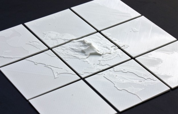
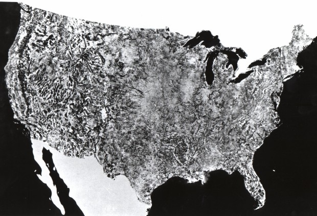
• In a follow-up to their map of racist tweets towards Barack Obama, the folks at Floating Sheep took a more rigorous route to get around the challenges of sentiment analysis. Over 150,000 geotagged tweets against races, sexuality, and disabled were manually classified and mapped.

    All together, the students determined over 150,000 geotagged tweets with a hateful slur to be negative. Hateful tweets were aggregated to the county level and then normalized by the total number of tweets in each county. This then shows a comparison of places with disproportionately high amounts of a particular hate word relative to all tweeting activity. For example, Orange County, California has the highest absolute number of tweets mentioning many of the slurs, but because of its significant overall Twitter activity, such hateful tweets are less prominent and therefore do not appear as prominently on our map. So when viewing the map at a broad scale, it’s best not to be covered with the blue smog of hate, as even the lower end of the scale includes the presence of hateful tweeting activity.

    Hard to believe this stuff is still around. It looks like I might want to stay clear of some parts of Virginia. (The aggregation at the national level seems a bit aggressive. When you zoom in on the map, the polarity between the east and west doesn’t seem so strong.)

    Update: Be sure to read the FAQ before making snap judgements.

  • It’s hard to believe it’s been over a month since Data Points: Visualization That Means Something hit the shelves. Thanks to all of you for the tweets, emails, and pictures of the book in the wild. Every one make me smile, and I’m glad that people are finding it helpful.

    In case you’re still deciding, here’s a sample chapter from the book. It’s Chapter 3 on representing data and should give you a good idea of what to expect. And of course it’s way sexier in print.
    Read More

  • This is my first time hearing about this, probably because it only happens every 17 years. After 17 years of development in the ground (getting nourishment from tree roots), the Cicada insects are starting to swarm on the east coast. Hundreds of millions of them mate, make a lot of noise, and then die. Adam Becker and Peter Aldhous for New Scientist mapped data maintained by John Cooley and Chris Simon from the University of Connecticut to show the cycles of the Cicada.

    There are 17-year broods, which is what’s happening now, and there are 13-year broods, with the next one expected next year in Louisiana.

    Click the play button on the top right to see the various broods appear over time, and be sure to turn on the audio (in the left panel) for added flavor. [Thanks, Peter]

  • May 9, 2013

    Topic

    Maps  /  ,

    Terrence Fradet of Fathom Information Design ponders whether metro maps suffer or benefit by leaving out geography. Geographic accuracy is good, but sometimes it can confuse your audience.

    Just how important is it that metro maps represent geography? This piece came from an interest in how metro maps over the past century have tiptoed between geographic and topological representations—topological meaning to forgo all spatial integrity and instead represent the connectivity of a specific environment.

  • When you focus on all the small events and decisions that happen throughout a single day, those 24 hours can seem like an eternity. Graphic designer Luke Twyman turned that around in Here is Today. It’s a straightforward interactive that places one day in the context of all days ever.

    You start at today, and as you move forward, the days before this one appear, until today is reduced to a one-pixel sliver on the screen and doesn’t seem like much at all.

  • On R is My Friend, as a way to procrastinate on his own dissertation, beckmw took a look at dissertation length via the digital archives at the University of Minnesota.

    I’ve selected the top fifty majors with the highest number of dissertations and created boxplots to show relative distributions. Not many differences are observed among the majors, although some exceptions are apparent. Economics, mathematics, and biostatistics had the lowest median page lengths, whereas anthropology, history, and political science had the highest median page lengths. This distinction makes sense given the nature of the disciplines.

    I was on the long end of the statistics distribution, around 180 pages. Probably because I had a lot of pictures.

    As I was working on my dissertation, people often asked me how many pages I had written and how many pages I had left to write. I never had a good answer, because there’s no page limit or required page count. It’s just whenever you (and your adviser) feel like there’s enough to get a point across. Sometimes that takes 50 pages. Other times it takes 200.

    So for those who get that dreaded page-count question, you can wave your finger at this chart and tell people you’re somewhere in the distribution.

  • I don’t know about you, but when I go to YouTube, I check my subscriptions and then look at what videos are currently popular. Because you know, it’s important to stay up to date on the most current news about kittens, people getting caught doing weird things, and movie trailers. The YouTube Trends Map is another way to see what’s popular, but from a geographic and demographic point of view.
    Read More

  • Nevermind the horrible traffic in Los Angeles, where it takes a several hours to get somewhere when it should only take thirty minutes. The road quality isn’t so great either. Using data from the Los Angeles Bureau of Street Services, which scores street segments on a 100-point graded scale, Ben Poston and Ben Welsh for The Los Angeles Times mapped road quality in the city.

    Red represents segments with an F grade, which means resurfacing or reconstruction is required, and green are segments with A grade, which mean no cracking and no maintenance required. Yellow is everything in between. Jump to a specific area via text entry and/or see the data in aggregate, by neighborhood or council district.

    The streets don’t look great almost any way you look at it.

  • Jaz Parkinson made color signatures for classic novels. Basically, mentions of colors were tabulated and the results are shown as stacked bars, so it’s fairly basic, but if you know the novels, these will mean something to you. For example, here are the signatures for Alice in Wonderland and Of Mice and Men.

    Alice in Wonderland Read More

  • The poster by Daniel E. Coe shows the life-like historical flows of the Willamette River in Oregon.

    This lidar-derived digital elevation model of the Willamette River displays a 50-foot elevation range, from low elevations (displayed in white) fading to higher elevations (displayed in dark blue). This visually replaces the relatively flat landscape of the valley floor with vivid historical channels, showing the dynamic movements the river has made in recent millennia. This segment of the Willamette River flows past Albany near the bottom of the image northward to the communities of Monmouth and Independence at the top. Near the center, the Luckiamute River flows into the Willamette from the left, and the Santiam River flows in from the right.

    Only $15 in print. [Thanks, Larry]

  • May 2, 2013

    Topic

    Maps  /  ,

    Transportation map by IBMIn parts of the world where there are few smartphones and GPS-enabled devices, transportation architecture has to be designed based on less granular resources, such as surveys, which can result in rough estimates. IBM researchers are looking into how data from simple cell phones can be used instead to see how people move.

    The IBM work centered on Abidjan, where 539 large buses are supplemented by 5,000 mini-buses and 11,000 shared taxis. The IBM researchers studied call records from about 500,000 phones with data relevant to the commuting question…

    While the data is rough—and of course not everyone on a bus has a phone or is using it—routes can be gleaned by noting the sequence of connections. And IBM and other groups have found that these mobile phone “traces” are accurate enough to serve as a guide to larger population movements for applications such as epidemiology and transportation.

    [via @krees]

  • There are over 4,000 Lego minifigure characters ranging from plumbers and judges to licensed ones such as Harry Potter and SpongeBob SquarePants. Christoph Bartneck from the University of Canterbury created a taxonomy to logically categorize all of the characters.

    If only the categories in the interactive expanded to show pictures or links to the actual minifigures. That would be killer. Hey, illustrators, looking for a side project? There you go.

  • Where do street names come from? Sometimes there’s actual history behind a name, and other times a street just needed a label, so someone pretty much pulled one out of a hat. For the former, there can be some interesting stories at work. Web developer and Knight-Mozilla fellow Noah Veltman mapped the history of street names in San Francisco under this premise. Just click on a blue street in the interactive and information pops up.

  • Kevin Jamieson, an electrical and computer engineering graduate student at the University of Wisconsin-Madison, put his work in active ranking into practice. The experimental app is called Beer Mapper.

    The application presents a pair of beers, one pair at a time, from a list of beers that you have indicated you know or have access to and then asks you to select which one you prefer. After you have provided a number of answers, the application shows you a heat map of your preferences over the “beer space.”

    Around 10,000 beers with at least 50 reviews on RateBeer were used as the foundation of the recommendation system. The reviews were reduced to just the individual words and counts, which gives sort of a profile for each beer (or a “weighted bag of words”). You rate beers, and the system tries to find profiles that are mathematically most similar.

    Two caveats. The first is that it looks like the app just gives you a heat map of the styles of beer you might like. A recommended list of actual beers would be way better. Second, the app is a research project that likely won’t be in the app store any time soon, so the first point is moot. Sad face. Maybe Untappd should read Jamieson’s paper. [via Fast Company]

  • Math and bad drawingsBen Orlin likes math and teaching. He’s bad at drawing. He has a blog on math and teaching with bad drawings.

    This blog is about the things I like. It’s also about the things I can’t do. I hope that the juxtaposition here — polished, thoughtful writing alongside art that my fiancee (charitably) likens to “the average 6th grader” — captures the contradictory state of the teacher, of the mathematician – and, what the hell, of the human. We are all simultaneously experts and beginners, flaunting our talents while trying to cover our shortcomings the way an animal hides a wound. You could call this a “math blog,” or a “teaching blog,” but I would call it a blog about owning up to weakness and drawing strength from successes, however transient or trivial they may seem.

  • Members Only

    Make a lot of charts at once, line them up in a grid, and you can make quick comparisons across several categories.

  • Jake Porway, the founder of DataKind, has a new show on the National Geographic channel called The Numbers Game. I unfortunately don’t have the channel, so the clips on the site will have to suffice for now.

    Keep in mind this show is for a wide audience though. Jake notes:

    Now for those of you who have been writing to me excited that Big Data is finally getting its own TV show, I should point out that this show is a lot more like a science show than a show about data. You won’t find discussions about Hadoop, machine learning, or even the basics of correlation vs. causation here. Instead, the show tries to make the latest statistics accessible to a wide audience of people who may just be dipping their toes in to this new world of data. It’s more Guy Fieri than Carl Sagan, but it’s a blast.

    The first of three episodes aired last week, and the second is on tonight. You should watch it.

  • In this straightforward video, Marius Budin offers a look at our insecurities as get older through the eyes of Google Suggest. If anything, it’s clear that there’s one thing we fear throughout: loneliness. Although, the suggestions in the early years worry me.

  • Stephen Wolfram analyzed the Facebook world, based on anonymized data from the Wolfram|Alpha Data Donor program. He visits topics from how people friend, how the Facebook world compares to the real one, and how people change with age.

    People talk less about video games as they get older, and more about politics and the weather. Men typically talk more about sports and technology than women—and, somewhat surprisingly to me, they also talk more about movies, television and music. Women talk more about pets+animals, family+friends, relationships—and, at least after they reach child-bearing years, health. The peak time for anyone to talk about school+university is (not surprisingly) around age 20. People get less interested in talking about “special occasions” (mostly birthdays) through their teens, but gradually gain interest later. And people get progressively more interested in talking about career+money in their 20s. And so on. And so on.

    Worth the full read.

  • As an alternative to dot density maps, Binify by Kevin Schaul allows you to map with hexagon binning in Python.

    Dot density maps are a straightforward way to visualize location data, but when you have too many locations, points can overlap and obscur clusters and trends. That’s where binning comes in. Generally speaking, the goal is to look at an area on a map and then count how many points are within that area. Do that across the entire area.

    Grab the package on GitHub and go to town.