We’ve seen this sort of thing before, but it doesn’t ever seem to get old. Peter Ørntoft takes some data and puts it into physical context:
The project deals with data from a list of the social related interests of the Danish people. The list is the result of an opinion poll from a major consultancy company in Denmark. I have used the context of specific opinion polls within each interest to shape and design diagrams. By doing so the receiver understands more layers of information about the data.
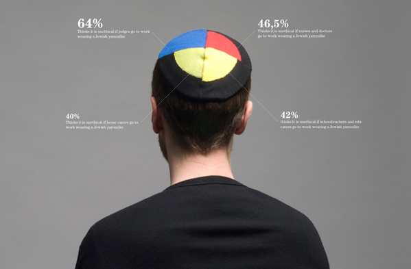
The graphics above and below show Danish opinion on whether it’s ethical to wear religious symbols in public professions. At their core, they’re just pie charts. Embed them on clothing relevant to the topic though, and somehow they become more than that.

What do you think – does it lend to better understanding, or at the very least, make you care more?
[Behance via Chart Porn]
 Visualize This: The FlowingData Guide to Design, Visualization, and Statistics (2nd Edition)
I think this kind of visualization is fantastic!
Kaizer.
I find simple graphs more readily understandable. And no, it doesn’t make me care more. But, I do think they are very beautiful!
The concept of contextualising data visually is a great idea, it needs to be executed very carefully though. A balance between being easy to understand (a necessity) and aesthetics (making people want to look at it) is needed…
Comparing something that does not add up to 100% to a pie chart is travesty – the first visual implies the segments are mutually exclusive within the same ‘population’ in the way it is constructed which is misleading. I feel kinder towards the second (which is definitely eye-catching) as it doesn’t echo a piechart and the layering implies overlap. So in short a great idea if used wisely!
This sort of contextualization is only acceptable if it happens on top of a minimal bra.
When I was a little boy, I remember being impressed by a scale model of the solar system, similar to the one that is now on the national Mall in Washington, DC: http://www.voyagesolarsystem.org/exhibition/ex_experience.html
I remember standing over a pea-sized Pluto at the far end of a parking lot and looking towards the “Sun,” which was in the science museum, and thinking, “Whoa! The solar system is BIG!”
So, yes, seeing data in context can make someone care more.
It dosen’t make me care more, but its much more interesting to look at and certainly made me think (and I like the second one more
certainly gets my attention. can’t read the text tho, too small, yet plenty of space for a larger font size!
Pingback: Pie charts with depth |
I like the ideas, but I can’t read the text in any of these images…..
Beautiful visualization crippled by tiny font size!
It doesn’t lead to better understanding because the text is so small it can’t be read, at least on my browser.
Pingback: More beautiful information « Mind Your Language