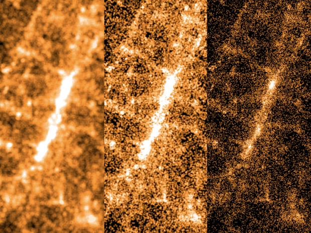
Erica Fischer, known around these parts for her dot maps, describes the lessons she learned (along with practical tips) from mapping millions of tweets to be visible on many devices. The views above show what you get when you vary dot size when you zoom in to a dot-filled map.
The first thing that becomes clear when you start drawing the same dots at different scales is that it doesn’t look right if you just scale the dots proportionately as you scale the area. Each time you zoom in on a web map, only a quarter of the area that was visible before is still visible, but if you match that and draw the dots four times as big as you did at the previous zoom level, the image is very crowded and fuzzy by the time you get zoomed in all the way. The Gnip maps instead double the area of the dots for each level you zoom in. Here’s what it looks like to zoom in on Times Square with dots that quadruple, double, or don’t change size at all with each zoom level.

 Visualize This: The FlowingData Guide to Design, Visualization, and Statistics (2nd Edition)