• Membership
  • Newsletter
  • Projects
  • Learning
  • About
  • Member Login
  • Planets as fruit to show scale

    November 18, 2014

    Topic

    Infographics  /  astronomy, scale

    I still don’t understand the relative size of planets. The universe is too big and my sense of scale is too small to fathom such large numbers. I wish someone would explain it to me like I was five years old. What? Avi Solomon used fruit illustrations to roughly show a relatable scale? Nice. [via Boing Boing]

  • Earth-orbiting satellites, all of them

    November 18, 2014

    Topic

    Statistical Visualization  /  Quartz, satellites, space

    David Yanofsky and Tim Fernholz for Quartz visualized the satellites orbiting Earth. There’s a lot of them.

    There are more than 1,200 active satellites orbiting earth right now, taking pictures, relaying communications, broadcasting locations, spying on you, and even housing humans. Thanks to a database compiled by the Union of Concerned Scientists, we can show you each one, as of August 21, 2014.

    As you scroll down, you see satellites that are farther from the Earth’s surface. The horizontal position seems to just be a uniform placement for satellites at the same level.

    By the way, I realize 1,200 satellites seems like a lot, but just for context: At the time I’m writing this (in the mid-afternoon on a weekday), there are about 7,800 commercial flights in the air.

  • You, Me and My Computer

    November 17, 2014

    Topic

    Data Art  /  Lauren McCarthy, lunch talk

    This talk that Lauren McCarthy gave at Eyeo is good. McCarthy, an artist and programmer, describes her work with the uncomfortable pauses during dates, technology as a way to change behaviors, and surprising explorations of how people interact with each other.
    Read More

  • Casual visualization books for the coffee table

    November 17, 2014

    Topic

    Visualization  /  books, casual

    Since my son was born, it’s been a challenge to focus on a single book for any prolonged amount of time. He’s in perpetual motion, as my mom often likes to say. Data Fluency is the only book I’ve read cover-to-cover in the past year (and you should too). So casual visualization reads — books that you can randomly thumb through at bite-sized rates — have piqued my interest more than usual.

    Here are five recent books worth a gander.
    Read More

  • A collection of small datasets

    November 14, 2014

    Topic

    Data Sources

    Sometimes you need data, any data, to test or mess around with. Sometimes you just want to make weird crap. Corpora is a collection of small datasets that might suit your needs.

    This project is a collection of static corpora (plural of “corpus”) that are potentially useful in the creation of weird internet stuff. I’ve found that, as a creator, sometimes I am making something that needs access to a lot of adjectives, but not necessarily every adjective in the English language. So for the last year I’ve been copy/pasting an adjs.json file from project to project. This is kind of awful, so I’m hoping that this project will at least help me keep everything in one place.

    Some of the sets: animals, colors, corporations, and foods.

  • This is big data.

    November 14, 2014

    Topic

    Miscellaneous  /  big data, humor

    A one-off tumblr that catalogs stock images that depict the tumultuous, rising sea of big data. Nice.

    Still though, nothing beats Big Star Trek Data.

    Big Data

  • Wireless networks translated to sound

    November 13, 2014

    Topic

    Data Art  /  invisible, WiFi

    Wi-fi is embedded in our everyday lives so much that we don’t pay much attention unless it’s not around. We’ve seen it translated visually a couple of times. But this time, Phantom Terrains, by Frank Swain and Daniel Jones and visualization by Stefanie Posavec, translates networks into sound.

    Phantom Terrains is an experimental platform which aims to answer this question by translating the characteristics of wireless networks into sound. By streaming this signal to a pair of hearing aids, the listener is able to hear the changing landscapes of data that surround them. Network identifiers, data rates and encryption modes are translated into sonic parameters, with familiar networks becoming recognizable by their auditory representations.

    Above is a test walk around the BBC Broadcasting House. Listen to signals translated to what kind of sounds like alien communications.

  • Data Underload  /  choropleth, marriage

    Relationship Status Geography

    Some places attract young singles, whereas others attract married couples and families. I was curious how this varied across the country, so I mapped it.

    Read More
  • Unclaimed remains

    November 11, 2014

    Topic

    Data Sources  /  death, Los Angeles Times, mortuary

    People die, and for various reasons many bodies go unclaimed. In Los Angeles county, the bodies go to the county crematory. The Los Angeles Times reports, along with a searchable database of the unclaimed in 2011.

    If relatives can be found, they are notified by the morgue or the coroner that their loved one’s body is available for pickup by a mortuary. If a family can’t afford the mortuary fees, the county handles cremation.

    The cost is typically $352 for a case handled by the coroner and $466 for others. Although that must be paid before the ashes can be taken, in some cases a family can ask a county supervisor to waive the fee.

    Some families simply don’t want to pick up relatives, said Joyce Kato, an investigator at the Los Angeles County coroner’s office.

    The county keeps remains for three years, so the ashes will receive a mass burial if they are not claimed by the end of this year.

    Oof, the remains of 137 unclaimed babies in the database and the drawer of paper bags with their remains struck a chord.

  • Berlin wall of lighted balloons

    November 10, 2014

    Topic

    Data Art  /  Berlin Wall, installation, remembering

    Celebrating the 25th anniversary of the fall of the Berlin Wall, Lightgrenze, translated to light border, places lighted balloons where the wall used to be.
    Read More

  • Jeopardy! clues data

    November 7, 2014

    Topic

    Data Sources  /  Jeopardy

    Here’s some weekend project data for you. Reddit user trexmatt dumped a dataset for 216,930 Jeopardy! questions and answers in JSON and CSV formats, a scrape from the J! Archive. Each clue is represented by category, money value, the clue itself, the answer, round, show number, and air date.

    I’m not sure what I’d do with the data, but the first thing that comes to mind is investigating the hunt for Daily Doubles. Where are those things usually placed, and how random is it? Oh wait, someone already did that.

    Have fun poking.

  • Ballet dance traces

    November 7, 2014

    Topic

    Data Art  /  Arduino, ballet

    Electronic Traces, by Lesia Trubat, tracks ballet movements and allows dancers to see the traces of their feet.
    Read More

  • Touchdown passing record

    November 6, 2014

    Topic

    Statistical Visualization  /  football, New York Times, time series, Upshot

    Peyton Manning, quarterback for the Denver Broncos, passed up Brett Favre’s career record of 508 passing touchdowns. Manning, currently at 510 passing touchdowns, is now setting his own records that won’t be beat for a long while. Gregor Aisch and Kevin Quealy for the Upshot chart out Manning’s trajectory of quarterbacks past and present.

    Those who have followed New York Times graphics might recognize a similar time series display from when baseball player Alex Rodriguez* joined the 600 home run club. Or from 2007, when Barry Bonds* chased the all-time home run record. It’s kind of fun to see the graphics grow bigger, brighter, and more open over the years. Flash disappears. Multi-line voronoi comes in.

    At the base though, it’s the same chart, and it’s still good.

  • Senate results maps →

    November 5, 2014

    Topic

    Maps  /  elections, New York Times, Upshot

    The New York Times pushed out super-detailed, precinct-level maps for the Senate election. The maps are also interactive, work well, and don’t take forever to load. As my dad would say — holy moly.

  • Data Underload  /  ancestry, family

    Chart of Cousins

    For every family get-together I go to, it seems there are more kids running around. I know that they are related to me somehow, but what do I call them? Maybe this chart will help next time.

    Read More
  • Basketball shot

    November 4, 2014

    Topic

    Infographics  /  basketball, Washington Post

    Todd Lindeman and Lazaro Gamio for the Washington Post explored shooting patterns for last year’s Washington Wizards.
    Read More

  • Most cited research papers →

    November 3, 2014

    Topic

    Infographics  /  nature, research, scale

    In the department of comparing large numbers to objects and situations that are slightly more relatable, this graphic from Nature explores citations in research.

    The bar on the left shows the height of a theoretical stack of papers that represents the first page of every paper cataloged in Web of Science. It would almost reach the height of Mount Kilimanjaro. The breakout stack is a zoomed in view of the 14,351 paper pages with at least 1,000 citations, and finally, the magnified orange section represents the top 100 papers. Also a flying bug.

  • Relative size of astronomy stuff

    October 31, 2014

    Topic

    Infographics  /  astronomy, scale

    Look! More size of very big things with large numbers, compared against things that you’re kind of familiar with. Does this ever get old? The answer is no. Because measurements of planets might as well be random large numbers without anything to scale, John Brady placed things from space on Earth and vice versa.
    Read More

  • Prostitution, GDP, and £1.7 billion due

    October 31, 2014

    Topic

    Statistics  /  David Spiegelhalter, prostitution, taxes, uncertainty

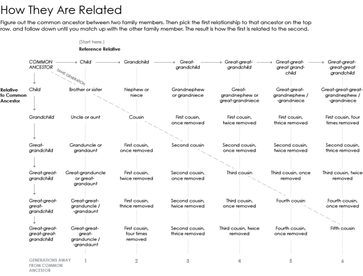
    David Spiegelhalter, professor of public understanding of risk, does some back-of-the-napkin math to describe why recent prostitution estimates for the UK are problematic.

    As always, it’s best to do a simple reality check. The ONS assumptions come to around 61,000,000 visits a year. Let’s say 50,000,000 are from locals rather than foreign visitors. There are around 27,000,000 men between 18 and 50 in the UK (taking an arbitrary upper limit), so this would mean that on average each of them buys sex twice a year. In fact the latest Natsal survey found that 3.6% of men reported paying for sex in the last 5 years – let’s say that means that considerably less than 1,000,000 men a year pay for sex, maybe 500,000. So the ONS assumptions mean that men who pay for sex do so on average twice a week. This seems high.

    The assumptions also mean that the average person working in prostitution is turning over nearly £100,000 a year, which Jolyon from Tax Relief 4 Escorts says is completely implausible, and he should know.

    Spiegelhalter makes a few of his own assumptions in there, but you can see why estimating illegal activity and then using those numbers to calculate gross domestic product can be a challenge.

    If you recall, the gross domestic product for the United Kingdom rose by 5 percent, largely in part due to estimates trying to account for drug sales and prostitution. Given that illegal activity and careful, public record-keeping typically don’t go together, the new numbers were rough at best. For prostitution in particular, the numbers from the Office of National Statistics estimated an extra £5.7 billion added to the GDP.

    The problem now is that the United Kingdom, as a member of the European Union, apparently owes £1.7 billion. This is based on gross national income which uses gross domestic product in its equation. Ouch. Consequences.

  • Decline of women in computer science

    October 30, 2014

    Topic

    Statistical Visualization  /  computer science, gender, NPR

    NPR spent some time on the subject of the decline of women in computer science. Whereas the the percentage of women in other technical fields rose, the percentage of women in computer science declined, as shown in the chart above. Although it’s tough to pinpoint a single factor, the time of decline coincides with when computer were mostly marketed towards boys in the 1980s.

    In the 1990s, researcher Jane Margolis interviewed hundreds of computer science students at Carnegie Mellon University, which had one of the top programs in the country. She found that families were much more likely to buy computers for boys than for girls — even when their girls were really interested in computers.

  • Page 210 of 392
  • <
  • 1
  • ...
  • 207
  • 208
  • 209
  • 210
  • 211
  • 212
  • ...
  • 392
  • >

Analyze, visualize, and communicate data usefully, beyond the defaults.

Become a member →

Recently for Members

May 8, 2025
When the data is not what it seems

May 1, 2025
Finding the Right Charts

April 24, 2025
Visualization Tools, Datasets, and Resources – April 2025 Roundup

April 17, 2025
Breaking Out of Chart Software Defaults

April 15, 2025
Line Chart with Decorative Neon Accents

Browse by Chart Type See All →

Cartogram Unit Chart Baseline Chart Strip Plot Choropleth Map Packed Bubble Chart Mosaic Plot Stacked Bar Chart Parallel Coordinates Dot Plot

Browse By Topic

  • Visualization

    Seeing data

  • Maps

    Seeing geographic data

  • Infographics

    Explaining data

  • Networks

    Connecting data

  • Statistics

    Analyzing data

  • Software

    Working with data

  • Sources

    Getting data

  • Design

    Making data readable

Get the Book

Visualize This: The FlowingData Guide to Design, Visualization, and Statistics

Available now.

Order: Amazon / Bookshop

Made by FlowingData

  • The Process

  • Data Underload

  • Chart Everything

  • Guides

  • Books

  • Shop

  • About
  • Contact
  • Newsletter
  • LinkedIn
  • Instagram
  • Bluesky
  • RSS
Copyright © 2007-Present FlowingData. All rights reserved.