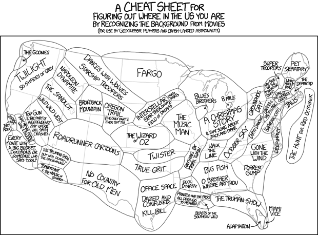
Stereotropes, made by the Bocoup Data Visualization Team, explores the many tropes in films and the the adjective used to describe them. Some are unique to a trope and some words span multiple tropes and genders.
Read More
Stereotropes, made by the Bocoup Data Visualization Team, explores the many tropes in films and the the adjective used to describe them. Some are unique to a trope and some words span multiple tropes and genders.
Read More
The talks from OpenVisConf 2015 went up, so I’m slowly making my way through. In this one Danyel Fisher from Microsoft Research talks about the challenges of working with data that doesn’t quite fit into your standard CSV data model. The visualization has to account for the mess.
Watch the talk
Winter is over and it’s shorts weather these days in California. This is good for relaxing outdoor lunches but not so good for the drought. It’s sad to drive down the state and see a bunch of barren farm land. Victor Powell shows this shift in water supply through reservoir data from the California Department of Water Resources.
Read More
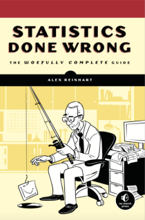 A while back Alex Reinhart, a statistics instructor and PhD student at Carnegie Mellon University, was working on a guide for doing statistics right. The goal was to teach through anecdotes of statistics done wrong, from statistical significance and p-values to regression and confounding factors.
Statistics Done Wrong is a book now. If you analyze data with any regularity but aren’t sure if you’re doing it correctly, get this book. It’s a concise guide with interesting examples and a light, easy-to-read tone.
Read More

The Avengers comic has been around since 1963 and the look and feel of characters have changed over the years. Jon Keegan for the Wall Street Journal looked at this change through color usage in the comic’s covers.
Read More
Justin Wolfers, David Leonhardt, and Kevin Quealy for the Upshot explore the gender gap between the black male and female populations in the United States. It’s wide.
Read More
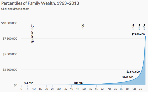
Wealth inequality is a real thing that is complex and a result of various factors. It’s difficult to capture everything in one chart, so Urban Institute explained wealth inequality in nine charts instead.
Read More
The Cartography and Geovisualization Group at Oregon State University and NASA visualized a one-year life cycle of carbon dioxide in an interactive video map.
Read More
Oliver Roeder for FiveThirtyEight covered this year’s American Crossword Puzzle Tournament and the battle between Tyler Hinman and Dan Feyer.
Read More
There were a couple of similar quantified self articles last week about email. They’re both joke-ish but kind of interesting with a this-is-kind-of-pointless undercurrent. In one, Paul Ford analyzes his email archive and deems it a failure after he finds nothing interesting. In the second, Emma Pierson analyzes her email in the context of a long-distance relationship.
Read More
The “speed of light” typically means “really fast” but when it’s relative to the scale of the universe, maybe not so much. Animator Alphonse Swinehart shows what it might look like to follow a photon from the sun to Jupiter, where the speed of light can sometimes feel really slow.
Watch the video
Using calculations by Nick Kasprak from the Center on Budget and Policy Priorities and Kyle Pomerleau from Tax Foundation, Amanda Cox shows tax penalties and bonuses for married couples.
Read More
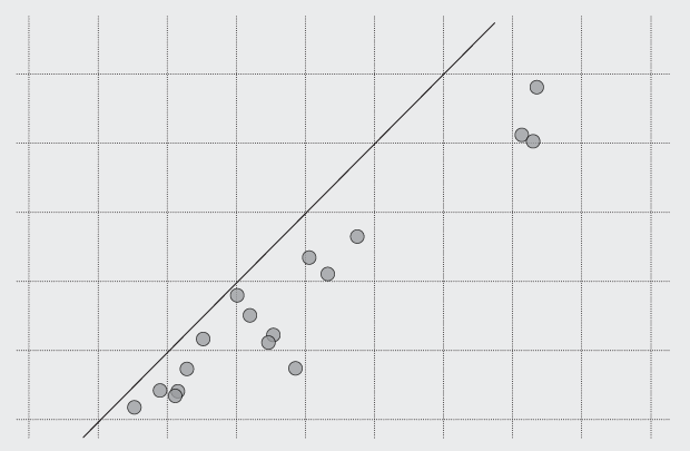
It’s easy to draw dots. The challenge is to make them meaningful and readable.
In their continued efforts to present statistics as a field that doesn’t suck, the American Statistical Association provides this pitch video. I approve of this message.
Watch the video
LEGOs make everything better. David Wessel for Brookings Institution explains how federal taxes play a role in decreasing the income gap. Each column an income quintile and each brick a lump of money.
Watch the video
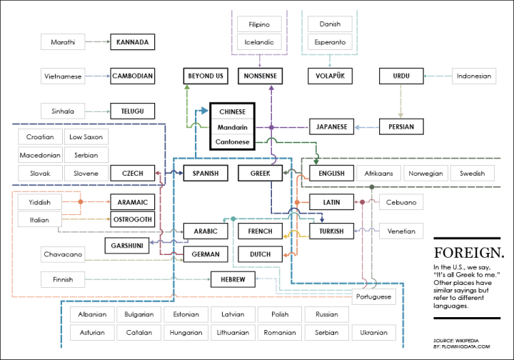
In English, there’s an idiom that notes confusion: “It’s all Greek to me.” Other languages have similar sayings, but they don’t use Greek as their point of confusion.
We know there are a lot of deaths in Game of Thrones, but how does this relate to real life? As fans eagerly wait for the next book in the series by George R. R. Martin, many won’t live long enough to see it published. Statistics PhD student Jerzy Wieczorek dives into reader demographics and actuarial tables to estimate how many people died before the show even aired.
Read More
Asterank is an asteroid database maintained by Ian Webster, an engineer at Google. It contains information for over 600,000 asteroids.
Read More
 Visualize This: The FlowingData Guide to Design, Visualization, and Statistics (2nd Edition)
New tools, refined process.