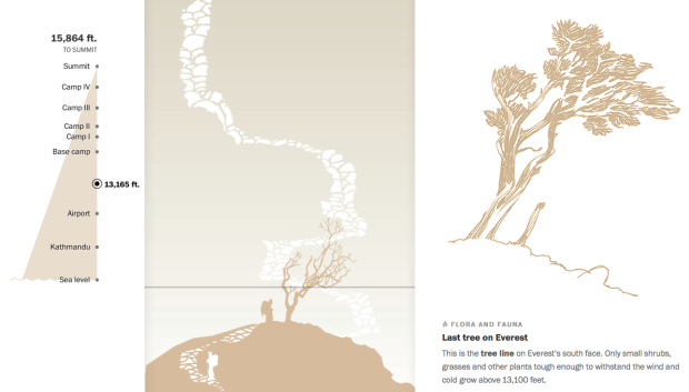
• Membership
  • Newsletter
  • Projects
  • Learning
  • About
  • Member Login
  • When data gets creepy

    December 15, 2014

    Topic

    Data Sharing  /  Ben Goldacre, privacy

    You make and publish bits of data about yourself, intentionally and unintentionally, and it goes to the indexed public web or to companies’ private black boxes. Ben Goldacre explains why it’s worth caring about these traces. It’s less hoorah and more example-driven than these sort of articles tend to be, and there’s isn’t a single mention of being awash in data.

    At the simplest level, even the act of putting lots of data in one place — and making it searchable — can change its accessibility. As a doctor, I have been to the house of a newspaper hoarder; as a researcher, I have been to the British Library newspaper archive. The difference between the two is not the amount of information, but rather the index. I recently found myself in the quiet coach on a train, near a stranger shouting into her phone. Between London and York she shared her (unusual) name, her plan to move jobs, her plan to steal a client list, and her wish that she’d snogged her boss. Her entire sense of privacy was predicated on an outdated model: none of what she said had any special interest to the people in coach H. One tweet with her name in would have changed that, and been searchable for ever.

    Before you say you’re not the woman on the phone and that you have nothing to hide, also read this.

  • Revealing location history via your phone’s Wi-Fi

    December 15, 2014

    Topic

    Data Sharing  /  privacy, Wi-Fi

    When you have your phone’s Wi-Fi turned on, even if you’re not connected to anything, you broadcast the networks you’ve connected to, which in turn can reveal your location history. Ars demonstrated with a handful of test phones and a low-powered Wi-Fi monitor.

    The results were not surprising to us, but they are still eye-opening, and indicative of the security and privacy risks that result from wandering around with Wi-Fi turned on but not connected. We were able to match specific devices with recent (and some not really recent) movements of the owners of the phones—where they worked, where their homes were, and in some cases where they had shopped recently—using publicly available Wi-Fi base station mapping data.

    Off goes the Wi-Fi.

  • Heartbeat during marriage proposal

    December 12, 2014

    Topic

    Self-surveillance  /  health, heart, proposal

    The moments leading up to a marriage proposal can be both exciting and nerve-racking. Will s/he say yes? What if I fumble up the words? Am I walking towards a disaster? Then it happens, everything blurs together, and the moment makes its way back to normal.

    Reddit user sesipikai tracked his proposal during a trip to Italy. He happened to be wearing a heart rate belt, and you can see the rise and fall of beats per minute leading up to the question.

    Walk. Ask. She says yes. Bask in the happiness. Find a bench.

    Ah, the little bits of narrative totally make the chart.

  • How to Download and Use Online Data with Arduino

    Before you can do anything with data, you have to get it into the application. Working with an Arduino is no different. Although the process is changes, if you’re used to working with desktop software.

  • Physical infographics

    December 11, 2014

    Topic

    Data Art  /  photography, physical

    Photographer Marion Luttenberger used physical objects and people as her visual cues in lieu of digital bars and lines. The results are striking. Note: The annotation is in German but nothing Google Translate can’t handle.

    Reminiscent of Peter Orntofts’ series from a few years ago.

  • Book genres for visualization

    December 10, 2014

    Topic

    Visualization  /  Fernanda Viegas, lunch talk, Martin Wattenberg

    Martin Wattenberg and Fernanda Viegas from Google Research ran with the book metaphor for visualization in their talk at Tapestry 2014. Unlike some who bash projects that don’t fit a narrow specification, Wattenberg and Viegas argue that visualization spans various genres. The key is to know your genre and create accordingly.
    Read More

  • Data-ish physical gift things

    December 9, 2014

    Topic

    Miscellaneous  /  gifts

    Gift-buying season is in full swing, and it’s time to get stuff for your loved ones. But, it has to be tangible, because stuff that occupies space in the physical world is how you tell someone you love him or her by that amount. I know this, because the UPS truck that delivers to my neighborhood had an additional trailer rigged to the back full of it.

    Here are some data-ish printed things to show your loved ones that you care. We’re approaching last-minute territory for packages that don’t arrive with an Amazon smiley on the side.
    Read More

  • Understanding segregation with a simulation

    December 9, 2014

    Topic

    Infographics  /  Nicky Case, segregation, simulation, Vi Hart

    In 1971, Nobel laureate economist Thomas Schelling proposed that a desire to have neighbors of the same race — even a small percentage — can lead to segregation. The model has been simulated through a variety of interactives before, but in Parable of the Polygons, Vi Hart and Nicky Case put extra effort into teaching the model, bringing playfulness to an otherwise serious subject.

    Two groups of people are encoded as shapes — squares and triangles — and they take you through each step of the model. Use the sliders to adjust thresholds and population distributions, and run the simulation. The shapes on the left move if they’re looking for similarity, and the line chart on the right shows segregation over time.

    You end up with an understanding of how segregation works (however simplified this model might be) and a glimmer of hope of how we might shift directions.

    Worth a try.

  • Detailed visualization of NBA shot selection

    December 8, 2014

    Topic

    Statistical Visualization  /  basketball

    Sports loves conditional distributions. What does Joe Billy Bob typically do against such and such team? How does play differ in wins and losses? And a lot of the data is easily accessible, which makes it straightforward to answer these questions. Buckets, by Peter Beshai, uses NBA data to explore shot selection with plenty of conditionals.
    Read More

  • Player shows tremendous growth towards Godzilla

    December 8, 2014

    Topic

    Miscellaneous  /  basketball, humor

    TNT described NBA player Anthony Davis’ growth and accompanied the discussion with a graphic that showed a picture of Davis over the years. To drive the point home I guess they made the image of Davis bigger each step. SB Nation had some fun with predictions of Davis’ future. The NBA is going to have a heck of time adjusting the rules for Godzilla.

  • Baseline matters

    December 5, 2014

    Topic

    Miscellaneous  /  axes, humor

    Sweet, I guess Fox News had it right all along. I’m going to save a ton of space by truncating my vertical axes from now on. I just might go back and retrofit all of my old charts too. [via Reddit]

  • Make your own detailed tweet maps

    December 4, 2014

    Topic

    Maps  /  Eric Fischer, mapbox, Twitter

    Eric Fischer, known around these parts for his detailed dot maps, describes his process along with a code release.

    I’ve been tracking geotagged tweets from Twitter’s public API for the last three and a half years. There are about 10 million public geotagged tweets every day, which is about 120 per second, up from about 3 million a day when I first started watching. The accumulated history adds up to nearly three terabytes of compressed JSON and is growing by four gigabytes a day. And here is what those 6,341,973,478 tweets look like on a map, at any scale you want.

    I’ve open sourced the tools I used to manipulate the data and did all the design work in Mapbox Studio. Here’s how you can make one like it yourself.

    Three main steps (not including data collection): filter out noise and duplicates, generate map tiles, and style to your liking.

  • Motion Exposure →

    December 4, 2014

    Topic

    Data Art  /  long-exposure, movement

    Motion Exposure, a photography project by Stephen Orlando, captures movement patterns with light.

    I’m fascinated with capturing motion through time and space into a single photograph. Using LED lights with custom color patterns and long exposure photography, I’m able to tell the story of movement. This technique reveals beautiful light trails created by paths of familiar objects. These light trails have not been artificially created with Photoshop and represent the actual paths of the objects.

    The above shows kayaking movements, which is just one of many activities including canoeing, soccer, karate, and bike polo. See it all in the Orlando’s galleries. [via Colossal]

  • Map print clothing

    December 3, 2014

    Topic

    Maps  /  clothes, Rachel Binx

    Monochome, a new service brought to you by Rachel Binx, lets you make custom clothes printed with maps. It’s not just major cities though. No that’s for chumps. Using OpenStreetMap data, you select a location, choose the style of map, and pick your clothing item, and you’ve got your custom map print to wear. You can currently choose among a tank top, pencil skirt, flare skirt, and t-shirt.

    Get your order in this week to ensure you receive your item for Christmas. Even if you’re not looking to get anything, it’s kind of fun to play around with the interface that lets you create an item.

  • Serial views

    December 2, 2014

    Topic

    Statistical Visualization  /  baseline, Serial

    Like many, I’ve been listening to Serial every week, but I always just listened through my podcast app. So I missed this little bit from Adnan Syed way back in the second episode. He sent the two graphs above to the host Sarah Koenig. The graphs show tea price changes over time for two stores and Syed asks Koenig which store she would get her tea from. She says the first one, which has a more steady price.

    Look again, Adnan said. Right. Their prices are exactly the same. It’s just that the graph of C-Mart prices is zoomed way in — the y-axis is in much smaller cost increments — so it looks like dramatic fluctuations are happening. And he made the pencil lines much darker and more striking in the C-Mart graph, so it looks more…sinister or something.

    This was Adnan’s point: See how easy it is to look at the same information, but, depending on how it’s presented, come to two different conclusions about what it means? The 7-11 graph is the “innocent” graph. The C-Mart graph is the “guilty” graph. But they contain the same information.

    See also: the baseline.

  • Pie chart pyramid

    December 1, 2014

    Topic

    Statistical Visualization  /  humor, pie chart

    This pyramid pie chart just might take the pie chart humor crown from the amount-of-pie-eaten pie chart. (Who made this?)

  • Cyber Monday Sale at the FlowingData Shop →

    December 1, 2014

    Topic

    Site News

    For today only, everything, and I mean everything (all THREE items) is on sale in the FlowingData shop. Currently available: the Famous Movie Quotes poster, the Chart-Topping Songs poster, and a signed copy of Data Points.

    Buy any one item and get the second for 50% off (discount code: CYBER50). Buy any two items and get two for free (discount code: CYBERFREE2). It works with multiples of the same item too. Just enter your code at checkout.

    The sale starts now and ends tonight at midnight.

  • Elemental cartograms

    December 1, 2014

    Topic

    Maps  /  Periodic Table

    Along the same lines as the scaled Periodic Table, Elemental Cartograms by chemistry professor Babak Sanii and his students lets you make your own scaled Periodic Table of Elements. Simply edit the provided spreadsheet, upload, and you’ve got your cartogram.

    Normally, I’m not so thrilled with cartograms because of how they mess things up with shape, but that’s with geographic maps. You don’t have to worry about preserving borders so much with the Periodic Table.

    Make your own or check out examples of the cartograms in use.

  • A scaled Periodic Table of Elements

    December 1, 2014

    Topic

    Statistical Visualization  /  Google, Periodic Table

    Inspired by a diagram from 1976, the Big Picture group at Google Research built a Periodic Table where elements are scaled based on their use in the world.
    Read More

  • Detecting your face

    November 28, 2014

    Topic

    Data Art  /  face detection, facebook

    Sterling Crispin reverse engineered facial recognition algorithms and produced masks that only kind of look human. Although the computer sees it differently.

    This research has resulted in the production of a series of 3D printed face masks which were algorithmically evolved to satisfy facial recognition algorithms. It is important to understand the the goal of creating these masks isn’t to defeat facial recognition or provide something undetectable, simply covering your face with your hand will do that. Rather, my goal is to show the machine what it’s looking for, to hold a mirror up to the all-seeing eye of the digital-panopticon we live in and let it stare back into its own mind.

    Creepy results. [via Kyle Chayka]

  • Page 209 of 392
  • <
  • 1
  • ...
  • 206
  • 207
  • 208
  • 209
  • 210
  • 211
  • ...
  • 392
  • >

Analyze, visualize, and communicate data usefully, beyond the defaults.

Become a member →

Recently for Members

May 15, 2025
Step Chart, Enhanced

May 8, 2025
When the data is not what it seems

May 1, 2025
Finding the Right Charts

April 24, 2025
Visualization Tools, Datasets, and Resources – April 2025 Roundup

April 17, 2025
Breaking Out of Chart Software Defaults

Browse by Chart Type See All →

Connected Scatter Plot Stacked Bar Chart Choropleth Map Table Timeline Dot Density Map Bubble Chart Streamgraph Word Cloud Spiral Chart

Browse By Topic

  • Visualization

    Seeing data

  • Maps

    Seeing geographic data

  • Infographics

    Explaining data

  • Networks

    Connecting data

  • Statistics

    Analyzing data

  • Software

    Working with data

  • Sources

    Getting data

  • Design

    Making data readable

Get the Book

Visualize This: The FlowingData Guide to Design, Visualization, and Statistics

Available now.

Order: Amazon / Bookshop

Made by FlowingData

  • The Process

  • Data Underload

  • Chart Everything

  • Guides

  • Books

  • Shop

  • About
  • Contact
  • Newsletter
  • LinkedIn
  • Instagram
  • Bluesky
  • RSS
Copyright © 2007-Present FlowingData. All rights reserved.