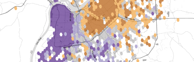
• Membership
  • Newsletter
  • Projects
  • Learning
  • About
  • Member Login
  • Detecting your face

    November 28, 2014

    Topic

    Data Art  /  face detection, facebook

    Sterling Crispin reverse engineered facial recognition algorithms and produced masks that only kind of look human. Although the computer sees it differently.

    This research has resulted in the production of a series of 3D printed face masks which were algorithmically evolved to satisfy facial recognition algorithms. It is important to understand the the goal of creating these masks isn’t to defeat facial recognition or provide something undetectable, simply covering your face with your hand will do that. Rather, my goal is to show the machine what it’s looking for, to hold a mirror up to the all-seeing eye of the digital-panopticon we live in and let it stare back into its own mind.

    Creepy results. [via Kyle Chayka]

  • Why you feel bloated after holiday meals →

    November 26, 2014

    Topic

    Infographics  /  health, holidays, Washington Post

    Because that’s what happens when you eat ten full plates of turkey and pie. However, Bonnie Berkowitz and Lazaro Gamio for the Washington Post go into some of the specifics of holiday eating. The last bit of the feelings section (part of it shown above) on permanently heavy:

    After the first 750 calories or so, your body begins to store a larger percentage of food as fat. A 2000 study found that the average adult gains a pound during each holiday season and usually never loses it.

    Wait — really?

  • Friends in Space

    November 26, 2014

    Topic

    Network Visualization  /  Accurat, space

    Part celebration of Samantha Cristoforetti, the first Italian woman to fly into space, and part social network above the clouds, Friends in Space by Accurat lets you follow Cristoforetti on the six-month long journey to the International Space Station.
    Read More

  • Chart data quickly with open source Charted

    November 26, 2014

    Topic

    Software  /  Charted, medium

    Charted is a tool used internally at Medium that they recently released into the wild. It’s for the quick-and-dirty times when you just need to see quick results.

    Charted is open-sourced and available for anyone to use at charted.co. The publicly-hosted charted.co works with files that are already publicly accessible to anyone with the link (e.g., Dropbox share links). For protected or sensitive data, you can serve your own instance of Charted on your secure network, which is what we do at Medium.

    It’s a stripped down charting tool built for a specific type of data, so there are of course limitations. But there’s also potential to customize for your own needs. Or if you have a simple time series that you frequently glance at, Charted might come in handy. [Thanks, Derek]

  • Pianogram

    November 25, 2014

    Topic

    Statistical Visualization  /  distribution, histogram, music, piano

    This is what you get when you cross a histogram and piano keys to show note distribution of songs. It’s the pianogram. View examples such as Fur Elise or the classic Chopsticks, or punch in your own MIDI-formatted song for a taste of the distribution ivories.
    Read More

  • English versus Chinese color descriptors

    November 24, 2014

    Topic

    Infographics  /  color, language, Wikipedia

    Color exists on a continuous spectrum, but we bin them with names and descriptions that reflect perception and sometimes culture. We saw this with gender a while back. Wikipedia has a short description on culture differences and color naming.

    Muyueh Lee looked at this binning through the lens of English versus Chinese color naming. More specifically, he looked at Chinese color names on Wikipedia and compared them against English color names. This comes with its own sampling biases because of higher Wikipedia usage for English speakers, but when you divide by color categories, it’s a different story.

    Full scrolling explainer here. Fun.

  • Easier online choropleth maps with Landline

    November 21, 2014

    Topic

    Software  /  choropleth, JavaScript, ProPublica

    Despite the frequent use of choropleth maps online, they’re still kind of tricky to produce for beginners. Landline, an open source JavaScript library from ProPublica, aims to make it a little bit easier. Given a GeoJSON file, Landline provides an interactive choropleth map with tooltips that works on multiple devices.

    Still in its early stages, the library lets you make state and county maps, as well as customize to your own needs. Underscore.js and Raphael.js are its two dependencies, so it plays nice with those libraries also.

  • Alinea cooker

    November 21, 2014

    Topic

    Miscellaneous  /  Alinea, food

    Alinea is a restaurant by Grant Achatz known for deconstructing flavors and piecing them together again for bites of deliciousness. They have a cookbook that describes how they make their food, but the recipes are so complex that no casual cook would ever try them. I actually have a copy myself, and it’s never gone past the coffee table.
    Read More

  • Mapping With Shapefiles in R – Getting Started

    Geographic data is often available as a shapefile, and there’s plenty of heavy software to get that data in a map. R is an open source option, and as a bonus, much of the work can be done in a few lines of code.

  • Fitbit data to be used in court as evidence

    November 20, 2014

    Topic

    Self-surveillance  /  Fitbit, law

    Personal data from Facebook, Twitter, and email are already used, so sure why not. Fitbit-generated movement data is now used in the courtroom.

    The young woman in question was injured in an accident four years ago. Back then, Fitbits weren’t even on the market, but given that she was a personal trainer, her lawyers at McLeod Law believe they can say with confidence that she led an active lifestyle. A week from now, they will start processing data from her Fitbit to show that her activity levels are now under a baseline for someone of her age and profession.

    It will “back up what she’s been saying,” says her lawyer, Simon Muller of McLeod Law.

    Sounds okay. This quote stuck out for me though:

    Now we’re looking at longer periods of time though the course of a day, and we have hard data.

    Hard data. I’d have to see it, but I’m pretty sure there’s some fuzziness and uncertainty there. I wonder if the defense has a go at an analysis that shows the opposite of the plaintiff’s claims.

  • Tracking global fishing through satellite data

    November 19, 2014

    Topic

    Maps  /  fishing, Google, ocean, Oceana, SkyTruth

    Global Fishing Watch is an initiative to place some accountability on global fishing, an activity typically a challenge to track.
    Read More

  • Planets as fruit to show scale

    November 18, 2014

    Topic

    Infographics  /  astronomy, scale

    I still don’t understand the relative size of planets. The universe is too big and my sense of scale is too small to fathom such large numbers. I wish someone would explain it to me like I was five years old. What? Avi Solomon used fruit illustrations to roughly show a relatable scale? Nice. [via Boing Boing]

  • Earth-orbiting satellites, all of them

    November 18, 2014

    Topic

    Statistical Visualization  /  Quartz, satellites, space

    David Yanofsky and Tim Fernholz for Quartz visualized the satellites orbiting Earth. There’s a lot of them.

    There are more than 1,200 active satellites orbiting earth right now, taking pictures, relaying communications, broadcasting locations, spying on you, and even housing humans. Thanks to a database compiled by the Union of Concerned Scientists, we can show you each one, as of August 21, 2014.

    As you scroll down, you see satellites that are farther from the Earth’s surface. The horizontal position seems to just be a uniform placement for satellites at the same level.

    By the way, I realize 1,200 satellites seems like a lot, but just for context: At the time I’m writing this (in the mid-afternoon on a weekday), there are about 7,800 commercial flights in the air.

  • You, Me and My Computer

    November 17, 2014

    Topic

    Data Art  /  Lauren McCarthy, lunch talk

    This talk that Lauren McCarthy gave at Eyeo is good. McCarthy, an artist and programmer, describes her work with the uncomfortable pauses during dates, technology as a way to change behaviors, and surprising explorations of how people interact with each other.
    Read More

  • Casual visualization books for the coffee table

    November 17, 2014

    Topic

    Visualization  /  books, casual

    Since my son was born, it’s been a challenge to focus on a single book for any prolonged amount of time. He’s in perpetual motion, as my mom often likes to say. Data Fluency is the only book I’ve read cover-to-cover in the past year (and you should too). So casual visualization reads — books that you can randomly thumb through at bite-sized rates — have piqued my interest more than usual.

    Here are five recent books worth a gander.
    Read More

  • A collection of small datasets

    November 14, 2014

    Topic

    Data Sources

    Sometimes you need data, any data, to test or mess around with. Sometimes you just want to make weird crap. Corpora is a collection of small datasets that might suit your needs.

    This project is a collection of static corpora (plural of “corpus”) that are potentially useful in the creation of weird internet stuff. I’ve found that, as a creator, sometimes I am making something that needs access to a lot of adjectives, but not necessarily every adjective in the English language. So for the last year I’ve been copy/pasting an adjs.json file from project to project. This is kind of awful, so I’m hoping that this project will at least help me keep everything in one place.

    Some of the sets: animals, colors, corporations, and foods.

  • This is big data.

    November 14, 2014

    Topic

    Miscellaneous  /  big data, humor

    A one-off tumblr that catalogs stock images that depict the tumultuous, rising sea of big data. Nice.

    Still though, nothing beats Big Star Trek Data.

    Big Data

  • Wireless networks translated to sound

    November 13, 2014

    Topic

    Data Art  /  invisible, WiFi

    Wi-fi is embedded in our everyday lives so much that we don’t pay much attention unless it’s not around. We’ve seen it translated visually a couple of times. But this time, Phantom Terrains, by Frank Swain and Daniel Jones and visualization by Stefanie Posavec, translates networks into sound.

    Phantom Terrains is an experimental platform which aims to answer this question by translating the characteristics of wireless networks into sound. By streaming this signal to a pair of hearing aids, the listener is able to hear the changing landscapes of data that surround them. Network identifiers, data rates and encryption modes are translated into sonic parameters, with familiar networks becoming recognizable by their auditory representations.

    Above is a test walk around the BBC Broadcasting House. Listen to signals translated to what kind of sounds like alien communications.

  • Data Underload  /  choropleth, marriage

    Relationship Status Geography

    Some places attract young singles, whereas others attract married couples and families. I was curious how this varied across the country, so I mapped it.

    Read More
  • Unclaimed remains

    November 11, 2014

    Topic

    Data Sources  /  death, Los Angeles Times, mortuary

    People die, and for various reasons many bodies go unclaimed. In Los Angeles county, the bodies go to the county crematory. The Los Angeles Times reports, along with a searchable database of the unclaimed in 2011.

    If relatives can be found, they are notified by the morgue or the coroner that their loved one’s body is available for pickup by a mortuary. If a family can’t afford the mortuary fees, the county handles cremation.

    The cost is typically $352 for a case handled by the coroner and $466 for others. Although that must be paid before the ashes can be taken, in some cases a family can ask a county supervisor to waive the fee.

    Some families simply don’t want to pick up relatives, said Joyce Kato, an investigator at the Los Angeles County coroner’s office.

    The county keeps remains for three years, so the ashes will receive a mass burial if they are not claimed by the end of this year.

    Oof, the remains of 137 unclaimed babies in the database and the drawer of paper bags with their remains struck a chord.

  • Page 210 of 392
  • <
  • 1
  • ...
  • 207
  • 208
  • 209
  • 210
  • 211
  • 212
  • ...
  • 392
  • >

Analyze, visualize, and communicate data usefully, beyond the defaults.

Become a member →

Recently for Members

May 15, 2025
Step Chart, Enhanced

May 8, 2025
When the data is not what it seems

May 1, 2025
Finding the Right Charts

April 24, 2025
Visualization Tools, Datasets, and Resources – April 2025 Roundup

April 17, 2025
Breaking Out of Chart Software Defaults

Browse by Chart Type See All →

Histogram Glyph Chart Donut Chart Parallel Sets Bubble Chart Stacked Bar Chart Grid Map Dot Plot Treemap

Browse By Topic

  • Visualization

    Seeing data

  • Maps

    Seeing geographic data

  • Infographics

    Explaining data

  • Networks

    Connecting data

  • Statistics

    Analyzing data

  • Software

    Working with data

  • Sources

    Getting data

  • Design

    Making data readable

Get the Book

Visualize This: The FlowingData Guide to Design, Visualization, and Statistics

Available now.

Order: Amazon / Bookshop

Made by FlowingData

  • The Process

  • Data Underload

  • Chart Everything

  • Guides

  • Books

  • Shop

  • About
  • Contact
  • Newsletter
  • LinkedIn
  • Instagram
  • Bluesky
  • RSS
Copyright © 2007-Present FlowingData. All rights reserved.