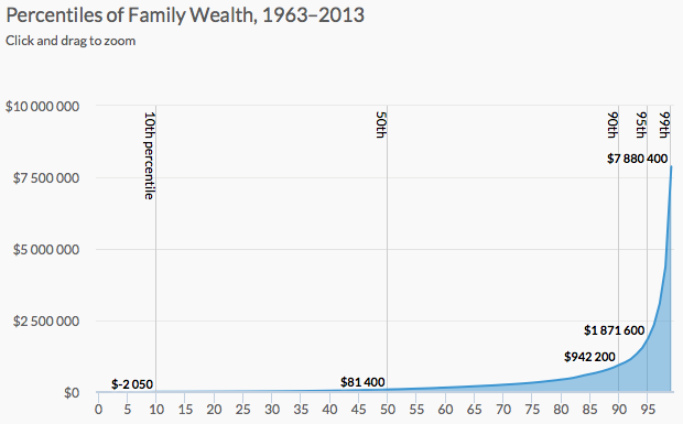
Wealth inequality is a real thing that is complex and a result of various factors. It’s difficult to capture everything in one chart, so Urban Institute explained wealth inequality in nine charts instead.
They start with an animated chart that shows growing inequality over the years (basically a rising spike on the right) and then move into demographic breakdowns for age and race. Then they go into more detail for possible explanations for why certain groups lag behind others.
Finishing with a handful of policy recommendations that might shrink wealth inequality, the piece is a nice progression of overview first to more details later.
 Visualize This: The FlowingData Guide to Design, Visualization, and Statistics (2nd Edition)