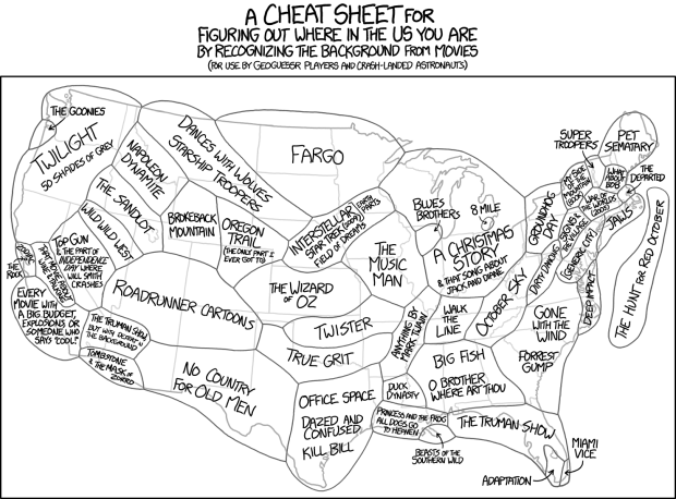
xkcd sectioned the United States by the background in movies. Because xkcd.
xkcd: U.S. of movie backgrounds
Second Edition
 Visualize This: The FlowingData Guide to Design, Visualization, and Statistics (2nd Edition)
 Visualize This: The FlowingData Guide to Design, Visualization, and Statistics (2nd Edition)
New tools, refined process.