Our daily lives are full of bias. We make assumptions about how the world works, why complex systems do what they do, and how precise measurements really are. That leads to a skewed view and sometimes misinformed decisions. Lena Groeger for Propublica describes how information graphics might play a role in providing a more accurate picture, in the particular the ones that engage readers with data.
You may have noticed by now that in some of these graphics, what we realize is not just something about ourselves (wow, I’m terrible at the stock market) but something about others (wow, it’s pretty hard to live on minimum wage). In a way these “you do it” graphics are like digital empathy tools. When we’re forced to make a decision or do something we don’t normally have to do, we get a glimpse into what it might be like to be another person. I believe we can take the idea much farther.
This is one of my fascinations with data these days. “Overall” comes to mind a lot when I think of statistics. Overall trend. Overall pattern. Aggregation. That’s hard for the everyday person or casual reader to grasp onto sometimes. But, if they see where they’re positioned in some amalgamation of data, that’s a good baseline to riff off of.


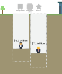 The tax plans of Ted Cruz and Donald Trump might seem fine if you don’t think about the actual values. Tax cuts. Less government spending. But then it gets tricky when you look at what they’re actually proposing. Alvin Chang for Vox provides a

 Visualize This: The FlowingData Guide to Design, Visualization, and Statistics (2nd Edition)


