10 Best Data Visualization Projects of 2015

Fine visualization work was alive and well in 2015, and I’m sure we’re in for good stuff next year too. Projects sprouted up across many topics and applications, but if I had to choose one theme for the year, it’d have to be teaching, whether it be through explaining, simulations, or depth. At times it felt like visualization creators dared readers to understand data and statistics beyond what they were used to. I liked it.
These are my picks for the best of 2015. As usual, they could easily appear in a different order on a different day, and there are projects not on the list that were also excellent (that you can easily find in the archive).
Here we go.
1. Dear Data
This was a fun project to follow and hits two topics — visualization and self-surveillance — that make my ears perk up.
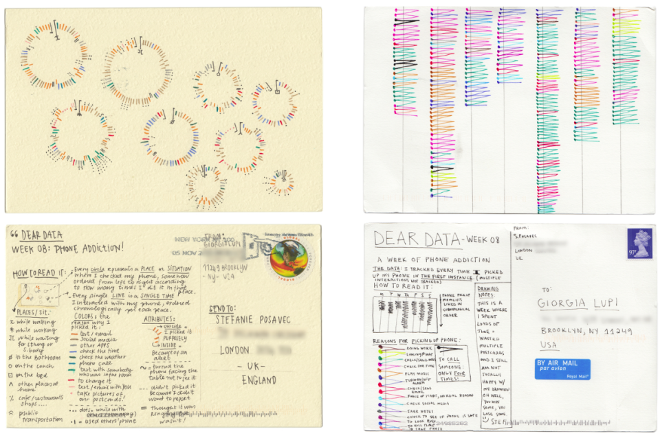
Dear Data was a year-long project by Stefanie Posavec and Giorgia Lupi. Each tracked everyday things during a week, such as how many times each picked up the phone, and then visualized the data on a postcard. Then they mailed the postcards to each other, with Lupi currently in New York and Posavec in London. (Read more)
2. You Draw It: How Family Income Predicts Children’s College Chances
It felt like a year to challenge readers’ understanding of data at a more statistical level.
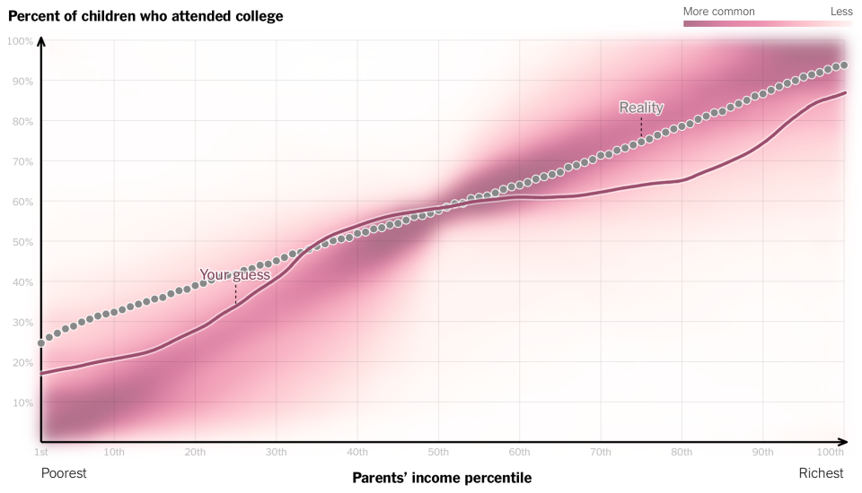
Gregor Aisch, Amanda Cox, and Kevin Quealy for the Upshot asked readers to draw a line that plotted family income against the percent of children who attended college. So you had your line, reality, and what other people thought the correlation looked like. (Read more)
Speaking of the Upshot/New York Times and data assumptions: See also this quick puzzle to test your pattern-finding ability and a 3-D chart of the economy’s future.
3. Hack Your Way To Scientific Glory
FiveThirtyEight also did some teaching through their visual interactives. The best one was a lesson on p-hacking to “scientifically” get the result you wanted from the same dataset.
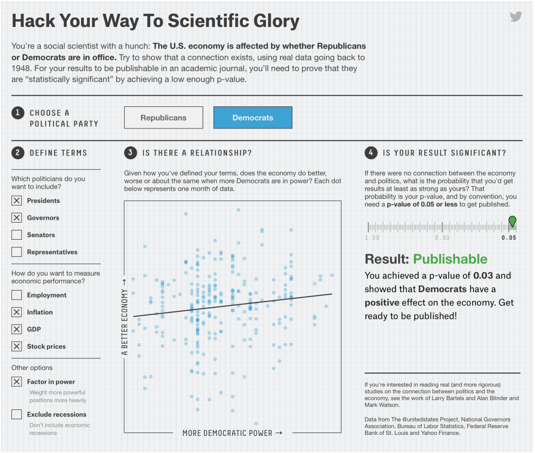
This came around the time a now former graduate student was under fire for making up data. The point of the FiveThirtyEight piece by Christie Aschwanden and Ritchie King wasn’t so much a disbelief that something so absurd could make it through the rigor of peer review. Rather, it was that science (and interpreting data) is hard. (Read more)
4. Making of “Where Are Ü Now”
The team at the New York Times made an interview featuring Justin Bieber not only tolerable but interesting.

Although Bieber is more of a side component, whereas Diplo and Skrillex go into the details of making a hit song. But still. The music visualization that plays along the sides of the video help you understand what the musicians are talking about. (Read more)
5. Watch how the measles outbreak spreads when kids get vaccinated – and when they don’t
Rich Harris, Nadja Popovich and Kenton Powell for the Guardian showed what happens when counties don’t get kids vaccinated.
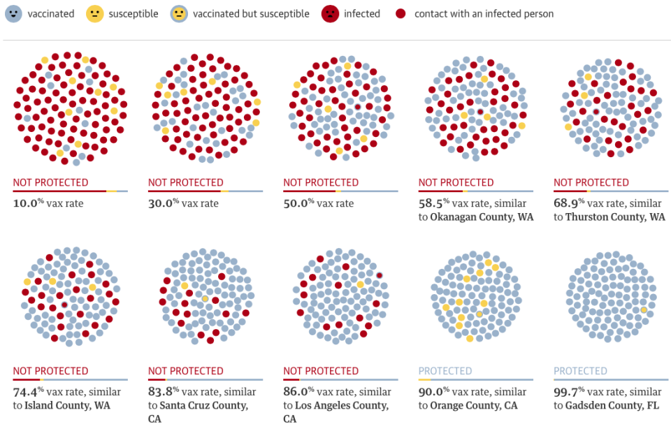
The parent in me wants to make this whole list this one interactive. (Read more)
6. A Visual Introduction to Machine Learning
Machine learning can seem like a magical concept with robots doing weird stuff without your knowledge. Stephanie Yee and Tony Chu demystified with a visual example.
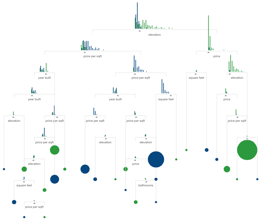
It’s a scroller that takes you through step-by-step of what it means when a machine “learns.” The series of transitioning charts make it super easy to follow. It was supposed to be first part of a series, but it looks like it might be a while before we see another. (Read more)
7. The Fallen of World War II
The project by Neil Halloran is part documentary, part interactive visualization, and they’re fused together seamlessly.
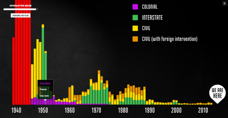
I’m surprised I don’t see more explainers in this style. When I realized what was happening, I just wanted it to keep on going. (Read more)
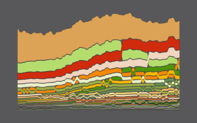
8. 2014 Was the Hottest Year on Record
The obvious way to visualize the data was as a single line chart. A split-up view got the point across much better.
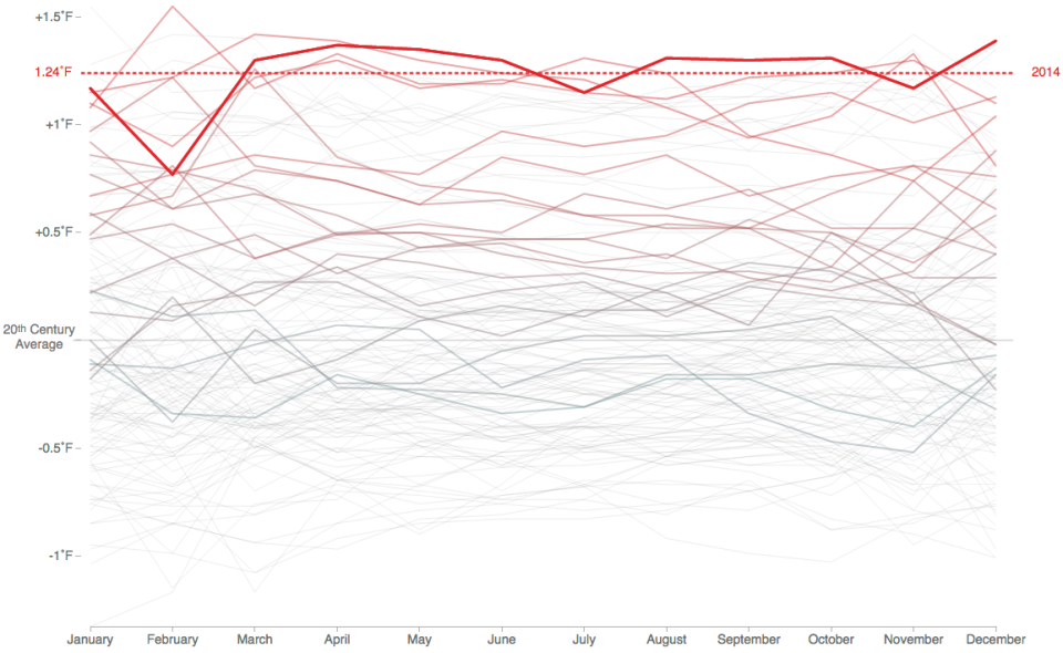
The animated chart by Tom Randall and Blacki Migliozzi for Bloomberg shows average monthly temperature. Each line represents a full calendar year, and as you get closer to present-day the line that represents record highs inches upwards. (Read more)
9. Network Effect
It’s been a while since we saw a project like this from Jonathan Harris.
In collaboration with Greg Hochmuth, Network Effect serves as commentary of the internet and as an oddly overwhelming way to experience it all at once, a few minutes at a time. (Read more)
10. Stereotropes
“Tropes are devices and conventions that a writer can rely on as being present in the audience’s minds.” Stereotropes by the Bocoup Data Visualization Team explores the words used to describe the tropes.

If you want to learn about gender roles and character portrayal in film, this is the project to look at. (Read more)
Become a member. Support an independent site. Get extra visualization goodness.
See What You Get