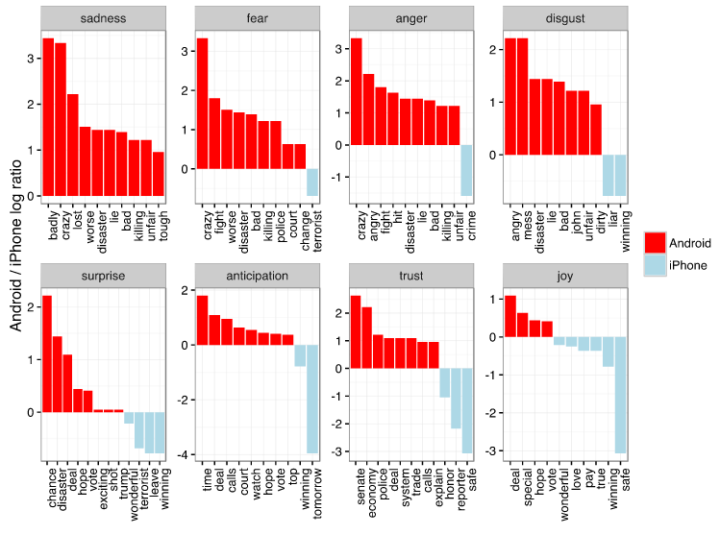
Mapzen, which offers a vector tile service, made Tile Exporter, so that you can search the world and 3-D print your favorites.
Read More
-
“What tool should I learn? ” I hesitate to answer, because I use what works best for me, which isn’t necessarily the best for someone else or the “best” overall. Nevertheless, here’s my toolset.
-
-
In 2008, Hurricane Ike blew just past the Houston Ship Channel, “home to the nation’s largest petrochemical complex.” Had Ike touched down on the area, the damage could’ve been far worse than it was. In a collaboration between ProPublica and the Texas Tribune, Hell and High Water shows simulated models of what the flooding might look like next time, if a hurricane is a bit stronger, if it takes a slightly different path, and perhaps most importantly, if the area constructs more protections.
Spend a bit of time with this one. It almost seems like a straightforward map at first, because it loads so quickly and runs smoothly, but there’s a lot of data displayed at once. Winds, rising waters, hurricane paths, and several simulations. The map is browsable and searchable.
More on process here. [Thanks, Scott]
-
People get married at various ages, but there are definite trends that vary across demographic groups. What do these trends look like?
-
Daniel Goddemeyer and Dominikus Baur grew interested in cell reception while on the New York subway:
In recent years, the MTA has started to equip select stations with WiFi and cell phone transmitters, but due to the remaining lack of connectivity in the tunnels, passengers rely on stray signals from surface transmitters to send or receive messages in between stations.
So they traveled the lines, collected data, and mapped out their results.
-
As we know, there are various outcomes during election season, with uncertainty in each round. The Upshot is currently using a simulation to show the expectations of tonight.
These estimates, which include states that have not yet reported all their votes, are based on several factors: Our expectations of every candidate’s performance, the voting results in other states and the demographic makeup and historical voting patterns of voters in each state. As votes come in, we expect the uncertainty around our estimates will narrow.
Nice.
-
I think the general assumption is that getting an Oscar nomination for Best Picture has a direct effect on profits. Krisztina Szucs put together a straightforward interactive that shows this isn’t typically the case.
Each bar represents a percentage of profit for a film. Roll over a bar, and you see three highlighted ones. The first represents the percentage of profit before a nomination, the second represents percentage of profit after a nomination but before the winner announcement, and the third bar represents percentage of profit after the ceremony.
So what you’re looking for is height before the red bar and after it. For impact level, you expect the third bar to be higher or at least the same as the first, but as you can see, most movies make the bulk of their profit in the beginning regardless.
-
It pains me to imagine a time when Donald Drumpf earns a Republican nomination. There are a number of ways he can get there, but there are a number of ways Marco Rubio can win the nod too. The Upshot simulated the possible routes.
To figure out what it will take for Donald J. Trump — or Marco Rubio or Ted Cruz — to win the Republican nomination, we built the G.O.P. presidential nomination process in code. This interactive delegate calculator uses each state’s delegate allocation rules, along with estimates of how favorable each district is for each candidate, to simulate how the race might unfold.
And if you have a different idea of what the results will be like, you can adjust the sliders for each candidate to simulate your own results.
-
Alyson Hurt quickly wrote some code to take screen captures of a Google Maps window periodically.
The original intention was to see the change in traffic during the January 2016 blizzard on the east coast, but this seems like it might come in handy for something else. I’m not sure for what, but I’m bookmarking it just in case.
-
A few years ago, Trifacta released Vega, a “visualization grammar” that lets you create charts with a JSON file. But you still have to declare a lot of things to make something standard like a bar chart. Vega-Lite, recently released by the University Washington Interactive Data Lab, lets you take advantage of Vega but with much fewer specifications.
As you might have guessed, Vega-Lite is built on top of Vega, a visualization grammar built using D3. Vega and D3 provide a lot of flexibility for custom visualization designs; however, that power comes with a cost. With Vega or D3, a basic bar chart requires dozens of lines of code and specification of low-level components such as scales and axes. In contrast, Vega-Lite is a higher-level language that simplifies the creation of common charts. In Vega-Lite, a bar chart is simply an encoding with two fields.
That sounds good to me. Gonna give it a shot.
-
-
Taking a step beyond 2-D glyphs, Codeology depicts GitHub user activity based on what they have contributed as 3-D objects made of ASCII characters.
The application pulls data from GitHub’s public API and creates visuals using WebGL, Three.js, and GLSL Shaders. Shape and color represent an individual language, with size being proportionate to how many characters of code were written.
I don’t know if it was intentional, but every visual looks like a microorganism. Pretty cool. [via Waxy]
-
It was hotter in 2015 than any other year ever. K. K. Rebecca Lai for the New York Times shows just how much hotter it was in your city. Simply type in your city name or click on the arrows to browse to see a time series for the year.
Read More -
Plants and animals interact with each other to stay alive, which in turn forms complex systems. I think the Lion King covers the system simplistically in song-form at the beginning of the movie, but that doesn’t cut it when trying to predict the effects of things like climate. Jianxi Gao, Baruch Barzel, and Albert-László Barabási study the complexities of nature’s network in greater detail.
Mauro Martino helps explain the work in this video for Nature. [Thanks, Mauro]
-
Last month, I published an interactive visualization that simulates how and when you will die. It reached millions of people worldwide, and I basically had one eye glued to the real-time traffic dashboard for a week. It was kind of nuts.
A few days in, I woke up and checked the stats. The Daily Mail was in the referral list. I clicked through to the article and my interactive was fully embedded on the page, which was strange because I didn’t give permission to do that.
Read More -
The Upshot has been doing a good bit on the Supreme Court dynamics after the death of Justice Antonin Scalia. In their latest, Alicia Parlapiano and Margo Sanger-Katz look at major shifts over the decades from more conservative to more liberal and vice versa.
The shifts are based on Martin-Quinn scores, which take past court decisions into account. You can grab the data here.
-
Noah Lorang, a data scientist at Basecamp, explains the key for most companies isn’t finding a way to use the most advanced methods. Instead, it’s about asking the right questions.
The dirty little secret of the ongoing “data science” boom is that most of what people talk about as being data science isn’t what businesses actually need. Businesses need accurate and actionable information to help them make decisions about how they spend their time and resources. There is a very small subset of business problems that are best solved by machine learning; most of them just need good data and an understanding of what it means that is best gained using simple methods.
Much along the same lines as when I say you can think like a statistician without the math.
-
For my graphic on emergency room visits over time and the other on things that get stuck, I used data from the National Electronic Injury Surveillance System, which is maintained by the Consumer Product Safety Commission.
You can download the data, grouped annually, as Excel files and then do some munging to get the data in order. It’s not a huge burden, but it’s not that fun either. Or, if you want to skip straight to the good stuff, you can use the neiss R package by Hadley Wickham to import the data in R.
I’d go with the latter.
-
Numberphile, from the Mathematical Sciences Research Institute, is one my new favorite YouTube channels. In this episode, Hannah Fry talks crime, data, and the Poisson distribution.
[Thanks, Mike]
-
Between 2009 and 2014, there were an estimated 17,968 visits to the emergency room for things stuck in a rectum. Here are those things’ stories.