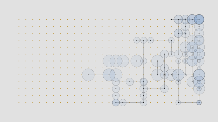
• For the Pudding, Alvin Chang uses the CANDOR corpus to explore our feelings when we do the unthinkable: talk to strangers.

    The story follows a sample of 30-minute conversations between strangers with transitions between anecdotes and patterns. Each square represents an individual as ASCII art, a timer on the right doubles as a progress marker, and in typical Chang style, he keeps you connected to what the data means on a personal level.

  • Members Only

    Communicate data so that more people care and fewer glaze over and fall into a deep mental slumber.

  • With temperatures rising, we must prepare for how everyday life could change, other than days getting hotter. For the Washington Post, Daniel Wolfe highlights research by Mohamed Foudad from the University of Reading on how flight turbulence might increase with just a 2°C bump.

    While at the University of Toulouse, Foudad led a study where he combined 11 climate models to predict where more extreme and dangerous forms of clear-air turbulence would increase. He said, “by using all these climate models … we have now a high confidence at each degree of warming that we have an increase in this turbulence.” The map above simulates the impact of a 2 degree Celsius (3.6 degree Fahrenheit) increase from preindustrial temperatures which, according to some estimates, could fall before 2055.

    An interactive map lets you enter two airports to see possible changes in turbulence over a flight path.

  • People tend to marry or partner with those closer to their age. However, some venture outside the typical range.

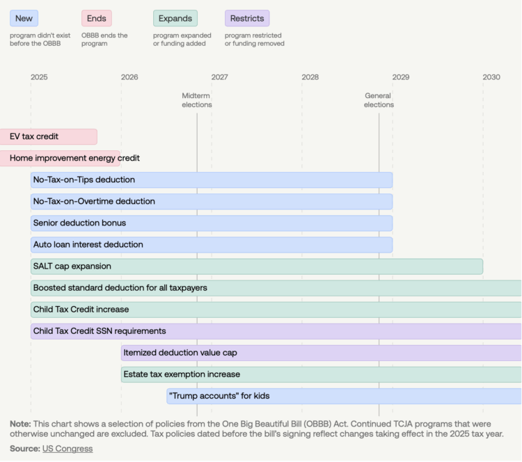
  • The bill proposed by the current administration affects incomes of the poor and the rich in an unusual way. To demonstrate, for NYT’s the Upshot, Emily Badger, Alicia Parlapiano, and Margot Sanger-Katz compare the bill against previous bills.

    The bill as passed by the House in May would raise after-tax incomes for the highest-earning 10 percent of American households on average by 2.3 percent a year over the next decade, while lowering incomes for the poorest tenth by 3.9 percent, according to new estimates by the Congressional Budget Office.

    The shape of that distribution is rare: Tax cut packages have seldom left the poor significantly worse off. And bills that cut the safety net usually haven’t also included benefits for the rich. By inverting those precedents, congressional Republicans have created a bill unlike anything Washington has produced since deficit fears began to loom large in the 1990s.

  • Making charts that are accessible to those with visual difficulties might seem like a lot of work, but it doesn’t have to be. Nancy Organ provides easy-to-implement suggestions to make it work.

    The good news is that the accessibility issues I encounter on a regular basis are fairly easy to solve. You don’t need any special tools or magic powers, and the result will be a visualization that is more easily enjoyed by a wide range of vision levels. And, if you’d like to go even further to include readers with a broader variety of disabilities and sensory experiences, resources like Chartability can point you in the right direction. Yes, you can make your visualizations more accessible.

    As a bonus, your visualization becomes more readable in general and everyone is able to read it.

  • The Pentagon Pizza Report tracks pizza place activity near the Pentagon. From the Guardian:

    The timing of Israel’s plan to attack Iran was top-secret. But Washington pizza delivery trackers guessed something was up before the first bombs fell.

    About an hour before Iranian state TV first reported loud explosions in Tehran, pizza orders around the Pentagon went through the roof, according to a viral X account claiming to offer “hot intel” on “late-night activity spikes” at the US military headquarters.

    The Pizza Meter Theory has been around since the 1990s, which is something new I learned today.

    The Pizza Meter, also known as the Pentagon Pizza Orders Theory, is a theory proposing that upticks in pizza orders received by restaurants near the Pentagon can predict international conflicts and times of crisis in the U.S. government. The concept originated in the early 1990s after a Domino’s Pizza franchise owner in Northern Virginia near the Pentagon named Frank Meeks, told newspapers that before major national security events, he saw a noticeable uptick in business.

    I guess there is some truth to the theory.

    It reminds me of the Waffle House Index and Canadian pee times during a hockey game. What other unexpected indicators are there for real-time events?

    (via)

  • There was one survivor from Air India flight AI171. He sat in seat 11A.

  • For the Pudding, Dorothy Lu and Anna Li examine the match rate between actor ethnicity and the characters they played. The rate is higher than you might think.

    On a character level, 207 out of 236 Asian main characters—88%—were portrayed by actors of the same ethnic background.

    This was more accurate than we’d expected! We were ready to blame Hollywood, but it looks like casting directors have been paying attention to Asian actors’ ethnicities.

    Honestly, as an Asian American, I only care that Asians are represented fairly in films. If a Korean can act Chinese or vice versa then it’s all good.

  • For Reuters, Dawn Chmielewski reports on the alleged copyright infringement.

    In the suit filed by seven corporate entities at the studios that own or control copyrights for the various Disney and Universal Pictures film units, the studios offered examples of Midjourney animations that include Disney characters, such as Yoda wielding a lightsaber, Bart Simpson riding a skateboard, Marvel’s Iron Man soaring above the clouds and Pixar’s Buzz Lightyear taking flight.

    The image generator also recreated such Universal characters as “How to Train Your Dragon’s” dragon, Toothless, the green ogre “Shrek,” and Po from “Kung Fu Panda.”

    “By helping itself to plaintiffs’ copyrighted works, and then distributing images (and soon videos) that blatantly incorporate and copy Disney’s and Universal’s famous characters — without investing a penny in their creation — Midjourney is the quintessential copyright free-rider and a bottomless pit of plagiarism,” the suit alleges.

  • Apple, with an announcement that the world has been waiting for, released 3-D charts with the Swift Charts framework. It is available across all of their platforms. Just remember that with great power comes great responsibility.

  • Members Only

    This week we make it easier to compare multiple charts when differences are small but significant.

  • While there are laws in the U.S. to protect some of your privacy from direct government surveillance, agencies make use of a loophole that allows the purchase of data from brokers. For 404 Media, Joseph Cox reports on one such broker, the Airlines Reporting Corporation, that is owned by the major airlines.

    The Statement of Work says that TIP can show a person’s paid intent to travel and tickets purchased through travel agencies in the U.S. and its territories. The data from the Travel Intelligence Program (TIP) will provide “visibility on a subject’s or person of interest’s domestic air travel ticketing information as well as tickets acquired through travel agencies in the U.S. and its territories,” the documents say. They add this data will be “crucial” in both administrative and criminal cases.

  • RJ Andrews and Attila Bátorfy highlight information graphics from Signal, the Nazi propaganda magazine that ran in the early 1940s.

    The magazine was the brainchild of colonel Hasso von Wedel, chief of the Wehrmacht Propaganda Troops. Its look was based on America’s Life magazine. Its content was significantly influenced by Paul Karl Schmidt, the press officer of the Foreign Office whose specialty was the “Jewish question”—the debate about the status and treatment of European Jews. Signal surprisingly contains almost no anti-Semitic content, perhaps because it did not want to offend intelligentsia in its target countries. Instead, it favored portraying Germany in an extremely friendly, kind, peace-loving, almost liberal light.

    Beware of dishonest charts.

  • Annelie Berner used blooming flowers as a visual metaphor to show climate change. The piece is called Plant Futures.

    Plant Futures envisions how a flower might show climate data, data that could eventually shape our familiar surroundings into something entirely new.

    Looking at just one flower, what does it need to survive and how might those needs be impacted by future climates? How a flower blooms is rooted in the place in which it grows. The variance in size, petals, color, even veins can be traced to that month’s temperature, rain, storms, which is in turn traced by sensors and compiled as data.

    Thus a flower represents, in and of itself, its surroundings as well as the broader climate.

    I like how the flowers morph into each other, given various conditions.

  • Many visualization folks recognize the cholera map as a vital tool that John Snow used in the 19th century to figure out the source of the disease. Joshua Stevens explains why that wasn’t what happened, as the map was made five years after Snow’s published conclusions.

    The famous map centered on Broad Street did not lead to an ‘a-ha!’ moment, nor was it the way in which Snow came about the truth behind cholera’s transmission. Simply put, the map played no role in the discovery of how cholera spread, the decline of the disease, or the removal of the Broad Street pump.

    […]

    Snow did not use a map to arrive at his conclusion. Instead, he holistically assessed the symptoms of patients, how they used and consumed water, and the conditions and municipal treatment of the water supply. He described how various sources of water smelled and even tasted, the water’s clarity, and whether upon drying it left behind residue. In this way, Snow systematically formed a hypothesis and used data to support his argument. With each step, the haze and mystery gave way and the truth began to emerge.

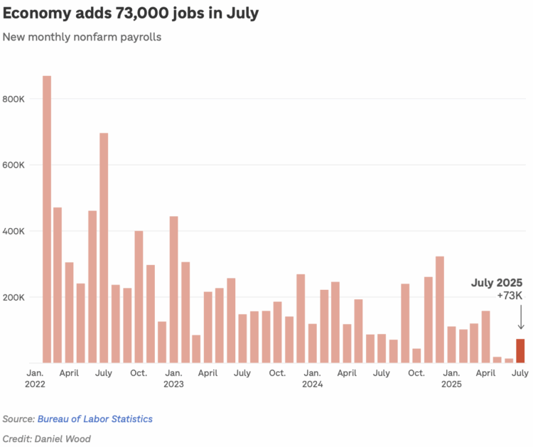
  • The Bureau of Labor Statistics announced a reduction in data collection to put together the Consumer Price Index, which is used to estimate inflation in the United States.

    BLS is reducing sample in areas across the country. In April, BLS suspended CPI data collection entirely in Lincoln, NE, and Provo, UT. In June, BLS suspended collection entirely in Buffalo, NY.

    Sample reduction and collection suspension affect both the commodity and services survey and the housing survey. These actions have minimal impact on the overall all-items CPI-U index, but they may increase the volatility of subnational or item-specific indexes. The number of imputed items and the response rates increased in April due to these actions. BLS makes reductions when current resources can no longer support the collection effort. BLS will continue to evaluate survey operations.

    I am sorry, Buffalo. You no longer directly feed into the national estimates.

    Budget cuts continue to force agencies to reduce their data coverage, which inevitably shifts the estimates. This seems to be an ongoing challenge across agencies, but it is growing worse.

  • Chess grandmaster Magnus Carlsen played against 143,000 people in a single game. The crowd voted on each move, and it eventually ended in a draw.

    Carlsen, 34, became the world’s top-ranked player in 2010 at 19 and has won five World Championships. He achieved the highest-ever chess rating of 2882 in 2014 and has remained the undisputed world No. 1 for more than a decade.

    “Overall, ‘the world’ has played very, very sound chess from the start. Maybe not going for most enterprising options, but kind of keeping it more in vein with normal chess — which isn’t always the best strategy, but it worked out well this time,” Carlsen said in a statement Friday as Monday’s draw seemed imminent.

    I hadn’t thought about the wisdom of crowds in a while. Over the years, it’s felt like the crowds have gotten a little less wisdom-y, but maybe it’s a good time to revisit. Use our powers for good.

  • A couple years ago, Harvard professor Francesca Gino was accused of faking data, ironically for research on honesty. Gino recently lost tenure:

    A Harvard professor who has written extensively about honesty was stripped of her tenure this month, a university spokesman said on Tuesday, after allegations that she had falsified data.

    The scholar, Francesca Gino, a professor of business administration at Harvard Business School and a prominent behavioral scientist, has studied how small changes can influence behavior and been published in a number of peer-reviewed journals. Among the studies in which Dr. Gino has been a co-author are, for example, one showing that counting to 10 before deciding what to eat can lead to choosing healthier food.

  • Members Only

    Hi folks. It’s Nathan. Welcome to the Process, the newsletter for FlowingData members…